WhatsApp Chat: 📞 8617370543 Call Girls In Siddharth Nagar At Low Cost Cash Pa...
Pitch
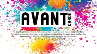
1. The avant-garde (from French, "advance guard") are people or works that are experimental or
innovative, particularly with respect to art, culture, and politics. The avant-garde pushes the
boundaries of what is accepted as the norm, primarily in the cultural realm.
2. I have been commissioned by the Northern Echo to produce
a new magazine or newspaper product. My product could
be in any style or genre but it must be self financed
through sales or advertising. I must also produce a
magazine for a specified audience segment within the 16 to
25 age group.
3. Magazine aimed at: Young adults,Alts,hipsters,people interested in culture
aged 17-22
Magazine connotations:grimy, not sanitized, with an open and transparent
manner relating teenage issues, not patronizing towards youths very realist, urban, cultural and artistic
with a political conscience, Very anti commercial, youth written to gain a realistic perspective.
Magazine brand image:Alternative,rebelling against the norm
(name) use of models,article tone and content
Unique selling point:The edgy, grunge/gothic/alternative magazine will
represent an artistic metaphor of the wild teenage spirit within itself.Multiple hybrid genres.
Alternative culture magazine with hybrid genres of art,photography,real life stories,style and
politics...
competition-one genre
focus=Gap in the
market=commercially viable
5. ● considerate,conscience when talking about sensitive products (similar
morals and values) community,close relationship with readers
● local advertising-TA can get to them and The Northern Echo:
“provide a tailored advertising platform on which local,regional and national
businesses use to engage with the readers”
● The Northern Echo prides itself on being ‘Reputable’, having
‘comprehensive article content’, ‘good quality journalism’ -incorporate all
these in my magazine and its brand image
*all quotes taken from the official Northern Echo website
6. WHAT DID I LOOK AT? Culture magazines such as Juxtapose,
Adbusters,I Love Fake,Rag and Bone etc.
HOW GENRE RESEARCH HELPED? Decided i wanted
a hybrid genre magazine,showed me there was a gap in the market for my product,influenced a more
simplistic layout,not abide as strictly by conventions
WHAT AM I GOING TO IMPLEMENT IN MY
MAG? Font(sans serif),models,colours,alternative approach
8. narrative
imagery
not mainstream layouts,rebels
against magazine conventions
lack of
sellines
larger
image:to
text ratio
models:
bad girl
alternative
vibe,
natural-
lack of
makeup
direct
stern
eyeline
anti-commercial
attitudes
headline
main
source of
text-focus
on that
mysterious content,teasing,importance
placed on discovering for yourself
Like-bold sans serif
font,conveys
message
in a bold
straightforward
manner
use of props for a
narrative purpose
like-use of
bold
primary
colours,
continuous
colour
scheme
9. dps analysis
paragraph structure-
blocks educational
intro bold-main
focus
image to text ratio-can
use illustrationfont-sans
serif
lack of colour,black and
white mostly,serious tone
mini header,
info on the
topic
overlaps,
artistic,use of
different fonts
unconventional
opposite side
picture overlaps
large
kicker
layering
11. QUESTIONNAIRE & how this helped
Researched:
1. music they enjoy
2. foods
3. shops they go to/do they
go in charity shops
4. favourite items
5. drinking habits
6. what makes seeing a live
gig enjoyable
7. hobbies
Helped: Gain insight into their
daily routines and interests,i
know what shops and
advertising to feature and
possible features for articles
12. Location; North East (a lot of galleries available,MIMA,the BALTIC,
local home exhibitions and art galleries.
● People who enjoy art and cultural activities
● elder readers of The Northern Echo (research shows 55+older is there main
readership)
● I need to be careful about: explicit photography-how sexualised my photography is,
no offensive language or mention of specific religions or ethnicities.
● YET: my brand image encourages freedom of artistic expression and has a feminist
vibe so it wont oversexualise women for men to look at or dull the alternative
content
13. golden rules:
The Press Complaints Commission is a voluntary regulatory body
for British printed newspapers and magazines.It deals with
complaints, framed within the terms of the Editors' Code of Practice,
about the editorial content of newspapers and magazines (and
their websites, including editorial audio-visual material) So this could
include blogs and online newspapers websites,and the conduct of
journalists. e.g the Northern Echo has a newspaper(print) and an
online website.
It is very important to ensure that informed consent is given before questioning,
photographing or publishing information about an individual.
I must ensure that all information about a topic, individual or organisation that is
published is accurate.
I will be considerate and caring when discussing sensitive topics such as illness,
shock, grief and traumatic events .
I must ensure all information is confidential therefore not giving out information
about an individual e.g. name, age and race. Unless permission is given.
14. Journalists have a moral obligation to protect confidential
sources of information.
If told any information by an interviewee that they later want to
retract or be dismissed from my article I must respect that and
not reveal the information. Alike to this if the identity of my
interviewee does not want to be revealed I am morally
obligated to protect them and the confidential information
provided by the source.
I will have to make sure the information
I’ve obtained and advice about drugs and
my Banksy article is correct.(refer to his
book as a main source of information)
The research into people's personal
experiences must also be factually
correct, so nobody is offended or think
that there story has been twisted or
factually incorrect.
How the
PCC affect
my product
Be careful the genre
of my magazine is
not too risque and
not contain
photography that will
offend readers,ask
models permission
to release the
photographs (form)
15. Why i did mock ups -Get feedback from my TA
then improve based on the constructive
criticism
What i did- created two mock ups (of separate
and very different layouts) in InDesign,
focus group for feedback
16. MOCK UP 1 WITH QUOTES Liked the
font,easy
to read,fits
the genre
black boxes were
boring-preferred if
they were
coloured
make bigger,
looks squished
interesting
introduction
and title,
draws the
reader in with
the use of a
question
interesting content,informative,
entertaining and educational
block
paragraphs
here are hard to
digest,break it
down
models fit
alternative
brand
image
use of
props is
intriguing,
fits artistic
genre
positive feedback
negative
feedback
17. liked:
black
informative,
flickability
eyeline is
directed
easy to focus on
the model,
natural and
alternative,fits
with the genre
hard to
read
enlarge
highlighted is
different,
contrast,good
use of black
and white
grunge
setting,typical
teenage
setting,
relatable
easily
readable and
digestible
paragraphs
20. space for regular
features such as
horoscopes
ISSUE 1
Only convention it
will keep to is a
issue number,not a
date
sans serif
fonts
throughout fake fur makes
a statement
and
fashionable
pose,skin
still shows
type of model
natural
gasping,
movement-
similar to i love
fake,strong
stance yet
‘caught in the
moment’
21. illusion
artistic
each one
has a new
illusion/illust
ration
links to FC,use an
outtake from the fc
pose
changed to contents,but keeps
the same style
sans font,change,
make the
magazine seem
packed
separate
sections,
different
NEON
colours
black outline,
white text-
contrasts the
black on
white usage
mesmerizing
hypnotic effect
22. left,irregularappears 3D
BRIEFER THAN
OTHER ARTICLES
more digestible
because its a
sensitive topic
same
format
as I love
fake
flickability
,informs
what the
topic is
aboutkeeps to
convention
womens lifestyle
mags
not smiling to deter
reader from drugs,
shows physicall effect
on physicallity and
mentality
sans serif capital fonts
alternative
use of neon
colours
simplistic
layout
larger image to
text ratio 65%
image BUT compact
and informative
text
writers
name
23. ● budget strategy
● why- students,not a premium product
● paper quality(economically/brand image)
● initial budget??
24. Pricing of my magazine:£2.00
Why: Student magazine,low disposable income,treat it as a
luxury item
demographics:my target audience will live in large towns but not close to cities in the north
of England. This allows me to give my magazine a regional aspect that will link me directly with my
client The Northern Echo.
socioeconomics:The socioeconomic group my magazine is target audience will have is
group B and C, (C1 and C2) I haven’t aimed it at group A as my magazine will make an effort to be a
saver magazine not a premium product. Affect my branding/advertising
choices
25. The Northern Echo circulation
30,735-Less, 30,000 (new to the
market)
local
- Advertising
26. Income from advertising:
DPS- 4X2200=8800
FULL PAGE-£1800
OUTSIDE BACK-£2500
overall income=£13,100
Overall profit:
£31,476.75
Expenditure: Total= £10,146.50
personnel (e.g journalists etc)=
£4,047.50
Equipment (e.g studio rental)=
£4,960.00
Printing (paper quality,quantity,
amount of pages)= £1,139.00
Distribution (areas the magazine
is delivered to by a distribution
company)=£45.75
27. How I’ve successfully met the brief,what i want
to achieve from this product...
So embrace your rebellious side and support
my magazine.
Thankyou for watching!