Call Girls in Nashik Bhavna 7001305949 Independent Escort Service Nashik
Webiste
1.
2. Product Analysis
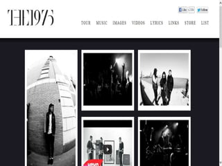
The 1975 Website
I chose to analyse Indie rock band The 1975’s official band
website. This is because they follow the same genre as our
chosen artist so we can take inspiration as to how the
ideologies and interests of our target population can be
targeted through the artists website. In addition, I analysed
The 1975’s music video for “The City” as product research and
for this reason I chose to also analyse their website aswell so I
can establish how a sense of continuity and brand identity
was achieved and we can use this inspiration in the planning
process of our own artists products.
3. When the audience initially opens
up The 1975 website they are
automatically shown a promotion
of the band’s debut album. This is
going to entice the person to
purchase the band’s music, it also
appeals to the indie ideology of
the music being the primary
focus. The fact that this is what
the person is exposed to straight
away with all other parts of the
website darkened conveys the
representation to the audience
that it is the music that is the
main focus and as indie fans are
know for the love and passion for
music this will get their attention
and lure them into exploring the
website more.
4. These are the links to pages that are provided to fans on the
homepage. They allow the audience easy access to the things they
would be most interested in. Options such as tour, music and lyrics are
all centered around the band’s music so will appeal to the target
audience and allow them to quickly gain access to their songs and
explore their music. Other links such as images and videos would
interest the audience by allowing them to feel as if they have the
opportunity to explore unseen and up to date things which will give
them a strong incite into the band, this may be included so that the
fans are able to identify more with the band making them more likely
to purchase their products. The link to store may mean more people
purchase merchandise from the band as it is easily accessible to them.
5. This is the header of The 1975’s website and is located in the top left corner
of the webpage, this placement is conventional as the band name must be in
a visible, noticeable place so that the audience can establish who the website
belongs to. The typeface of this is not what would stereotypically be used on
a website. This is because generally, a very clear typeface would be used so
that what is written can be read with ease and no confusion is caused.
However, this typeface is unique in that the letters appear to be joined up to
each other and each letter is not clearly spaced out and easy to read.
Although this is not conventional of a website, the representation this
typeface creates is stereotypical to the indie genre. This is because they have
an interest in the idea of uniqueness ad ambiguity, the fact that the words are
not just written clearly as they are expected to be may create a sense of
interest for the audience as it sets the band apart from others which is the
intention of a band in the indie genre. In addition, the band name may be
unclear as the fans who visit the website are expected to be already know
and like the band so would recognise the band’s brand identity through
techniques used in the website such as the use of black and white.
6. Because of the link, I explored The
1975s twitter page and found it
keeps the continuity with their other
products through the use of black
and white as well as providing new
images and information which will
appeal to the target audience.
Links are provided which allow people who
visit the website to follow the band on twitter
and like them on facebook with ease. This is
an effective method of increasing the band’s
popularity in the current online age as an
increasing amount of people use social
networking in the everyday lives because of
the increased popularity and dependence on
smart phones, this means more and more
people will be introduced to the band as a
result of their social media friends liking or
following the band. The use of these links will
also appeal to The 1975’s target population as
they are aimed mostly as younger adults, the
band have utilised the fact that these people
would have grown up with using technology
so they have included links, this is useful to
people who use technology in their everyday
life as they can keep up with the most up to
date information with ease on their
smartphone.
7. When I analysed the music video for The City, the entire thing was
in black and white which gave it a unique and artistic effect. All of
the images used on the website are also in black and white, this
continues the artistic and creative look which would appeal to an
indie audience. It also creates an extremely strong sense of
continuity between the 1975’s products. This creates a brand
identity which is extremely easily recognisable to the target
audience.
8. The images used on the website are carefully
selected so that they appeal to the band’s target
audience. For example this image utilises their
interest in going to gigs and live performances by
showing a packed crowd at one of their shows, the
fact there is a full crowd would make the audience
want to attend one of their shows as it gives the
impression their music is very popular.
This image also used on the website would also get the
attention of someone interested in the indie genre.
This is because the effect used makes it look artistic
and it looks like photography which is known as an
interest for people who like indie music. Additionally, it
is set in a urban location and most people who enjoy
this sort of lifestyle live in cities such as London as they
often attend universities in these places and also
because cities are where most gigs and performances
are held and this is a main interest in their lifestyle.
9. Overall, the analysis of The 1975’s official website gave
me an insight into the types of links we need to provide
on our artist website. I realised it is important to
provide information which will make the target
audience feel as thought they are finding an exclusive
insight into the artist for example through images and
videos. It is also important to appeal to the young
target audience by utilising their dependence on the
internet and social networking by providing links to the
artists social media sights. It also allowed me to see
the importance of a strong sense of continuity with
other products and that a distinctive brand identity can
be created through the use of techniques such as
colour (black and white in the case of The 1975).