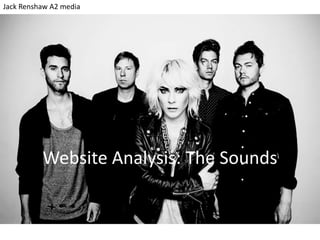
2. • Main image is of the artist for
star appeal. The photo is in
black and white which is a
convention of indie rock.
• Grey white and black colour
theme is continuity of the black
and white photo and also
represents the arty indie
genres.
• The parallel lines are used a lot
to match the whole website to
the artist.
• The bar at the top is for easy
access to the rest of the site.
• The layout is quite plain,
meaning that complete focus is
on the picture of the artist.
• Competition
• Everything on front page, including news and tour dates are to advertise the band and keep fans updated
• These are all stubs of the main pages found in the nav bar.
• Section on Twitter and on Flickr – for advertising and
audience benefits
• Multiple free downloads for advertising. This is relatively
unknown Swedish band after all.
3. • The picture at the top
remains, along with the
links to social media.
This means that visitors
to the site can share it’s
content with friends at
any time. The fact that
you can do this also
encourages you to do
this too. Being popular
on social media is
obviously a good way
to advertise of course.
• The news stubs on this site are more visually orientated. Unlike on other sites I have
researched, most of the stub on this site is made up of a picture. This is more visually
appealing and satisfying. It relies on the star image of the artists shown in the pictures or the
album art for the band’s new album to attract the viewer to the article. This would suggest
that these are tailored for fans of the artist as these are the people whom would be attracted
to such. This could also represent the artistic characteristic of indie genres.
4. • Each section has the
same kind of layout
with the main part
underneath the
picture of the band like
the home page. This
gives the site an
element of continuity
and reflects that all
focus is on the artist.
This is also an
advertising technique
as we are constantly
shown the same
branding and
trademark layout and
picture.
• The music page is once more quite visually orientated, for the same reasons as the news
page. It also gives a chance to show of album art and is perhaps best for people who listen to
songs on iPod etc. as they may relate a song to it’s art more than it’s name. Perhaps this
shows that the artist focuses almost completely on the music.
5. • You can see in this image that
the nav bar and the social
media links are all at the
bottom of each page as well
as at the top. This makes the
website easier to use and
means that visitors are more
likely to explore.
• There is a quick and easy link to all videos produced by the artist, despite the fact you can
find them in the music section. This just makes the site a little more user friendly.
• No other website I have looked at has had just one link to YouTube, a playlist. Most simply
embed each individual video. Whilst this technique doesn’t advertise each individual video as
the other format would, it does mean you are most likely to watch them all as they play
automatically one after another and you can easily scroll and browse through them.
6. • There are two sections of
photos; a stream of photos
showing the artist during
performance and then a
selection of choreographed
photos showing each of the
band members. The latter is
also available in the ‘Band’
section. The former section is
probably heavily promoted
as live performances are a
key part of the rock genre.
• There is an option to add
your own photos of The
Sounds to a Flickr group. This
is a personal quirk for fans
who have gone to a The
Sounds performance. It is an
active way to get fans
together to discuss the artist.
It may also persuade others
to go to gigs and get their
own pictures.
• There is little writing on this
page and the images form a
visually appealing pattern.
7. Live performances
are deemed
important enough by
the artist to have its
own section of
videos. This is a
convention of rock
and indie bands who
depend a lot on live
performances.
Videos and photos
have their own
media section. This
makes it a little
more organized
and encourages
viewers who look
at say, photos, to
view Live as well as
they are listed
under the same
category.
There are multiple
options for the
audience regarding
store. This means
viewers are more
likely to spend
money, especially as
many would feel
comfortable using
amazon.
This bar shows symbol-links
to just about every
social media site
imaginable. This suggests
that the artist is up to date
and ‘hip’. It puts them into
contact with the public on
many different levels and
means they are advertised
all over the web. They are
in blue to stand out.