
Recommended
More Related Content
What's hot
What's hot (20)
Viewers also liked
Similar to Magazine advert
Similar to Magazine advert (20)
Recently uploaded
Recently uploaded (20)
Magazine advert
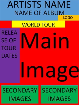
- 1. Main Image ARTISTS NAME LOGO WORLD TOUR SECONDARY IMAGES SECONDARY IMAGES NAME OF ALBUM RELEA SE OF TOUR DATES
- 2. MAIN IMAGE- This is the most important part of the magazine and it is what attracts the audience. I feel that the main image needs to act as the background for the whole of the magazine advert with all the other information overlapping on it. I want this image to link to the album cover and the music video as well so that it all connects and the audience will recognise it. This means I am thinking of having a very plain image of both of the dancers in a plain and dark background but the image still in colour. I think that this image can be an action shot from the music video or still image that they create in the routine they perform. ARTISTS NAME- This needs to be at the top of the magazine because it is one of the main things that the audience will recognise the poster for. It will immediately attract the artists fan base that already exists which will create more buyers for us. It is important that the audience are immediately aware of the artist so that they automatically know what the poster is for and the style and genre of the music. It will be in large bold text with san serif font. This will be in the same house style as the rest of the digipak we have created so that is connects and flows. NAME OF ALBUM- This needs to be at the top of the magazine advert so that the audience can immediately associate the advert with the album that is released. The typography will be the same house style as well so that it fits in with the rest of the advert and it represents the album and the fonts used on there. WORLD TOUR- This needs to be towards the top of the page so that the audience know what the advert is about to inform them. It will follow the same house style of the rest of the advert and digipak. It should be in bold and big so that is clear as it is important the audience understand what the advert is informing them. RELEASE OF TOUR DATES- This is the main bit of information that the advert needs to include as it informs the audience when they can attend the tour etc. I think that this should be going down the left hand side of the poster because this is where is it usually positioned on existing adverts. This typography needs to be smaller font size and I feel that a white colour would work because of the dark back ground and this still runs with the themes. LABELS LOGO- This will be at the top of the poster so that it is able to be seen. It is important that the label is recognised as they need to be as they have rights to the song. They will have their own house style and typography that will be unique to the label because it is different to the album. This is so that it also stands out. SECONDARY IMAGES- These images could be of the artist themselves so that they are recognised so that it is clear to the audience who the artist is if the name isn’t enough. It will show them that the artist is involved with the advert as well. These images can be in black and white so that it is different to the back ground image and this also connects with the house style because blacks and whites run throughout.