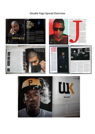
2. All of the following double page spreads are from the music magazine Vibe and so
they have been designed with the intention of attracting fans of R&B and Hip-Hop.
Through carrying out an investigation of them and by comparing them to each other,
it is possible to identify shared features within them and to establish repeated
patterns.
The five double page spreads cover all of the general conventions and layout of an
ordinary music magazine. We can see the main image along with smaller images and
text. We can also see the magazine logo and a couple of quotes on a couple of them.
We can also see a colour scheme to match the style of the magazine.
In addition to this, we see other repeated patterns. In all of the double page spreads
we can see one artist. Two of them make direct address towards the audience while
one is wearing sunglasses. Each of the artists also makes a different face expression.
This is the same in most music magazines to indicate the style and genre of the
magazine. It makes the artist stand out and draw in the audience.
All of the magazines have one main image located on one side of the double page
spread, along with a little detail about it on the same page. On one magazine
featuring the artist Drake, we can see the text starting on the same page of the main
image. This can be seen breaking a convention because none of the other double
page spreads follow this.
In terms of mise-en-scene we can see all of the artists wearing various different
clothes. One wears a cap while another one tries hiding his face. The artist could be
covering his face because he might have done something bad and rebellious. Once
again we can see that all of the artists have black hair, this can show that this is a
popular colour within this genre.
If the magazine logo is on a double page spread then it is likely to be on a plain white
background. This is because it is noticeable to see on the colour white. On about
three of the double page spreads we can see a quote located on the same page as
the main image. In two double page spreads we can see a smaller image of the artist.
This gives the audience a little bit more detail about the artist.
Having carried out this overview, it is obvious that Vibe has its own brand identity
and signature look that can be easily recognized by its target audience. This is
maintained through the repetition of stylistic and layout features from issue to issue
and is a wonderful way of helping the magazine to sell and succeed.