Influencing policy (training slides from Fast Track Impact)
Analysis on word
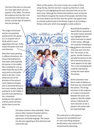
1. Often on film posters, the actor’s names are in order of fame
The font of the title is in the style along the top, like this one here. I would say that this is a bad
of a neon light which was very thing as it’s not highlighting the main characters that are on the
popular in the 1960s. This shows front cover. Although this attracts the audience more as they are
the audience that this film is set more likely to recognise the names of the people, therefore they
around these times which may are more likely to see the film. Also this poster may appeal more
attract a certain type of audience to a female audience due to the female singers so by including a
they are aiming at. famous male actor which may appeal to a male audience.
By putting the Academy
The images of the three Award Winner separate to
women are purposely the actors names along the
positioned for this poster top, highlights that the
as it is using the rule of actors have won an award
thirds which is more in their career, although
appealing to the eye. It also this could be misleading as
makes the poster look neat the audience may assume
and attractive. they have won it for this
film. The actress in the
With their hands pointing
poster, Jennifer Hudson is
in different directions, this
actually the woman on the
shows that leading lines
left of the three when her
have been used especially
name appears on the right.
the woman in the middle.
This is very misleading and
She is holding her arm up
could be improved by
which leads the eye to the
putting the name above
main point on the poster
the actress.
which is the title. It also
draws the eye to the
direction of the actress’s All the characters have
name, Beyonce Knowles direct mode of address as
who is extremely famous in they have eye contact with
the music industry. Also by the camera. This brings
putting her in the middle, it attraction to the audience
puts the main attention on as it makes a connection
her. It therefore between the actors and
familiarises the audience audience. Also the middle
and fans which will then actress is obviously the
attract them to see the main character as she is
film. placed in the centre with
her head held high.
The colour scheme is blue and white. These
colours often represent freedom which is
also shown in the characters facial The small print in a film poster is
expressions and body language. The colours necessary for accreditation but
are also very appealing as they stand out and it’s not a main thing someone
catches the eye. would read or even notice as it’s
not particularly interesting.
2. The image on this poster, of the two characters
is not so eye-catching. This is because there is There is no tagline for this poster even
no direct mode of address as they are looking though there is space for this in the top
away from the camera. This may be because the right corner. A tagline is often an
image has been selected from the actual film essential to a film poster as it acts as a
rather than specifically taken. Although images slogan which sells and promotes a
taken from the film can sometimes be appealing product.
as it is essentially giving the audience a snap
shot of what the film is about.
The way that this poster
has the actor’s names is
unusual for a film
poster as they are often
placed along the top
without the characters
The colours used in this name. Although they
poster appear very dark are still categorised in
but contrasted with the order of fame as Kirsten
image of the characters. Stewart is a well known
You can also tell that actress from Twilight so
the whole poster has the audience will
been edited so it is very recognise her therefore
high contrast. This is would want to go see
because it makes it the film. There is a
appear more old reason the names to be
fashioned and a photo put in this style, which
taken with an old is because Joan Jett and
camera. This links in Cherie Currie are
with the year that the former musicians which
film is set in which is the the film is about. For
70’s this poster, it is more
about the characters
they play rather than
the actors.
The small print in a film poster is necessary for The title is shown as if it has been stamped on
accreditation but it’s not a main thing someone the poster, especially as it is slightly tilted.
would read or even notice as it’s not This also links in with what the film is about as
particularly interesting and doesn’t promote a stamp used to be what was used for when
the film. Although in this poster, the titles are you enter a concert in the 70’s. This shows
too visible for something you can’t read as font that the title alone gives you a lot a
is too squashed together. information about what the film is about.
3. The fonts used are all different in every The images used for this aren't very
section of the poster, for example the quotes appealing as it is a drawing rather than an
at the top are completely different to the font actual photograph. However direct mode of
of the slogan. This makes the poster appear address is still used with the eye contact
untidy and not as appealing to look at. which draws the audience’s attention.
On top of the title HELP The slogan used for this
film “stop worrying!
there is four characters
stood on top of each HELP is on the way” is
letter. This tells you a appealing and
little bit about the film memorable as the title of
as it indicates that the film is in it. The
slogan then promotes
these characters are
the ones who “help” the film, therefore gets
people. people to see it.
Often in film posters, the small print appears
The colours used in this poster are very
as if it hasn’t had much thought put into the
bright and colourful with the yellows and
style of it as it is just about 3 lines across the
reds. This film is from 1965 when coloured
bottom. However on this poster, they have
picture first came about so by showing these
used different font sizes and positioning.
bright colours, it attracts the audiences eye
Although the audience often don’t read the
as films were still in black and white.
titles, they still look attractive, making the
However these colours wouldn’t necessarily
poster look tidy to the eye therefore more
be attractive now as it looks quite tacky and
appealing to look at.
untidy.