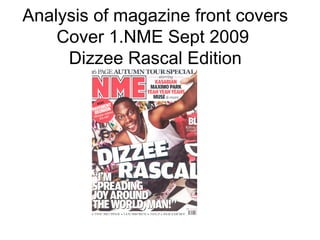
2. THE HEADER tells you the
THE MASTHEAD is the FRONT COVER ANALYSIS special features in this issue.
logo of ‘NME’ It is bright and
red making it eye catching THE SELL LINES/COVER
to the reader. The word LINES lets the reader know what
‘NME’ sounds like enemy other articles are in the
which signifies the magazine. If there is a cover line
magazine could be about on the cover of a magazine
rebels or rebelling. It is there must be a story inside that
placed in the top left corner is related to it.
of the front cover. It must be
at the top so readers can THE MAIN IMAGE is shot so it looks
notice it in the shop. like the artist is jumping out at the
reader. He has a big open grin smile
USE OF A FLASH offers some extra
on this face showing he is friendly and
information to the reader which they
happy, meaning the story inside is a
might not get anywhere else. T is red
positive story.
which is eye catching and sticks to the
colour theme of the magazine. It is THE MAIN COVER LINE lets the
placed behind Dizzee Rascals head reader know who he magazine is
which also makes the reader look there. featuring this issue. It is anchoring the
image which makes it obvious who the
BACKGROUND is in the image is.
style of graffiti. This is part of
the mise en scene. It
connotes that he is a rapper Barcode-date/issue/price are
and kind of a rebel. essential to a magazine.
Without the barcode in can not
USE OF A PULL QUOTE lets the be sold in shops. It is also a
reader know why Dizzee Rascal way of the magazine finding
is featured in the magazine. It is out how many sales it has
also like he is speaking to the made. The issue lets the
reader as it is a direct quote of reader know if they are up to
what he is saying. date with what they are
THE FOOTER tells the reader more readings. The price is
RULE OF THIRDS/THE LEFT THIRD is used as
names of bands or artists that are important because if you are
Dizzee Rascals head is positioned so the reader
featured in the magazine. This makes paying around £2 for a
looks directly at his face. It is in the left third. His
the reader want to buy the magazine if magazine you will expect to
arm is positioned so it looks like he is jumping out
he or she sees an artist they like. have at least 80 pages.
the shot.
3. TARGET AUDIENCE OF THIS MAGAZINE
Male: 66% METHODS USED TO ATTRACT
THIS TARGET AUDIENCE ARE:
To attract the male audience they
Female 34% have featured a male on the front
cover. The use of colour also
attracts males (red and black)
Median age: 23 and not females because if the
colours were based on a ‘female
Student 35% look’ there would be lots of pinks,
purples and light colours used.
This also attracts the female
ABC1: 61% audience as they might like
Dizzee Rascal. As there is only
text cover lines and not a lot of
Circulation: images used you can tell that this
magazine is for an older
23,924 sophisticated audience unlike a
magazine like ‘Top of the pops’
Readership: which uses a lot of flashers.
289,000
4. STRETCH AND CHALLENGE
ACTIVITY-
USE THE HYPERLINK FOR DIRECT ACCESS TO NME
http://www.nme.com/magazine
IPC Media publish NME. It
is the longest published
and most respected music
weekly in the world
It was the first British paper to include a
singles chart, in the 14 November 1952
edition. In the 1970s it became the best-
selling British music newspaper. During the
period 1972 to 1976 it was particularly
associated with gonzo journalism, then
The New Musical Express, popularly became closely associated with punk rock
known by the initialism NME, is a music through the writing of Tony Parsons and
publication in the United Kingdom, Julie Burchill.
published weekly since March 1952. It
started as a music newspaper, and
gradually moved toward a magazine The target audience is mostly aimed at males ages 23
format during the 1980s, changing from years old. They target people who like indie/rock music
newsprint in 1998. and enjoy going to concerts or festivals.
7. This masthead is placed in the top left
Front cover analysis 3 This magazine has used a type of
third of the magazine instead of going header. It is yellow so it stand out and is
across the top. This is because it is also also in the ‘handwriting’ font. The words
used as their logo which is recognisable ‘2011 renewed’ makes the reader think
by many people. It is in a red square they don’t know everything about
box, the red makes it stand out as there Coldplay and there could be more
is no other use of red ion the front ‘secrets’ to read about that they haven't
cover. Part of the main image is cleverly already came e across.
going through the masthead. This links
everything together and stops the The rule of thirds has been used as the
audiences eyes leading off page. main image is a long shot of the band
member doing a movement shot. His
The main cover line has been used to hand and body is placed In the centre of
make it look like a ‘handwriting’ effect. It the magazine but is right arm is shooting
says ‘By Chris Martin’ so this makes it out to the left side of the front cover. It
seem that Chris Martin has wrote this has been edited so it look like his arm is
cover line himself making the audience going through the letter ‘Q’ This makes
want to buy it. The word ‘Coldplay’ is the cover quirky and eye-catching.
underlined because it is the name of the
band. This makes it clear to the The cover lines have been placed on the
audience who the artist is and what right of the front cover. The main image
genre of music they are from. It placed is looking down at them suggesting he is
over the main image instead of under it reading them and he is also interested in
which reinforced the look that Chris the articles.
Martin wrote it.
The background of this front cover is
multi coloured glowing paint. This Is
The footer is used to give extra used because it relates to the Coldplay
information about what is inside the Tour theme. Throughout the tour they
magazine. The footer tells you what have had this theme featured on the
other artist are featured inside. This is stage, costumes and instruments they
used because if the audience see an have used making it recognisable to the
artist they like on the footer of the band Coldplay.
The barcode and date is placed in the bottom left corner. This is
magazine they will want to buy it
essential so people can but the magazine in the shop and keep up to
because they know it will have to feature
date with what magazine is what each month.
them.
9. The masthead is in big bold capital
Front cover analysis 2 A header ha been used on this
letters. Kanye West (The main images) is magazine to give ‘exclusive’ news.
covering some of the masthead, this The word exclusive has been put in
could mean it is recognisable easily. It is pint to stand out and the word
at the top of the magazine so when it is in ‘Notorious’ is in blue and in italics as it
the shops it is easy to see and the first is the name of a film.
place the audience looks is the top of the
magazine. The sell lines are very short and
snappy following the colours of pink,
The main cover line tells the audience black and blue. They tell the audience
who the main image is about. It is in what articles are going to inside the
capital letters and pink. Underneath this magazine.
is a quote from Kanye West saying ‘I AM
RAP’ this is in blue to make it stand out.
This main cover line gives the audience The rule of thirds has been used as
an indication of what genre this issue of Kanye West’s head is in the centre of
the magazine is about. the magazine and the cover line
placed around him. Making him the
The main image dominates the frame as main focus.
it is a Close Up of the rapper. He is
posing quite arrogantly which is a
stereotype of rappers. His clothing links in
with the colour scheme of the magazine The audience knows the genre of this
so it fit quite well together and looks or artist as a ‘rap’ institution has been
professional. Hi head overlap the used at the bottom.
masthead. The masthead is an important
part of the magazine so this could The background used is plain which
connote that he is better and bigger than also suggests that the target audience
anyone else. are ‘cool’ and laid back. There has
been editing done on the main image
The colour scheme or house style is the giving Kanye West a glow or shadow
same throughout the magazine. It behind him making him look bigger
consists of three different colours; Pink, and stronger.
Blue and black. This signifies that the
target audience is quite sophisticated as
there is only one image used and few
colours.
11. The Masthead stands out and is placed Front cover analysis
behind Katy Perry’s head making you look
directly at the Masthead. It is in black bold The date is essential on a magazine as
letters to stand out from the pink it lets the audience know what issue
background. The different colours in the they re buying and if they are up to
centre of ‘a’ and ‘d’ recognisable as date. The date on this magazine is at
Billboard and is like this throughout each the right under the masthead.
magazine.
The rule of thirds is used on this front
Cover lines emphasise what is inside the cover. As you can see Katy Perry’s
magazine and gives a brief detail about head is central and to the top. If the
what articles there are. There are also black lines were drawn on her head would be
and in a bold font. The use of Yellow on in the middle box at the top. Her body is
some of the text makes the target audience slightly to the right. This is used so the
know that this part is important. cover lines and go onto the left of the
magazine. Using cover lines on the left
The background of this magazine is pink. side of the magazine is popular as
This lets the audience know that the artist when the audiences reads their eyes
featured in this issue is female and shows read from left to right automatically.
the genre of music Katy Perry is featured in
which is pop. This does not mean only The use of a flasher makes the
females would buy this issue as males also audience feel as they are being given
like Katy Perry and would not be put off the extra information inside the magazine
colour chosen. that they could not get any where else.
It is an orange circle with writing inside.
The main cover line tells the audience who They have used orange here because
the artist is as it anchors the main image. It it will stand out as they haven't used
also gives an insight on what the article, orange anywhere else. It is featured on
usually a double page spread is going to be the right as everything else is on the
about in a smaller font. left.
Under the bigger font of ‘Katy Perry’ It says
‘Inside the court of the new queen of is essential on magazines as it can not be sold in shops if it does not have one. On
The barcode pop’
indicating to the audience the genre her barcode does not seem to be on the front but they can often be found on the
this magazine the
music is. back as well.
The main image is a medium shot. It is layered on top of the text and background to make it
standout. Katy Perry is wearing/holding flowers as this is a July issue of the magazine and the