Similar to Looking back at your preliminary task (the school magazine), what do you feel you have learnt in the progression from it to the full product?
Similar to Looking back at your preliminary task (the school magazine), what do you feel you have learnt in the progression from it to the full product? (20)
Looking back at your preliminary task (the school magazine), what do you feel you have learnt in the progression from it to the full product?
1. Looking back at your preliminary task (the school magazine), what do you feel you have learnt in the progression from it to the full product?
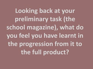
2. Here are the two designs of the school magazines that I produced. As shown you can tell that from the first design I haven’t gone far with using Photoshop and by the second design my use and confidence of Photoshop has improved slightly. I was coming up with more ideas however I still used some of my ideas from the first design and adapted them into the second cover. I wasn’t confident on the software nor was I coming up with imaginative ideas. The ideas were simple and I wasn’t experimenting with Photoshop as much as I think I could have done. I still used the use of layering and moving text closer and larger. I also used the fading tools which made blocks of colour more transparent.
3. The second cover (on the left) is much more improved then the one on the right. This is because I began experimenting with the options that Photoshop can offer and do. I also used an image that was larger on the page as it was more zoomed in. There is also more going on, with more cover lines and colours being used. Throughout my year at Chosen Hill studying media I have come up with more ideas to use on the covers as well as get more knowledge and confidence on Photoshop.
4. On the school magazine I was using simple colours and wasn’t experimenting with ways to express the text that I have on the front cover. For example on the contents page I wasn’t using any exciting ways to project my contents page in order for it to look fashionable and stand out. Compared to my final magazine I was using a block of colour to make the text stand out. I used tacky colours which don’t go together and the colours aren’t very bold. My target audience was sixth form and this didn’t portray its audience. However I did keep the green colour of the contents page text linked to the school magazine front cover. However on my music magazine I kept the colour scheme linked throughout the whole three designs using the pinks, blacks and whites. These colours work together and make the each colour stand out onto of other colours. The colours work together much clearer then the colours on my school magazines, so this is another plus that I have learnt throughout the last six or seven months. The colours I also feel attract my audience as they will stand out and hopefully catch their eyes. Considering my audience for my school magazine was 16-18 year olds and that clashes with my target audience for my music magazine, the school magazine doesn’t feel like it attracts that age group.
5. On my school magazine my front covers were very bare, the one on the left is evidence that I wasn’t sure what I was to include on the front cover after looking at other magazines I began to have more confidence on what to include. By the second school magazine cover I have added a few more cover lines. In my opinion they would fail as a school magazine as normally they have to be very ‘informative’ with many highlights at Chosen Hill School. Comparing to the first school magazine designs my language and content has improved a lot on my front covers, on the school magazine my cover lines were in great depth and this will have made the readers get bored as the cover is full of text. By the second cover I began to shorten my cover lines and by the music magazine my cover lines are much more complex and to the point. The cover lines need to be catchy and stand out to users. For example on the school magazines my cover lines were: “the new sixth formers, the gossip, the news, and the people who did worst and best.” By the music magazines my covers lines were much smaller and to the point such as “LADY GAGA BACK IN BLACK” and then below that in much smaller text is a bit more information that readers can read if they want. This makes it easier for readers to read the catchy blunt cover lines without having to read all the information round it.
6. Compared to the images I took last September, my work has progressed a fair amount, my school magazine photos are simple and taken at school however this was the theme. By the time of the photo shoot taking images of Emily and Mason my skills have improved as I improvised with outfits and taking pictures with a specific background. On the front cover of the school magazines I was taking images in front of a wall bricked background, this meant that I had to keep the image straight as the bricks had to be straight and in line on the front cover. I kept the images basic and simple and I took them quickly and I didn’t think about what I was capturing or how I was. If I was to take the same images now I would use a tripod as I did when I took the photos for the music magazine. For the music magazine I also had more of an idea what I wanted to take pictures of as I had a specific audience. I chose the outfit and style and theme for the magazine. I also considered the light for the photo shoot as well. I got my models more prepared and also took a lot more pictures. I needed to have my pictures looking perfect as they needed to be emphasised into the magazine front cover and also be used on the double page spread and contents page so I considered this and made sure I took many more images. On the school magazine I was taking pictures of the two students and didn’t take into consideration the background and how many I was taking. I also didn’t think about the facial expressions either.