3. I feel that I have greatly improved
from my preliminary task as my final
piece looks far more professional.
To create my final music magazine
front cover, I made a number of drafts
in order to get feedback on them to
therefore improve on my next draft.
However, I did not get this chance
and opportunity for my preliminary
task.
5. Some of the things I learnt during the process were:
• Make sure the masthead is the biggest text to see as it is the
first thing the reader sees to it needs to be eye catching.
• Make sure you make a use of colour, for instance, put
specific or the most important text in a more alerting and
eye catching colour to help it stand out.
• Stick to a colour scheme so there is not loads of colours
filling the front cover, as this will cause troubles for the
reader to read.
• Make sure there is plenty of elements for the reader to see
or read otherwise it will come across as very boring.
• Make sure you include sell lines and bursts that are suitable
for the right target audience, for instance, advertisements
for festivals and concerts go down well for the younger
audience as it is what’s most suitable for that target
audience.
6. Overall, I feel that I have made huge progress from my
preliminary task as my music magazine looks a lot more stylish
and professional. However, I have not kept any conventions the
same. This is because my school magazine needed to look more
sophisticated and formal rather than stylish. The main element
that makes the two magazines very different to each other is the
font used. The font I used for the short snippets and sell lines on
my school magazine is a very formal font that makes the
magazine seem more sophisticated and may come across a bit
boring. However, I changed the font for my music magazine to
something that is a lot more livelier. I also feel that the font I
have used for my indie rock music magazine is more aimed at the
younger audience, whereas, the font on my school magazine is a
bit too formal for the kids at the school and would be more
suited for the parents.
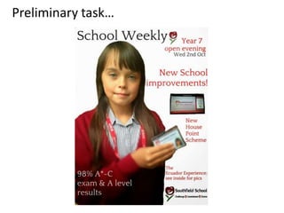
7. Another convention that I have changed is the main image on the front cover.
For my preliminary task, I have used a mid shot image of a school girl who’s
smiling, the smile connotes happy feelings and creates a lively atmosphere.
The school magazine front cover image would also attract a very young
audience, it would be mainly kids who are at school wanting to read the
school weekly magazine. However, on my final draft for my music magazine I
have used an almost full length shot of the model who is looking down with
most of her face covered by her hair. This is more aimed at teenagers and
young adults as it creates a relaxed and calm mood. Also the image could
relate to some of the readers which would influence in to them buying it. The
image on my indie rock music magazine is also very dark and unusual for a
magazine front cover, however, this relates to the music genre as it is very
independent. On the other hand, the dark image and use of black and white
enabled me to use a brighter and more alerting font colour for the sell
lines, bursts and short snippets etc.. To make them stand out catch the readers
eye. The standing out of certain texts is what I feel my school magazine is
lacking in.
On the whole, I feel that the drafts for my music magazine helped me make a
use of the main image in order to discover what colour I should use for the
text that would benefit my target audience. Comparing the main image on my
music magazine to the one on my school magazine shows how much I have
progressed and it has made me realise that you have to consider other things
like the colour of the font before choosing the right image.