The document summarizes the student's process of creating a school magazine as a media product. Some key points:
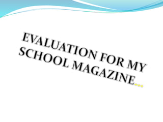
- The magazine includes conventions of real magazines like mastheads and cover lines, but not things like barcodes and prices since it's a school magazine not produced for profit.
- The content and images are tailored to the target audience of students aged 11-16, including topics related to school life.
- Distribution would be within the school to students, teachers, and parents through students.
- Creating a questionnaire helped identify what the target audience wanted to see.
- Learning experiences included using InDesign software, improving image selection, and realizing multiple fonts are typically used.
My media product uses conventions of real magazines
1.
2. In what ways does your media product use, develop or
challenge forms and conventions of real media products?
My media product contains certain conventions of
real media products such as the mast head, cover
lines, images, pugs and even a strap line. However it
does not contain certain conventions like the bar
code and price. This is because I felt using these
conventions would be inappropriate as school
magazines are never usually priced or produced as a
means for profit but are made to benefit and
support their target audience. Also as it would not
be purchased by retailers to then sell in their stores
it would not need to contain a bar code to identify
the item. Like other real media magazines I have
adapted my magazine to its genre and made it
suitable for my target audience. I have also tried to
include reader interest in my magazine for the
audience it is aimed at, a key ingredient in
magazines because if the magazine is not
interesting the reader will not be attracted and
therefore will not buy. Throughout the magazine I
have tried to stick with the house colours (colour
scheme) by using the same colours on both my
contents page and front cover. Another convention I
did not include on my front cover is the date,
however I did not do this by intentionally (like I did
with the bar code and price), I forgot to put the date
on, a mistake I will not make with my music
magazine.
Main article-
Similar fonts
causes the
magazine to look
more like a
contents page.
Although this
says the school
motto “Learn
to love and love
to learn you are
unable to see it
properly due to
the colour.
Mast head
Strapline
Pug
As you can see there is
a continuity of the
colour scheme
throughout the
contents page and
front cover.
3. My media product represents the social group of young students. To adapt my magazine to its
audience I had to be careful about the content it contained. Also due to it being a school
magazine the topics it contained had to be school related or contain a form of support for the
students for example “the agony aunt” which is basically a page where students are able to seek
advice for any problems they have in school. Another way I have adapted my product to its
audience is by selecting appropriate images to suit the genre of the magazine. As it is a school
magazine I used mainly students as they are at the top of the hierarchy above staff, governors
and parents. All my photography was original. Also I felt using images of people like them
would be a form of attraction as it is showing that the magazine is for people like them making
it more personal. I tried my utmost to make the articles within the magazine of student interest
by applying cover lines I thought could help within the life of the students and including things
I believe would help in my student life. Again the agony aunt allows the magazine producer to
build a relation ship with its audience and makes the magazine more personal as students are
able to write in and explain their problems or even relate to another persons problem. Usually
young people are quite competitive and competitions are a way of attracting young children to
the magazine therefore I included a pug which had a competition on it which I felt was another
way of attracting the audience. Finally although there is not a lot of content towards the older
target audience, personally I felt getting the main target audience interested was the main
objective as school governors, parents and staff main interest is basically knowing what is
going on at school which they can see within the magazine from things like exam revision times
and projects like the Comenius project.
How does your media product represent
particular social groups?
4. What kind of media institution might
distribute your media product and why?
My product would be distributed on school grounds by staff, students and
teachers. Parents would receive the magazine through the students who would
usually take the magazines home allowing the parents to read them. Due to it
being distributed on school grounds it may be difficult for the governors to get
hold of the magazine however this could be done through the head teacher who
could give copies of the magazine to school governors.
5. Who would be the audience for your
media product?
The main target market for my media product is young students aged 11-16 . However for
the older target audience it would vary as parents, school governors and staff would be a
secondary target audience. The pupils would come in to the E category on the social
demographic scale, the parents could be anything from C1 to A As a result of this the
topics would be related to the younger target market although it would contain some
content for the older target audience. As you can see although my magazine had a wide
range of target audience I targeted it mainly at the students as I felt this could build a
relation ship between the audiences. Also the magazine contains things about school
and things that are going on in school which parents governors and staff would like to
be aware of.
6. On my front cover the main images used are images of the students. By making the
magazine colourful, bold with a interesting layout I tried to attract the audience by
making it eye catching. Also I thought by using images of mainly students
emphasised their importance. This meant that if the students were happy so would
the older target audience (staff, governors and parents). Before constructing the
magazine I created a questionnaire to see what my target audience wanted
increasing the popularity of the magazine. Having received the result of my
questionnaire I created a basic flat trying to include everything my target audience
had asked for. Once I had created the flat plan I began to construct my magazine on
InDesign. During construction I had to make a few changes to improve the quality of
my magazine and make it look more effective, for example on my flat plan I had
said I was going to use a number of images, however I had to decrease the amount of
images due to a lack of space. Although I could have decreased the size of the images
instead, I felt it caused them to become unclear also too many images caused my
magazine to look overcrowded. Another thing I changed was the type of images I
used, on my flat plan I had decided to used a variety of shots due to the feed back I
got from my questionnaire, however I felt that mid shots looked the most effective
therefore used mainly mid shots with a minority of other shots. On the front page I
have used only mid shots. To see if I had made the correct decision I asked a few of
my peers for their opinions and they agreed with me. On my flat plan I had decided
not to write the colour of my background as I wanted to experiment with different
types of backgrounds once I had constructed my Magazine. After testing a few
How did you attract/address your audience?
7. colours I settled for black as I felt the font and images I used stood out well on a
black background. Unfortunately once I had constructed my magazine I was unable
to apply a back ground as I had not placed layers for my objects, as a result of this I
had to start again. However I think this was good as I it has taught me not to make
the same mistake with the music magazine (my main task). Looking at my finished
product I can see that I have only used one type of font, on my music magazine I will
use more then one type of font as I have just realised that on other magazines more
than one font is used.
As you can see here
I was going to use
six images however
I used only three
due to a lack of
space. Also I was
going to use
different types of
images but ended
up only using mid
shots.
8. What have you learnt about technologies
from the process of constructing this
product?
Throughout the process of constructing my magazine I have come across a new form
of software which I have not previously used. This soft ware is called in design. I feel
I am now confident to use this software for my main task (the music magazine) and
any queries I had about it have gone away therefore I am confident and now looking
forward to constructing my music magazine. My knowledge of other programmes
such as Photoshop has also been expanded as I did not know how to use it properly
before and throughout this process I feel I have become an expert at editing photos
and using tools such as the magic wand tool .Other programmes I was unaware of
and had not come across before are blogger and slide share; With blogger I have
learnt how to upload pictures, embed videos etc. ; and with slide share I am able to
upload power points on to my blog.