꧁❤ Aerocity Call Girls Service Aerocity Delhi ❤꧂ 9999965857 ☎️ Hard And Sexy ...
Question 7
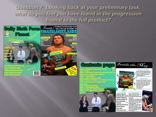
1.
2. Progression of the covers
In the pre-lim task magazine my cover lacked a sense of style it’s a green colour that
doesn't really make it stand out and is not a colour a normal magazine would use
because it is not a very nice colour. The text does not seem to catch the eye of the target
audience because of the style of it and the size of text was not big enough and plus it
was yellow, which is not a colour writing should be in because it makes it hard to read.
Since the pre-lim task I have developed my headline by using colours that are best
suited with the background photograph, I have also ensured that the colour of the title
fits in with the pop genre. If I were to improve the pre-lim task I would use more
graphics to make the text stand out, I would also change the colours I have used. Also I
would make sure there was more sophisticated words in it due to the target audience
being 16-18 year olds. I feel that I have made a massive progression since the Pre-lim
task because in the finished music magazine I have used more graphics to make the
text stand out against the cover photograph. I have also made the colour of the
finished music magazine bright colours which fits in with my genre, which is also
colours that my target audience (teenage girls aged 10 – 16) like. I have also made sure
that I have used a couple of pictures on the front because pop music magazines tend to
have more photos on. This is so that it is not to wordy because of the target audience
being 10-16 year olds. In my finished music magazine I have made sure I used
language that my target audience understands which is basic and simple.
3. Progression of the contents
Since the pre-lim task I have used columns in order to have structure. I used columns
because it breaks up the text so that it is not just one block of writing. I also did it this
way because it looks neater and it enables me to write more on the page. Where as in
my Pre-lim task it just has a block of writing that was no more than 60 words which is
not very effective, because all that it tells you is what is on the pages. It doesn’t even
tell you a bit about the pages its just blunt and not very detailed. The colour of the text
in the pre-lim task is again yellow which is not an effective colour to use as it is hard
to read unless you have it in big writing which is what I did. Whereas in my finished
music magazine contents page I have used black writing which stands out against the
white background and the text is an reasonable size which enables me to write more.
On my finished contents page I have used 3 pictures which makes the page look
fuller. I inserted a picture of the front cover to show people what pages the stories are
going to be on. I also showed a glimpse of the poster in the magazine to make the
reader want to carry on reading. However on my Pre-lim task contents page I used
one picture which was the same one I used for the front cover. This was not good due
to the fact I had already used that picture and a magazine needs different photos not
the same ones. On both magazines I have stuck to the same colour scheme as the front
cover as it needs to be consistent.