1. Images
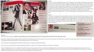
There are around ten images featured on this ‘Q’ magazine’s content page, including a thumbnail of the
front cover. They all range from small to a large main image, this is also happens to be the main story on
the front cover. There is also a number of different shots that have been used: close-up, mid-shot, long
shot. Some are studio shots and one is a location shot, the location shot is a band actually performing
on stage. Almost all the images are boxed, even if they are overlapping; however there is only one
image that is not boxed and has been cut out, this is the image on the page 34. One or two images have
text that supports them, and some of the others do have text that supports them however this
information has been displayed under one of the subheading that run along either side of the contents
page.
Layout
The layout of this page has been presented as extremely neat, tidy and everything is organised so that it
can be seen or found easily. The subheadings of: regulars, special, features and review make everything
organised and makes it easy to navigate around the page. Attention is immediately directed towards the
main image as it is clearly the biggest and also the page number next the image is bold and much bigger
than the others. As the page is so uniform, it then makes it easy to see where you ca fine the main story
inside the magazine.
Sections
The sections that are used are: regulars, special, features and a review heading. There are four sections with around three to five articles per section.
Each article is layed out with the page number to the left, then the heading; all this is in the same size, font, and is all in capitals. Then below that is a sentence summing up the article in a smaller, lower case font.
The heading is black and bold however the subheading is grey and is not as prominent.
The cover stories are identified within the features however there is nothing that really indicates these.
There is no use of social media of this contents page however there is a website and a subscribers address at the bottom of the page.
There is the header of ‘Contents’ in a bright red box with the name of the magazine and the issue number also highlighted, there is also the footer of a slick black line and the page numbers, the name of the
magazine and web addresses. The main colours used are red, black and white, these are used as a colour scheme and have also been used on the front cover. I would also like to point out that there is a minimal
number of font that have been used, this makes the contents page look neat and professional.
2. Images
There are only six images on this contents page, there is two larger ones with for smaller ones. These
range from