
Recommended
More Related Content
What's hot
What's hot (20)
Viewers also liked
Viewers also liked (6)
Similar to Researching student work
Similar to Researching student work (20)
Recently uploaded
Recently uploaded (20)
Researching student work
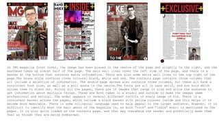
- 1. On IMG magazine front cover, the image has been placed in the centre of the page and slightly to the right, and the masthead takes up almost half of the page. The main sell lines cover the left side of the page, and there is a banner at the bottom that contains extra information. There are also some extra sell lines to the top right of the page.The house style contains three colours: black, white and red. The contents page contains three columns that all include a selection of information. The double page spread also contains three columns, but these all have a consistent font size, as well as a pull quote in the centre.The fonts are all in sans serif, and are bold which allows them to stand out. Across all the pages, there are 10 images that range in size and allow the audience to get information about multiple things. These are both taken in a studio and outside to make the images seem professional and natural. The model appears in several different outfits of every image of him. There is a consistent banner across the pages, which include a black banner with yellow crosses inside and this helps it to become more memorable. There is some colloquial language used to help appeal to the target audience. However, it is difficult to identify what the main genre of the magazine is, as both “rock” and “indie” music is mentioned on the pages. It is also quite loaded on the contents page, and that may overwhelm the reader and potentially make them feel as though they are being bombarded.
- 2. The front cover consists of 3 main colours: Yellow, red and white, and these are used throughout the entire magazine pages. The main image has been placed in the center, and parts of it overlap the masthead of the front cover. There are a total of 6 images across the pages; the most being on the contents page. The masthead from the cover has also been used on the contents page to remind the audience what they are viewing, and they both use the exact same font. Across the cover, the language used is quite simple and does not use any loaded language that may give key information away. This entices the reader to want to read the entire magazine as there would be no point in sales if all the details of articles were displayed on the cover. The model for the cover has also been used for the double page spread, and he is wearing the same outfit and holding the same props on them both. However, the guitar prop and the leather jacket help to emphasise the genre of the magazine, as it gives off a masculine sense and a rock and roll demeanor. Both images appear to have been taken in a studio, whereas the images from the contents page seem as though they have been taken outside a studio.
- 3. The front cover of this magazine is comprised of four colours: red,grey,white and black, and these are maintained throughout all the pages. The masthead has been brought behind the main image, which may be a problem as it becomes difficult to see the magazine’s actual name. The image is surrounded by sell lines and the main sell line, which is much larger than the rest of the text. The model from the front cover of the magazine has been used across all the pages, and there is a total of 8 images used. They are all in black and white except a mid long shot of the model which is on the contents page. Also, the model wears different costumes for each image, which adds variety. The fonts are all in sans serif and appear bold, but the main sell line contains a font which appears edgy and this adds to the rock genre stereotypes.