1. How effective is the combination of your main product and ancillary
texts?
In all 3 of my media products I have used the same fonts, colors, type of imagery and
styles. The images used throughout my ancillary products and in the music video
show the same clothing on the performers, the same performers and the same
setting. This makes the products easily recognizable to an audience as the same
product and band rather than any confusion being caused. I found in my product
research that this is something that was quite frequent throughout real media
products, making it easy for the audience to recognize something as the same
product. On my digipak product I decided not to use an image of the band
themselves, this is because I found out in my product research that indie rock artist
didn’t tend to use a direct image of the band but instead tend to use something quite
conceptual and mysterious, relating to the genre. I used an image of the woods in the
location where we filmed our music video and I put the image on photo shop and
used both the color balance and the contrast tools to edit the image. I decided to edit
the image to a red color, connoting with danger which again may relate to the genre.
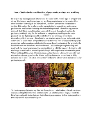
When looking at the cover, it looks unique and mysterious which will hopefully pull
the audience in and question the album, making them want to purchase it. This
reminds me of how I felt when I looked at ‘The Killer’s’ album which I analyzed in my
product research:
To create synergy between my final ancillary pieces, I tried to keep the color scheme
similar and kept the same font and text style. On all of my inside pages, I created a
little logo and put it in the bottom right of each page, making it clear to the audience
that they are all from the same place.
2. We produced a performance video for our final piece which we explored as a group
and found that this was quite frequent for music videos within the indie rock genre. I
did find that it was quite difficult to create synergy between the music video and the
ancillary products; this is because it isn’t really a convention of any music video to
use text and colors to create this synergy. Instead, we tried to create the synergy in
the imagery and iconography of the music video.