
Recommended
More Related Content
What's hot
What's hot (16)
Similar to creating digipak
Similar to creating digipak (20)
More from caitlinharrington1
More from caitlinharrington1 (19)
Recently uploaded
Recently uploaded (20)
creating digipak
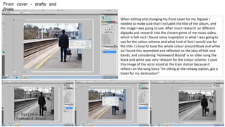
- 1. When editing and changing my front cover for my Digipak I needed to make sure that I included the title of the album, and the image I was going to use. After much research on different digipaks and research into the chosen genre of my music video, which is folk rock I found some inspiration in what I was going to use for the colour scheme and what kind of font I would use for the title. I chose to base the whole colour around black and white as I found this resembled and reflected on the idea of folk rock bands, and considering ‘Homeward Bound’ is an older song the black and white was very relevant for the colour scheme. I used this image of the actor stood at the train station because it reflects on the song lyrics “Im sitting at the railway station, got a ticket for my destination”. Front cover – drafts and finals
- 2. These two images are taken from my first draft of the back cover. I used an image of a map to reflect on the idea of the music video; homeward bound, and how he is always travelling and on a journey. I changed it to black and white to fit into the colour scheme. I used various editing tools to create this. The tools I used to create the draft and the final draft were things like changing the brightness and contrast, hue and saturation, curves, levels, and enhancing the colours and black and white areas. I found the barcode on the internet and saved the image I wanted to use by importing the images. I created my logo of ‘HME’ standing for Harrington Music Entertainment, and by creating this I am able to use it on other parts of the digipak. I am happy with the two outcomes and I will see from my survey I will ask to people Which draft they prefer. This way I will get a better understanding of which one to use for my final one. I think both reflect well on the music video and the actual album.
- 3. Spine – draft and final When editing my spine I needed to make sure that the sizing were correct and I was able to fit everything on that I needed to. To create the spine I needed to make sure that I could include things like; the name of the album (which was Homeward Bound), the artist (which is Harrison – but real artist of the song is Simon and Garfunkel), and the distributors logo. I made sure that after I had the correct sizing's I made the background colour of the spine and grey colour – due to the colour scheme, as everything needs to fit well together. I started in my first draft as using a darker grey colour, but then reflecting on my front and back cover I decided to change it to a lighter grey colour – by doing this I think that the album overall will no look as sinister as it would if it were to be dark grey/almost black. Because I have already made the distributor logo (HME – which stands for ‘Harrington Music Entertainment’) which I made up, I could easily move it over to the spine template to create the draft and the final spine. I needed to make sure that the main focus on the spine was the name of the album, which is Homeward Bound, and the artist name, considering he is the one acting and miming in it. Although the two drafts of my spines are very similar I think I am happy with the style, font, colour scheme and sizing’s chosen.
- 4. Front Cover – Option 1
- 5. Front Cover – Option 2
- 6. Back Cover – Option 1
- 7. Back Cover – Option 2
- 8. Spine – Draft and final Option 1 Option 2
- 9. Inside – Page 1
- 10. Inside – Page 2
- 11. Inside – Page 3 ©2015 Harrington Music Entertainments Inc. “MusicMania” is the exclusive trademark of Distribution Harrington Music
- 12. Finished Digipak Layout Inside Left Inside Centre Left