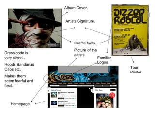
1. Homepage. Album Cover. Tour Poster. Graffiti fonts. Picture of the artists. Dress code is very street . Hoods Bandanas Caps etc. Makes them seem fearful and feral. Familiar Logos. Artists Signature.
2. Professor Green. EP Cover. Photo shoot. Album Cover. Tattoo’s on show constantly. Tattoo acts as a logo, Prof. Green is recognised by this symbol. Artists name. The use of the colour green, matches the artists name. Artist is in no way ‘flashy’. In fact, he looks rather ordinary.
3.
4. Graffiti font- usually used in the genre Basic- artist chose to be very basic at times Not a very good choice because it is too long and does not look at all good almost like its amateur but runs the conventions of the genre professor green is in. Interesting- font is different and could have good potential for a good logo Bold- lets people know who it is Good logo because it is different an could be a very recognisable logo. Graffiti- again a usual type of font used within his genre Basic- artist is seen as sometimes basic Bold- people can see who it is clearly This is a good logo as it gives it the bold and basic look while having the graffiti and street feel about it. The colour scheme i will probably use for the logo is green and red. I would have the professor green and it is his name and would be a good way to represent him. I would have the word green in red as it is his clashing colour suggesting that he just isn’t like any other rapper/mc he is different.