
Recommended
More Related Content
What's hot
What's hot (20)
Similar to Contents Page
Similar to Contents Page (20)
Recently uploaded
Recently uploaded (20)
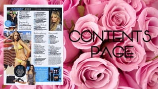
Contents Page
- 2. Masthead: The masthead featured on the contents page is quite small compared to the issue date of the magazine ‘January 2010’, this shows individuality as it contrasts to other stereotypical fashion and beauty magazines. Which makes it more attractive to the public to buy due to their individuality. However, the masthead is featured in a website link, therefore leading readers to the website, as well as being a masthead on the contents page. Although the masthead is printed in a small sans-serif font, it is more visible to the eye due to the fact it is in capitals, therefore it is more attractive and eye-catching to the reader/target audience. However, a downfall of having the masthead printed in a small font is that it isn’t really visible if someone was flicking through the magazine, so they may not be sure where the contents page is.
- 3. Main image: The main image used for this magazine shows the whole of her outfit in a medium long shot photographed from straight on; this means that they want you to purchase the outfit and possibly gain inspiration from it, as they are promoting a clothes company. Also, the main image is trying to connote the summer theme to the magazine, emphasising the season, helping the readers enter summer with the latest trends, tips, and styles. Also, using a yellow bikini expresses the summer theme in which they are trying to portray, it also can be linked to happiness which many people feel in summer. The background which is featured in this shot connotes summer very well, as the background shown is on a beach, looking like a seaside resort/old town etc. Also, the way the model is composed is very dramatic but relaxed, emphasising that you should feel chilled out in summer, as it is a time for relaxation. The female gaze is applicable to this image as women may aspire to have her figure or get the perfect bikini body. However, this is majorly frowned upon in the print industry, as editors are supposedly photographing non-realistic body images of women.
- 4. Plug: The plug featured in this magazine is there to entice readers/the target audience to quickly flick the pages to page 192 to get the juicy insider featured in the magazine. This kind of feature on a contents page is very effective within these kinds of products as it stands out to the audience, catching their attention, pushing them to read the magazine. Also, it adds the idea that there is a lot of information within the product. The word used ‘Shh!’, emphasises the secrecy of the article/feature, which could potentially make the target audience feel more involved with the magazine and the ‘secret’ involved. The word ‘Now’, emphasises the direct message to the reader that they need to go to the page immediately, that the ‘secret’ is crucial information. Using a black circle background for the plug makes the typography featured stand out more to the reader, as it is in white capitals in a sans serif font, which also makes the message seem more direct to the target audience. Also, using a serif font for the word ‘Shh!’ makes the magazine have a more girly/feminine feel to it, also linking to the stereotypical view that women gossip a lot.
- 5. Typography: The mixture of sans-serif and serif fonts across the contents page, expresses individuality, emphasising that the magazine is aimed at a young (18-25) audience, as this is stereotypically the ages in which young women find their identity and bloom into their individual self, experimenting with their styles/looks etc. The use of serif font for the sub-headings ‘Love, sex & destiny special’, ‘Fashion & beauty’, ‘Freebies’ and others, links to the femininity of the magazine. It also creates a girly feel, as this is typical within gender norms for women’s handwriting to be like the sub-headings printed on the contents page. The use of bold font for the features, for example “Hollywood’s biggest bitches”, draws the attention of the target audience if they were flicking through the product. Alliteration is also used in this heading with ‘biggest bitches’, which has a hook to it, meaning that the reader is more likely to read the article. Also, by using colloquial language ‘bitches’, this connotes that the magazine/brand is aiming their product at a specific demographic/target audience. Also, all the topics featured in the magazine are all that would stereotypically apply to young women and what they would have an interest in possibly; for example: “Confessions”, “Get your kink on tonight”, and “How does a celeb look stand up in real life?”
- 6. Colour Palette: The colour palette featured on the contents page of the magazine goes against conventions and gender norms; this is due to the continuous use of blue, which is stereotypically the main colour linked to males. However, it is also quite a summery colour which goes against the conventions of the particular issue, as blue skies and the ocean connote summer. Whereas, this issue is in January 2010; however, light blue is quite a cool colour which connotes winter and the weather conditions of January. The black background against the date and the masthead at the top of the contents page adds more of an eye-catching effect to the page as it pops out to the reader, emphasising it’s importance. The white background of the page links to the month of the issue also, as it is usually the time of year which snow falls. However, a fault I have found on this contents page is that the page numbers in the bottom left corner ‘50’ and ‘48’ are not very visible; this is because they are in bold and white, against a white background which I feel is a bit too much of a clash. Therefore, I will make sure to not use this feature in my magazine when in the production stages.