2. Unit 14: Digital Magazine Production
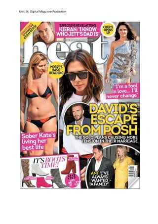
Heat magazine frontcover- print
This magazine is a celebrity magazine which is dated 13th- 19th October 2018. This provides
evidence to the audience that the magazine produces’ weekly. This gives more
opportunities for the company as the target audience will then know when the new issue
will be available to purchase and this will then help with marketing and sales. Also, the date
could be also seen as advertisement. This is because they are advertising when the dates
are so the following date after is for the next issue. If the company didn’t do this, they
would have questionable customers and may struggle to find out when the next issue is. A
weekly magazine for celebrity gossip/news is a good timeframe because there are that
many celebs that there is more news every day which is updating by time. This gives much
more opportunities to the company by bringing them in weekly for more pages. Therefore,
being weekly you will have more stories to tell where as a daily magazine may struggle for
stories which is limiting the companies’ potential.
The images which are included, show popular celebs; Cheryl Cole, David Beckham and Ant
Mcpartlin. However, also include things such as fashion previews for pages ahead. The front
cover of this company is very full and busy. Which may suggest that the person to read this
magazine, is a busy person or is messy. You may find that most celebrity magazine have a
busy image setup which attracts the eye to buy the magazine as it is a preview of the stories
to come throughout the upcoming pages. However, it may also be to draw the reader in at
the most interesting stories which will help with sales. The images have a large spectrum of
variation. They range in small and large which help with the importance of the subject.
However, this could link to the popularity of the celeb which summarizes the size of
interest. The types of shots which have been used in this magazine vary. This is because
Heat have used a range of close up, medium long shot and also mid shots. The types of
shots used may also link to the interest or popularity/intensity of the story. The shots they
have used to publicize the magazines pages, mainly are paparazzi shots which suggest that
the magazine may hire people to take them at events or out in public. One of the images
used on the cover is a women revealed in a bikini which may draw in the male gender as a
reader. This is because it may appeal to the male sex through the choice of image with the
shortage of clothing which is the opposite suggestion of target audience they are aiming at
through their colour choice.
The colour choice of this genre is more obvious to choose from as it is more likely to be read
by a woman than man. There are 3 main colours which have been used in the magazine:
pink, yellow and white. These colours all link towards women. This is because these colours,
especially pink, are associated with the female gender. Heat may imply to the audience that
this magazine is aimed for women because of these colours through the gender spectrum of
colour reference. However, the yellow may be thought of as an equalizer colour. This may
be because they don’t want a tacky looking magazine with blue. The colour of yellow
resembles happiness and energy and this is what the magazine genre will be trying to
portray to the audience. The designers of Heat have used a clear style of font which will help
the colour compliment the images. If the magazine chose different colours, for example
blue and pink, this would then be thought of for both genders equally. However, the
magazine has chosen to focus more on the female gender.
3. Unit 14: Digital Magazine Production
The target audience, which is portrayed to the public, is women. The reason behind this is
because of the colour choice and also the choice of stories included which are shown to
publicize, for example the clothing which is called a puff. This is a preview of what is from
inside the magazine to entice the readers. It will show a little bit about but it is to draw the
audience to that page. With support of this, there are articles which have been found
through research with supported evidence of questionnaires of which male genders would
prefer car magazines. This may lead celebrity magazine companies to want to aim for
women especially because of this reason.
The layout of this magazine is a very important part of catching the eye for the audience to
purchase the product. The layout is like mentioned previous, busy. It is filled with images
which is very effective by enticing the readers with the articles ahead. Heat uses many
subheadings and puffs to draw the reader in. This helps the audience discover the type of
articles in the magazine. It also promotes content. However, this may have something to do
with the genre. Celebrity genres are more flamboyant. Most layouts are based the same
because they want to show what is on offer and show the most then possibly can in a cover
to draw people in and appeal the target audience.
Heat magazine has many considerations to think about with doing print copies. These are
that the amount of copies made needs to be thought about so there is no waste, it is
harmful on the environment and that print can’t compete with the rapid growth of the
internet. However, there are many opportunities for print magazines as it has more to
interact with which leads to investing more time into it. For example, quizzes and games
which need to be written inside on the paper.
For a print magazine, you will have to get it from a shop, whether this be a supermarket or a
convenient store. However, if you are not feeling going out, the store may offer a delivery
service which will post a new issue every week through your door so you receive it in the
comfort of your own home ready to indulge into the pages.
The purpose of celebrity gossip magazines is to let the audience know the things what is
going on about. This will educate the audience and will also be there to entertain.
The limitations this magazine may find are if stories are struggling to form. This will not
attract people as the stories may be poor or repeated updates. Another limitation of a
magazine may be printers not working which will make putting them into distribution a hard
task to fulfil and complete in time. This may lead into angry customers and bring bad
publicity to the brand of heat.
Many opportunities are out for print magazines. One of these are the advertisement it will
get. For example, if you go to a shop you can physically see it and pick it up and flick
through. This helps with getting more sold as it will come across more eyes to discover and
explore it.
The effectiveness of the codes and conventions used are huge. This is because all of what is
used have been successful toward the target audience. It has been effective by the use of
imagery it will create in the audience’s mind by the utilization of colours and images to
4. Unit 14: Digital Magazine Production
create the story what it is trying to sell. The brand heat, have used colour wherever possible
to add power and to enhance the look of the magazine. It is a good alternative to the
original black and white piece. Making a magazine effective, leaves a lasting impact to the
audience. The codes and convention which have been used for the most effectiveness is the
secondary leads: this has been used for a sneak preview of the inside article or story which
has been used by a picture. This will be what will fulfill with magazines purpose to the target
audience and will give enough info to help attract and entice the audience into reading
further.
6. Unit 14: Digital Magazine Production
Heat magazine double page spread-print
Celebrity magazine double page spreads are usually a bit different to the normal looking
page. This is because the pages are normally filled with paparazzi photographs with text
supporting the images. You may find that the images may overlap each other too which
show they are all important and link to each other.
Double page spreads are the main stories. This is found by the use of information going on
to fill the double page spread. Whenever people are buying magazines, you may find they
skip straight to the double page spread because they are known for the most important
things. It is important to the designers of the magazine that you have enough detail and
information to fill the page so you don’t repeat yourself or overuse images.
The images which are included in this double page spread, are Cheryl Cole and also Liam
Payne. The story which is issued is all about Cheryl and her decisions which have been
made. This is linking to Liamand that is why they have included images with him also. The
purpose of this page is to inform people what is going on the celebrities lives. It may be
because they use there lives as entertainment.
The house style of the heat double page spread is very dominant in colours using primary
colours to do a subtle but effective outlook drawing attention. As it is a mainstream couple,
they may have used the colour red to show the passion of love. However, it may be used as
it is a strong powerful colour which may express the dramatic disaster which may be about
to happen. The colour enhances the look of the page and red is a catchy elegant colour on
the eyes. This makes it effective and will leave a lasting impact.
Doing a double page spread you have to think about the design because when you go to
print it, it may be placed wrong due to the centre of the magazine where it is restricted to
see because of the staples which keeps the whole of the magazine together. This may cause
problems in the printing department in the production because they would not want to
publish a page what is half missing due to that issue.
The target audience for a double page spread are anyone who buys the magazine. This may
be because they may have bought it through the stories on the front of the cover. These
stories usually get projected to the double page spreads as they are the most important and
valued. The target audience is suggested that it is women. This is because the magazine is
aimed at women by the front cover info which is proved in the above article about the front
cover.
The layout of double page spreads is known as tricky. This is because you have to balance
the article out evenly across the two pages with text framing and supporting the images.
The main text within the article is in symmetrical columns and the masthead and image fit in
with the symmetry. The text used is split up into sections discussing the different topics. The
text has used pull quotes to highlight important parts of the article and attract the readers
to these parts. This style of writing may not appeal to the younger generation as a target
7. Unit 14: Digital Magazine Production
audience such as teenagers because the amount of writing in the article may be too
complex. However, depending on the age it may be aimed for higher aged teenagers.
The code and conventions which have been used most effective are the the pull quotes. This
has been done because it will then attract the audience to read the story instead of just look
at the pages. This makes it successful.
The limitations what a double page spread could face is that there aren’t enough things to
equally fill both pages. Moreover, the opportunities could be that it is a highly noticeable
feature and this is sometime can be important especially if an advertisement were to be on
a double page spread when that business is launching a new product.
9. Unit 14: Digital Magazine Production
Now magazine frontcover-digital
This magazine is a celebrity magazine which is dated the 15th October 2018. This shows to
the audience that it may be a daily magazine. However, could be weekly and just shows the
start of the week’s date for the issue date. This gives confusing information to the target
audience as they may not know when the date of the next issue is. This may lead to
disappointment if they think it is daily but is weekly. Therefore, the company should indicate
when the issue is weekly or daily. If they did this instead of what they are doing, they may
find the audience will know a bit more about Now magazines and the publishing. Perhaps,
they may also give better advertising which may lead to more sales on the first day of issue
release as people may know clearer.
The images which are included show popular celebs but also real life situations. The celebs
are people such as Gary Barlow, Michelle keegan and Lauren goodger. They have used pull
quotes/ drawing lines to attract people to look inside the magazine and buy it. However,
now have also used things like secondary leads. For example, the sneak preview of the
fashion stylish buys. They have used this by adding the story line as a cover piece to add
attraction to look further into the magazines pages to discover what is upcoming. The front
cover of this company is very full and busy. Which may suggest that the person who may
purchase or read this magazine is very busy. Most celebrity full magazines have a busy set
up on the front cover. However, you may find that it attracts the eye to buy this magazine as
it shows secondary leads of what is to come in the magazine. They do this by putting the
most popular stories on the magazines front cover and it will boost advertising and sales. If
they never did this, people may not buy the magazine as it is not advertising what is in.
people like to know what they are purchasing before they get it. therefore, by putting the
most popular stories to publish it may interest them more.
The images have a large spectrum of variation. They range from small and large which help
with the importance of the subject. However, it could be in rating of importance or interest.
Moreover, it could also link to popularity of the celeb which summarizes the size of interest.
The type of shots what they have used are all mid/ close ups. The dominant image used, is
Gary Barlow. This may suggest that it is aimed at men as it is a huge picture filling more than
half of the front cover. Moreover, this could also be seen to attract women as it is a male
figure which may attract the women sex. However, it is suggested opposite to the target
audience due to the reference of colour they have used.
The colours which are used are blue, yellow and pink. The use of the colours suggest to the
audience that it is aimed at women and will be more likely read by women than men. The
main colours which are used are pink and yellow. The blue is used to symbolize the brand
and is used no further throughout the magazine. The pink and yellow all link towards
women. This is because these colours, especially pink, are associated with the female
gender. Now may imply to the audience that this is aimed for women because of these
colours through the gender spectrum of colour reference. However, yellow could also be
seen as the balance and equalizer colour. The yellow resembles happiness and energy and
this is what the magazine genre will be trying to portray to the audience. The designers of
now have also used a clear modern style of font which also helps the colour compliment the
images. If now chose different colours, for example, green and purple. This would be
10. Unit 14: Digital Magazine Production
thought of equally for both gender but may send a different message than what they have
chosen for the yellow and pink. The magazine has chosen to focus more on the female
gender.
The target audience, which is portrayed to the public, is women. The reason behind this is
because of the colour choice and the images used and also the secondary leads which they
have chosen to be shown on the front cover. They have used many previews to draw the
target audience into the magazine and one of them helps decide who they are aiming at.
Moreover, they have decided to include a preview of the clothing which is women’s clothing
and nothing for men. This instantly concludes to the audience that it is aimed at women.
The type of genre what now magazine is, is a magazine proven to which men would choose
not to purchase or read unless necessary.
The layout of this magazine is very important part. This is because it is apart of the whole
sale and advertising part of the magazine and it is the first part of what the audience will see
to determine whether or not it will be purchased. It will be needing to be eye catching for
the audience for them to purchase the product. The layout is very busy and filled with
images which is effective by enticing the readers with the articles ahead. Now uses many
subheadings and puffs to draw the reader in. this helps the audience discover the type of
articles which are included further on. This is also a way of promoting the content. However,
this may have something to do with the genre. Celebrity genres are more flamboyant and
exciting. Most layouts are based the same but show different things or have different
subheadings. They do the most in the layout that they possibly can in a cover to draw
people in and appeal the target audience.
Now magazine has many considerations to think about with doing digital copies of the
magazine. These are that you have to rely on the internet to get your copy, you are more
likely to flick through and not invest your time into it, you may have to wait for it to
download or wait for the email of confirmation, may not be able to see fully and will have to
zoom in or scroll and will be hard to flick to a certain point and will have to go through all
the pages. These are many limitations what you have to think about whilst doing digital
copies.
There are many opportunities for digital magazines as well as limitations. The pros of a
digital magazine are that you can share it to your friends and around the internet to show
your friends and family how good it is for them to purchase it also, it lasts a life time with no
wear or tear to the magazine, once registered you can have the magazine instantly, eco
friendly and also cheaper to publish.
For digital magazines, you will have to get it from the internet. For some people that may be
a struggle and will have issues if there are internet cable issues. However, it saves you from
going out to a shop to have to purchase one, which is a bonus if it is cold and raining.
The purpose of the celebrity magazines and all magazines in general is to update the
audience on the news what is happening and to educate and to entertain.
11. Unit 14: Digital Magazine Production
The effectiveness in this magazine is the cover stories, this is because it tries to create the
story to sell. It will be the most successful thing on the front cover because this is what
attracts the audience to buy the magazine. This fulfils the magazines purpose to the target
audience ad will give enough info to help attract and entice the audience into reading
further.
13. Unit 14: Digital Magazine Production
Now double page spread-digital
This double page spread is a bit different to the ‘typical’ article. This is because it has more
images than text where are they usually balance and fill both pages with each. Double page
spreads are for the main stories. Whenever people are buying magazines, you may find they
skip straight to the double page spread because they are known for the best bits and most
important things. it is important for the publishers of the magazine to have a unique style
and layout with detail and information or images to fill the page.
The images which are included in this double page spread are all of Gary Barlow on his
journey and battle with his condition. They may have included these for inspiration for
people who is battling the similar or same issue to help follow his way he found worked
best. This is shown as being remorseful and kind. They have used this story as a double page
spread as it is entertainment to the audience.
The 2 colours they have used in this article are red and black. The colour red shows the
resemblance of power, strength and determination as well as passion. Red is a very
emotional intense colour and shows the intensity of the article. It could also express the
dramatic disaster which has happened. The colour red enhances the look of the page and
red is also a catchy elegant colour on the eye. This makes it effective and will leave a lasting
impact. Therefore, it deserves a double page spread. The colour black, also like red,
resembles with power and strength. However, black links with mystery which may show to
the reader that it will be a mystery and may not get it if they do not read. Black also relates
to the meaning of fear. Now may have used the two colours red and black because they
both have similar representation. This will help support the article by using appropriate
conventions and will also support the images truly and fully by using the colours what show
affection what the story is trying to tell. If they never used these colours, it would give off a
total different look and may not tell the story as well as the red and black. This may
jeopardize the attention of the page.
Doing a double page spread you have to think about the design for when you go to upload
to the internet. This is because if there is a mistake it is out there forever. Also, if one person
sees it, they may point out on it and it may be published or posted marking the mistake for
more than that one person to see. With the magazine being digital, you have to think about
how they may see the double page spread as some designs may split them up into two
separate sections and this may restrict the reading part of the magazine as it may split the
words up.
The purpose of this double page spread is to inform people on how this condition affected a
celebrity’s life. This may be to entertain or to educate the audience in a way were they may
be able to engage with someone on their level or learn about something.
Now magazine has many considerations to think about with doing digital copies of the
magazine. These are that you have to rely on the internet to get your copy, you are more
likely to flick through and not invest your time into it, you may have to wait for it to
download or wait for the email of confirmation, may not be able to see fully and will have to
14. Unit 14: Digital Magazine Production
zoom in or scroll and will be hard to flick to a certain point and will have to go through all
the pages. These are many limitations what you have to think about whilst doing digital
copies.
There are many opportunities for digital magazines as well as limitations. The pros of a
digital magazine are that you can share it to your friends and around the internet to show
your friends and family how good it is for them to purchase it also, it lasts a life time with no
wear or tear to the magazine, once registered you can have the magazine instantly, eco
friendly and also cheaper to publish.
For digital magazines, you will have to get it from the internet. For some people that may be
a struggle and will have issues if there are internet cable issues. However, it saves you from
going out to a shop to have to purchase one, which is a bonus if it is cold and raining.
The layout of this double page spread is very one sided. This is implied by the large image
which is central and there are more to the left of this image. The text of this article is all on
the right side of the two pages leaving very little amount of space. The layout of this article
once again is very one sided and has more images than text, which is circling the text.
Images range in a collage to tell a story supporting the text bellow it. The image which is
used, uses direct mode of address as the central image is looking direct at the audience
which is drawing them in to read and find many things out. The layout, is very modern and
elegant looking which could also be supported by the colours used as these also symbolize
that.
The target audience of this double page spread is essentially women. This is because the
target audience of the whole magazine is mainly women. However, as the main article is a
male, this may attract more of men towards this issue of Now. People who are fans of Gary
Barlow, may be the people to read this article. However, it may also be people who are
interested about the things he is talking about.
The effectiveness of the article towards the audience is the use of images. This is because of
the use of direct mode of address and the use of different images which are all different but
give the layout texture.
15. Unit 14: Digital Magazine Production
Comparison
The main comparison between print and digital magazines are the difference of money for
the publishing. Printed magazines can generate more revenue than what digital copies can
however, digital is slowly creeping in. The price what is payed to publish a print copy of a
magazine is much higher. This is because printed magazines need to use paper and ink
which cost and then to print then will also cost. However, print copies are more harmful to
the environment that digital as digital is eco friendly all on the internet.
Magazine sales of the print copies have been falling since the day of the inventor of digital
magazines for the internet can around. Lately news and current affairs magazines are
becoming more popular but celebrity, gossip and fashion are struggling. This may be
because you can find any of that out on the internet and people are interested in what is
going on in the world now from the past 18 months. The magazines which have available of
both print and digital sources are Now which is down 20.8%, closer down 19.8% and heat
which is down 16.6%.
Print magazines have more memorable experiences and are able to be read straight after
being bought. However, there are down sides of print. In decline and can’t compete with
the rapid growth of the internet, it costs more to make with the price of paper and ink and
is very harmful on the environment. However, if used with recycled paper it would be
better. For print magazines you will have to purchase from a supermarket or a store which
some people may not have time for.
Digital magazines you can share with your friends around the internet and doesn’t get and
wear and tear however you may need to keep it in a place you will remember on your
device. Once registered with a digital subscription, you have the magazine instantly and is
cheaper to publish than print and is more eco friendly. However, you have to rely on the
internet, may have to wait for it to download or wait for a confirmation email, may have to
zoom scroll or print pages and are more likely to flick through and not invest your full time
into it. moreover, if your going to flick or purchased the magazine for one certain section,
you may find it hard to flick to that bit and will have to click through them all. Digital
magazines, will have to be purchased on the internet with a subscription and some people
will have trouble doing so.
Digital magazines are struggling more than print. This reason is because they don’t have
enough advertisement which allows people to know what and if it is available. This then
leads people to purchasing print copies instead leaving a gap in the digital market with
struggles of sales and money.
The purpose of digital magazines was to save money and help the environment and to cut
the use of paper. However, not everyone who reads a magazine has access to the internet
or a device with internet.
16. Unit 14: Digital Magazine Production
References
https://www.magzter.com/top-free-magazines
I used this website to get previews of the magazines to get a double
page spread and front cover from the same magazine for both
companies’ which I have used for the analysis.
This website has many different styles of magazines to choose from. I
chose the celebrity sub heading which takes you to that genre with
all of the magazines belonging to that category.
https://www.statista.com/statistics/321518/women-s-celebrity-
weekly-magazines-ranked-by-sales-volume-uk/
I used this website to get stats and also information for certain topics
of the magazine industry to get facts to include in my summary.
https://www.bbc.co.uk/news/entertainment-arts-40897967
I have used this resource for some facts on print and digital magazine
and to find out what people are using print more for.