1. How does the card appeal to its audience?
The cards really appeal to the audience as they are aimed at children. The recipe cards
are fun and interesting to look at because of the fonts and bright colours which will
appeal to the audience.
What is the best aspect of the fonts used?
The font works really well for the audience as it is very illustrative and cartoony and fun
so it appeals to children it also makes the cards look a bit different and not as formal.
What areas of font use could be improved?
The fonts are very strong and don’t need to have any improvements, as all the fonts
used tie in well together.
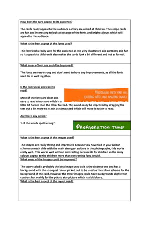
Is the copy clear and easy to
read?
Most of the fonts are clear and
easy to read minus one which is a
little bit harder than the other to read. This could easily be improved by dragging the
text out a bit more so its not as compacted which will make it easier to read.
Are there any errors?
1 of the words spelt wrong?
What is the best aspect of the images used?
The images are really strong and impressive because you have tied in your colour
scheme on each slide with the main strongest colours in the photographs, this works
really well. This works well without contrasting because its for children so the crazy
colours appeal to the children more than contrasting food would.
What areas of the images could be improved?
The starry salad is probably the best image used as it is the clearest one and has a
background with the strongest colour picked out to be used as the colour scheme for the
background of the card. However the other images could have backgrounds slightly for
contrast but mainly for the potato star picture which is a bit blurry.
What is the best aspect of the layout used?
2. What areas of the layout could be improved?
Do the cards work as a set?
What changes could be made to improve the cards?
Do you feel it meets the brief? If so why/why not?
Do the cards make the recipe appealing?
Do the cards look professional? If so why/why not?
Do you feel this work is better or worse than your own and why?