1. Evaluation
Producing Print Based Media
Visual Language:
Composition
How have you chosen to set out your designs and why?
I chose quite a simple layout for my design because my recipes cards were suited
for children and their parents. This meant that I had to stick to quick a simple look
without it being too boring or plain. By adding the little touches such as the strokes
on all the borders, boxes, etc made the card a bit more professional, which helped
suited to the parents than if I just left it plain. It also made it easier to realise what
which box was about, this also help by adding my bold titles. My layout was very
straight forward because if I had too much information on the cards it would be a bit
too jagged.
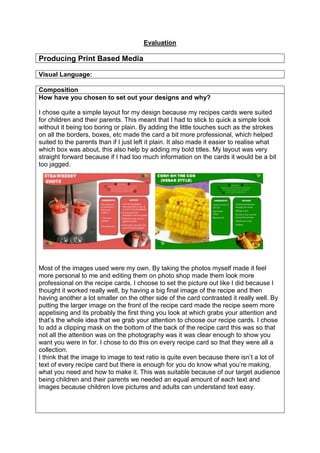
Most of the images used were my own. By taking the photos myself made it feel
more personal to me and editing them on photo shop made them look more
professional on the recipe cards. I choose to set the picture out like I did because I
thought it worked really well, by having a big final image of the recipe and then
having another a lot smaller on the other side of the card contrasted it really well. By
putting the larger image on the front of the recipe card made the recipe seem more
appetising and its probably the first thing you look at which grabs your attention and
that’s the whole idea that we grab your attention to choose our recipe cards. I chose
to add a clipping mask on the bottom of the back of the recipe card this was so that
not all the attention was on the photography was it was clear enough to show you
want you were in for. I chose to do this on every recipe card so that they were all a
collection.
I think that the image to image to text ratio is quite even because there isn’t a lot of
text of every recipe card but there is enough for you do know what you’re making,
what you need and how to make it. This was suitable because of our target audience
being children and their parents we needed an equal amount of each text and
images because children love pictures and adults can understand text easy.
2. Image Construction
Discuss the contents of your final images and reflect upon decisions made.
All the text used I made up myself, I did source the recipes from other webpages but
read them and re wrote them out so that they were simpler because of my target
audience being children and their parent meant I couldn’t have very complex
language or long lengths of writing. I think my decision was pretty realistic because
of the target audience.
Most of the images used were my own. By taking the photos myself made it feel
more personal to me and editing them on photo shop made them look more
professional on the recipe cards. Even though some of my images were sourced
they wasn’t really a great notice in which were sourced and which were, this was
because the photo I took myself were then photo shopped to look a little more
professional.
Representation
Discuss the semiotics and connotations created from the content you have
included.
All of my images have more than one product in it, for example the strawberry shot
comes as a per which influences that there is more than one person that’s going to
drink this drink which insinuates that there are people together which by the look of
the foods that it is a party.
Also I think that the colours scheme that I’ve used is mostly bright which conveys a
happy theme. The reds, and greens stand out making the recipes more exciting.
The vegetarian logo is all greens and usually green colour relate to nature and fields
which makes you think about what’s outside and that’s a lot of fruit and veg in the
fields which relates you to vegetarians.
Audiences:
3. Create an audience profile of your chosen demographic
The recipe cards we created were designed for the children to pick up off the shelf
and nag to their parents that they wanted them for there ‘Party’. This is why my
recipe ,s cards were bright and colourful.
Age: 7-11 and 40+
Gender: there isn’t a specific gender, all genders are suitable.
Psychographic: Achiever
Hobbies: baking, playing in the garden
How have you constructed your work to appeal to this audience?
I used photo shop to
edit my photography.
I enhanced the
colours by changing
the brightness and
contrast. I also used
circular marquee tool,
and feathered it to
create a blur around
the edge.
I created a circle with the
shaping tools on photo shop,
then I added my photo in and
sized it down to the right size I
needed, I then created a
clipping mask which merged
the two together creating the
photo to look like its hidden
behind the circle.
I used a font from ‘da
font.com’ that I had to
download. I then used the text
tool to add my text in choosing
the font which I had found.
I used the custom shape
tool in photo shop to
create all these little
shapes such as the
clocks, no entry sign and
the people. It was very
easy to do as they were
all shapes that were
already in the program
so by clicking on them
and re sizing them made
this job very easy to do.
4. Historical and Cultural Context:
What did you use as your design influences and why were they chosen?
I didn’t really have any influences to my design work or the reasons why I chose
them; I just decided to use my imagination. I researched a lot of images to see what
my recipes cards should look like but didn’t really use any existing products in my
work. My influence was based upon the target audience and the party food I was
creating, which meant I had to stick with a simple sort of layout but still be brightly
coloured and exciting enough for someone to reads without getting bored. My layout
was chosen as quite a simple look because of my target audience, I couldn’t have
too much jumping out of the page or it would have been abit too much and
overcrowded to read. I chose the bright colour scheme because partly most of my
party foods were to a similar colour but also with my target audience being young it
meant bright colours and bold writing were going to have to catch their eye so that
they would pick it up from off the shelves and ask their parents to buy it. If I was to
do this again id probably research more into the design of my recipe cards to help
me influence my work abit more.
Do vegetarian products have a specific design aesthetic and how does your
project reflect/contrast this? Why?
I found that in my work because my target audience were children and their parents,
it was quite a high factor that I made sure most of my party foods were healthy and
appetizing; children don’t want to eat something that doesn’t look great that’s why we
made sure everything looks colourful and as creative as we could.
Finished Products:
Does your finished product reflect your initial plans? How? If there are any
differences, describe why changes were made.
A lot of changes were made in my final product; this was because things looked
better when I planned them to how it was actually done. For example some of my
colour scheme didn’t look very aesthetically pleasing when I set the colours so I had
to re think some of my colours to make sure that it actually looked nice but still went
with my theme and other colours.
Also when I first started doing all my fonts I realised that I could have some of them
for my ingredients writing or method because it wasn’t clear enough to read, it may
of looked pretty but it wasn’t practical that’s why my fonts for that section are pretty
simple and very readable.
When I first decided on where pictures etc were going I only chose to have one big
full picture on the front of my recipe cards and I thought this looks quite plain so I
added an extra photo on the other page, creating a clipping mask which I thought
made my work seem better and the clipping mask gave it a nice touch.
Finally when I first started designing my recipe cards I didn’t have any icons to tell
me how many people the food served, the preparation time, etc but I added it further
along the way and liked it so I kept it in my work. I thought it made my work less
5. boring and it also helped the children who were reading it because they tend to
relate to pictures instead of words.
Does your finished product match what you were set in the brief? How?
My finished project did match what was set in the brief because firstly we were asked
to make sure that all our methods were numbered and as you can see from my work
every one of my recipe cards on the methods are numbered. Secondly the brief asks
you to have a border in your recipe card and on each of mine thee is a different
coloured border depending on what recipe it is. Thirdly it asks that you have the
vegetarian logo on each of the recipe cards and I followed this requirement.
How did the use of peer feedback help you in your production?
(Reference specific examples and their final outcome in finished product)
Bekki stated that it was hard to read some of my choices of coloured backgrounds to
the white fonts so I chose to change some of the background colours such as the
yellow like Bekki’s suggested to a darker
green which still connected with my theme
and target audience. Also Bekki helped me
realise that I had a few spelling and
grammar mistakes so I went through my
recipe cards to adjust any alterations that
were needed.
6. Discuss the strengths and weaknesses of your final product regarding its
technical and aesthetical qualities.
What skills/knowledge have you gained/developed in this project? How could
these be applied in future practice?
I have gained the knowledge on how to use a clipping mask which I thought made
my recipe cards look more professional and interesting than just a blocked picture on
the bottom of the page. I also learned how to create your own fonts into the
computer and put it into your work so that you don’t just have the
same old boring fonts used every day. Also I learned how to erase
the white parts around something if you didn’t want it to be there,
for example when I first put the vegetarian logo on it had a white
box around it and inside all the gaps removed the white.
I liked my clipping masks
because I thought they made
the piece quite professional
but if I was to change it then I
would not cramp it in the
bottom.
I think that I could of tried to not have
sourced images in all of my recipe
cards, even though they aren’t bad it
wouldn’t of been more ‘my’ work if I
had all my own photographs and not
half and half.
I think that my layout could
have been a little better but it
was hard to fit all the
information on the one side of
the page.
I like that in
every of my
recipe cards I
had extra
information box
about how
many people it
serves, how
long it takes to
cook and the
preparation
time.
7. Production Processes
Do you believe your work is creative and technically competent? Why?
I think some of my work is creative but not all of it, I found that this was down to time
that I had to complete the work. I could of maybe been alittle more creative in the
things that I did in my work but I did have to base it on time and also my target
audience. I think the most creating part of my work would definitely be the images
because most of my images were all taken by me and l didn’t just stick an image in
anywhere, I made sure there were correct spacing for them and that they looked
appetizing after I edited them. I made sure that one of my images of in full size and
that it was clear enough to make your mouth melt when looking at it, I also added the
second one in the bottom with a clipping mask to make it more creative and I think I
made the work look more professional than if I just stuck the original image just at
the bottom. I think that if I made my recipe cards a little more creative then they
would probably look a lot better and stand out more.
How effectively did you manage your time?
I managed to use my time quite well considering that for some of the production time
I was ill so I missed a few lessons. I think that I managed to complete my work in
time because my recipe cards were quite simple but because of my target audience.I
think even though I was ill one of the production days that I did manage my time well
throughout. When the schedule was first set we had three weeks to complete our
recipe cards but then because the process was taking a lot less that everyone
anticipated, we changed our production time to two weeks and still I managed to
finish my work in that time because when actually creating the recipe cards it wasn’t
as hard as I thought it would be. This was because I didn’t realise that I would use
some of the same thing in other templates so it was a case of copy and pasting my
work into it which saved me a lot of time.
If you could repeat the process what would you do differently?
If I was to do this project again I would probably prefer to work alone because you
think that working with someone means that it will be easier to get things done but
actually it’s harder because you have to listen to each other’s ideas of what to do
and sometimes even if you don’t agree on them you have to go with it because it
saves arguments and time. Also my doing the work on my own meant that I could
8. chose my own ideas and recipes when though Hannah’s ideas would good some of
them weren’t mine and by the end of the production we weren’t even working as a
team so it seemed alittle stupid putting all our ideas together and not even processes
them together at the end so by working on my own would mean that everything was
mine idea and there would be no disagreement or arguments involved.
Also if I was to do this project again id make my work abit more creative and change
the target audience so it wasn’t confusing to explain and work with.
Working to a Brief in the Creative Media Industries
Constraints Experienced:
What constraints did you encounter and how did you consider/avoid them?
Legal Constraints
In this project I used two sourced images which meant if I was to publish my work I
would have had to get copyright permission to have the images in my work. I
probably should have used all my own images to avoid this but with timing and that
fact that we didn’t have the entire ingredient to make everything it meant that
sourced images were going to have to be an option. Also another reason for not
using my own images in all of the recipe cards was that when there were taken the
quality of the images weren’t at a great standard so I didn’t think that it was good
enough to present them on my recipe cards.
Regulatory Constraints
1, Compliance: all work must be truthful, factual and not breaking the law.
I think that throughout my work everything is truthful, factual and isn’t breaking any
laws.
5, Children: Children must not be allowed to work with hazardous substances and
dangerous equipment.
In my work I have made sure that this doesn’t occur because even though the design
of the recipe cards are targeted at children the actually making of the foods is for the
adults to do so this will prevent the hazards from happening.
Financial Constraints
I researched everything on how much it would cost to hire a photographer, or a chef,
graphic designer and even a writer. By researching all of these financial constraints I
realised that it would be far too expensive therefore me and Hannah worked together
so that they wouldn’t be any charge a bit from buying the ingredient. When I bought
all my ingredients I made sure that instead of buying the most expensive products
that we kept to buying a lot of the cheaper products like the no branded things.
Management:
How did you work as part of a group?
Me and Hannah worked together on this project, we didn’t really work together
9. throughout the whole of the project, it was mainly the research and actually cooking
of the recipes that we worked as a team. When it came to making the recipe cards
Hannah thought It would be better doing 4 each, we tried to make sure that our ideas
were the same on the recipe cards so that they linked together and didn’t look like
separate cards but this didn’t really happen apart from our banners being in the
same place and our vegetarian society logos were also in the same place. This
meant that the only thing that was actually linking our work together was the banners
on our recipe cards.
How important is communication when working in a group?
Communication within a group is probably the most important thing, if there was no
communication then nothing would of probably been completed. I don’t think that me
and Hannah communicated enough throughout our project, I think at the beginning it
was fine but then when we started making our recipe cards we didn’t really stop to
make sure that we were both creating similar recipe cards and by not communicating
enough shows that both mine and Hannah’s work is quite different. I think that if we
were to do this again we should of probably done each recipe card together putting
both our idea in so that each of us were definitely communicating with eachother but
it meant that our ideas were getting spoke about and the work would of probably
been to a better standard than it was because there were two brains working on it,
instead of one.
What have you learnt about working in a group and how will you apply this to
future practice?
I have learnt from this project that the key would always be communication. I feel
that mine and Hannah’s communication between one another let our recipe cards
down because we didn’t communicate enough to realise that each of us had pretty
good ideas and if we applied them together our recipe cards could look even better.
If I was to do this in the future I would definitely communicate with Hannah more and
make sure that we both listen to each other’s ideas because by doing so our recipe
cards would have been more successful.