
Recommended
More Related Content
What's hot
What's hot (20)
Viewers also liked
Viewers also liked (20)
Similar to Font research
Similar to Font research (20)
Recently uploaded
Recently uploaded (20)
Font research
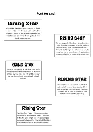
- 1. Font research What I like about this particular font is that it is fun and bold which would work well with a pop magazine. It is also easy to read which is important as sometimes the target audience tends to be younger. Thisone is againboldand easyto read,whichis a good thing.Butit’snot veryexcitingtolookat incomparisonto otherfonts,butsometimes thisisn’ta bad thingas the title mustbe simple enoughtoread so sometimeshavingatitle that has too muchgoingon makesitharder to read. This font isn’t as bold as the other ones but it doesstill standoutas sometimesit all depends on how big you make the title and the colour you use. Its good as it automatically is in all capitals. This font has been made to look 3D which automatically makes it stand out and look bold. By using a white border on the inside to create the 3D effect its made the font better to look at and eye catching. Withthisfont it’s gota faintpatternonthe colourin the middle whichmakesitdifferent, but isstill quite simple andnotas excitingas previousfonts.AnotherthingisthatI don’tsee it beingagood fontfora popmagazine title.