1. HOW DOES MY FRONT COVERHOW DOES MY FRONT COVER
DEVELOP AND ATTRACT ADEVELOP AND ATTRACT A
TARGET AUDIENCE?TARGET AUDIENCE?
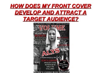
2. Masthead.Masthead.
I made sure that my mast head stood out and was bold, using the colour red which not
Only expresses the magazines content but is a unisex colour so would attract more
people, and there would be a variety of genders attracted to my magazine.
BANNERSBANNERS
I used banners associating my magazine with branching extensions such as the volume
Music awards and catching the readers eye by referring to the magazine as “BRITAINS
LEADING MUSIC MAGAZINE” suggesting that it has been around for a while, gaining
The readers trust.
IMAGESIMAGES.
I chose my paticular model, as she is a female and (only by a small amount) the domin-
ating audience for my magazine is female. I think her pose, clothes and attitude are very
Endearing, as she looks mysterious and so may make the reader intrigued and want to
Find out more. She is also a current indie star so I would expect my audience to be
Interested in her.
3. MAIN COVERLINEMAIN COVERLINE.
My main cover line is also in red like the Mast head, and this is to show its importance.
It is the second biggest font on the page and I made it bold outlining it in white to make
It stand out to catch the readers eye. I made sure it stood out because if someone was
Just browsing it would instantly catch their eye, making them scan over the rest of the
Magazine.
OTHER COVERLINESOTHER COVERLINES
I have included a flash for “top 50 indie songs of all time” and I think this is an important
Aspect of my cover, as it represents the genre and so people interested in indie will notice
my magazine straight away. I have included big indie-rock names such as cold play,
Fallout boy and more, to encourage the reader to buy the magazine.