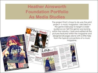
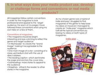
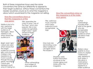
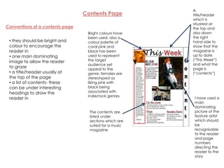
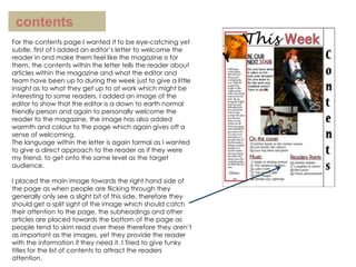
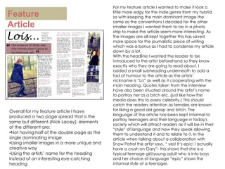
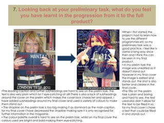
Heather AinsworthFoundation PortfolioAs Media StudiesThe project that I chose to do was the print project- a music magazine. I decided on the genre indie-pop to target a wider audience as I felt this genre was lacking within the industry. I took and edited all the pictures featured within the magazine and designed all pages alone with a little help from the typical conventions of a music magazine.
1. In what ways does your media product use, develop or challenge forms and conventions or real media products?All magazines follow certain conventions in order for the magazine to look professional and appeal to the  target audience. For each of my pages I have followed these conventions whist using my own take on a few of them.Conventions of magazines: The magazine should be bright, interesting and eye-catching to reflect the genre and target audience
 A title/header- to create the “brand image” making it recognisable to the audience
 One main image of a star- consisting of a close-up/medium shot with the use of direct address
 The leading caption- which dominates the page and anchors the cover story
 Subheadings- more stories to appeal to  the audience
 Straplines-  attracts the reader to other stories in the magazineAs my chosen genre was a hybrid of indie and pop I struggled to find magazines of this genre to help base my ideas on however I managed to create an “indie-pop” magazine which fulfil all the typical conventions by basing my ideas on both types of magazines.Indie-pop
Both of these magazines have used the same conventions the same but differently to appeal to their target audience, without these conventions the reader would be unsure as to what the magazine is about which would lead to the magazine not selling.How the conventions show us this magazine is of the indie-rock genre:How the conventions show us that this magazine is of the pop genre:Title- well know music channel which plays indie-rock music, recognisable logoFurther subheadings- includes other artist of the genre who are recognisable amongst the audience which will attract their attentionTitle- resembles the chart TV show “Top of the Pops” which was popular, title is now widely recognisable, bright colour  again aimed at target audienceMedium shot of a star- well know with the target audience of teenagers, direct address is use which draws the audience inBright, bold “girly” colours are used which shows that the target audience is young girls- a lot of young children’s first experience of music is usually through the pop genre, the bright colours also represent youth and of it being fun.One main star dominating cover, direct address in use again draws the reader inDarker colour palette to show more of a darker “indie/rocky” side, appeals to both sexes, it also gives a more serious /adult look to appeal to a wider audienceStrapline- adds further information on bands of the chosen genre and stories within the magazineOther subheadings and images of other pop artists
How my magazine followed these conventions..Dominant image using direct address- in this case the artist is inviting the reader in to introduce themselvesTitle- gives the reader an idea of what the magazine is about- up and coming artistsFont is modern yet rounded to show the pop genre yet a dark colour suggests the indie genreSUCCESS!!!!!Subheadings- famous artists of this genre are listed which will attract the target audienceLeading caption- resembles the main image  as the artist’s mouth is covered upBright (pop), bold colours which stand out and contrast with the  darker more serious palette to indicate the genresA barcode, date and price have also been added in order for the product to be soldStrapline- added information on gigs
A title/header  which is situated at the top and also down the right hand side to show that the magazine is up to date (“This Week”) and what the page is (“contents”)Contents PageConventions of a contents pageBright colours have been used, also a colour palette of coral pink and black has been used to represent the target audience yet appeal to the genre, females are stereotyped as liking pink with black being associated with indie/rock genres they should be bright and colour to encourage the reader in
 one main dominating image to allow the reader to graze
 a title/header usually at the top of the page
 a list of contents- these can be under interesting headings to draw the reader inI have used a main dominating picture of the feature artist which should be recognisable to the reader and page numbers directing the reader to the storyThe contents are listed under sections which are suited for a music magazine
Feature ArticleQuestion and answer structure is easy to read, also allowing the  reader to skim read if they want toHeadline- as my magazine is about new artists I decided to just introduce the artist’s name then add a quotation which could  “sum up” the personality of the artistConventions of a feature articleHeadlines and subheadings which should explain the story and catch the readers attention
A dominating image with further smaller images around the article
Clear writing with sometimes the use of slang/swear words
Text grabs to make the reader attracted to the article
Advertisement of the artist’s purpose e.g. tour, albumSmaller images around the article-  I decided on a strip of photos to make the artist seem more funky , fun and down to earthSubheading- a nickname for the artist is “Lo” therefore I thought it would be clever and interesting to have the subheading as “...gives us the lo-down”Page numbersDominating image, different locations and shots usedText grabs- the quotes I decided to use make the artist sound quite bitchy however she is the total opposite, they also mislead the reader and are shocking which grabs the browsing readers attention and encourages them to readInformation on the artists new album and single
2. How does your media product represent particular social groups?The stars used in my magazine are young teenagers/adults to be aimed at the target audience of 16-24 year olds.
Stereotypes for teenagers are usually loud, ignorant,  arrogant, bad mannered, scruffy, etc.
However the genre and artist used in my magazine challenges these views as the artist is the opposite as a nice, friendly, well mannered young woman who is loyal to her friends.
The “independent” image also differs from the stereotypical teenage image as they are seen as different, old fashioned-vintage styled, down to earth, rebellious, unique, non conformistand majorly musically gifted which was important when portraying the genre and social group.
“Pop” genre is mainstream and conformists  which usually represents girly girls who like either girl bands or boy bands or solo artists- this conforms to the dominant ideology of pop, this social group is represented through the solo artist and the boy band that are featured within the magazine.Stereotypical teenagersIndie-pop artistsThese artists are the “type” of social group I am aiming for-  they are shown not to be loud and are dressed nicely and appropriately , as there are more and more different social groups I wanted to aim for one of the different ones to show a sense of belonging to them

Magazine evaluation

  • 1.
    Heather AinsworthFoundation PortfolioAsMedia StudiesThe project that I chose to do was the print project- a music magazine. I decided on the genre indie-pop to target a wider audience as I felt this genre was lacking within the industry. I took and edited all the pictures featured within the magazine and designed all pages alone with a little help from the typical conventions of a music magazine.
  • 2.
    1. In whatways does your media product use, develop or challenge forms and conventions or real media products?All magazines follow certain conventions in order for the magazine to look professional and appeal to the target audience. For each of my pages I have followed these conventions whist using my own take on a few of them.Conventions of magazines: The magazine should be bright, interesting and eye-catching to reflect the genre and target audience
  • 3.
    A title/header-to create the “brand image” making it recognisable to the audience
  • 4.
    One mainimage of a star- consisting of a close-up/medium shot with the use of direct address
  • 5.
    The leadingcaption- which dominates the page and anchors the cover story
  • 6.
    Subheadings- morestories to appeal to the audience
  • 7.
    Straplines- attracts the reader to other stories in the magazineAs my chosen genre was a hybrid of indie and pop I struggled to find magazines of this genre to help base my ideas on however I managed to create an “indie-pop” magazine which fulfil all the typical conventions by basing my ideas on both types of magazines.Indie-pop
  • 8.
    Both of thesemagazines have used the same conventions the same but differently to appeal to their target audience, without these conventions the reader would be unsure as to what the magazine is about which would lead to the magazine not selling.How the conventions show us this magazine is of the indie-rock genre:How the conventions show us that this magazine is of the pop genre:Title- well know music channel which plays indie-rock music, recognisable logoFurther subheadings- includes other artist of the genre who are recognisable amongst the audience which will attract their attentionTitle- resembles the chart TV show “Top of the Pops” which was popular, title is now widely recognisable, bright colour again aimed at target audienceMedium shot of a star- well know with the target audience of teenagers, direct address is use which draws the audience inBright, bold “girly” colours are used which shows that the target audience is young girls- a lot of young children’s first experience of music is usually through the pop genre, the bright colours also represent youth and of it being fun.One main star dominating cover, direct address in use again draws the reader inDarker colour palette to show more of a darker “indie/rocky” side, appeals to both sexes, it also gives a more serious /adult look to appeal to a wider audienceStrapline- adds further information on bands of the chosen genre and stories within the magazineOther subheadings and images of other pop artists
  • 9.
    How my magazinefollowed these conventions..Dominant image using direct address- in this case the artist is inviting the reader in to introduce themselvesTitle- gives the reader an idea of what the magazine is about- up and coming artistsFont is modern yet rounded to show the pop genre yet a dark colour suggests the indie genreSUCCESS!!!!!Subheadings- famous artists of this genre are listed which will attract the target audienceLeading caption- resembles the main image as the artist’s mouth is covered upBright (pop), bold colours which stand out and contrast with the darker more serious palette to indicate the genresA barcode, date and price have also been added in order for the product to be soldStrapline- added information on gigs
  • 10.
    A title/header which is situated at the top and also down the right hand side to show that the magazine is up to date (“This Week”) and what the page is (“contents”)Contents PageConventions of a contents pageBright colours have been used, also a colour palette of coral pink and black has been used to represent the target audience yet appeal to the genre, females are stereotyped as liking pink with black being associated with indie/rock genres they should be bright and colour to encourage the reader in
  • 11.
    one maindominating image to allow the reader to graze
  • 12.
    a title/headerusually at the top of the page
  • 13.
    a listof contents- these can be under interesting headings to draw the reader inI have used a main dominating picture of the feature artist which should be recognisable to the reader and page numbers directing the reader to the storyThe contents are listed under sections which are suited for a music magazine
  • 14.
    Feature ArticleQuestion andanswer structure is easy to read, also allowing the reader to skim read if they want toHeadline- as my magazine is about new artists I decided to just introduce the artist’s name then add a quotation which could “sum up” the personality of the artistConventions of a feature articleHeadlines and subheadings which should explain the story and catch the readers attention
  • 15.
    A dominating imagewith further smaller images around the article
  • 16.
    Clear writing withsometimes the use of slang/swear words
  • 17.
    Text grabs tomake the reader attracted to the article
  • 18.
    Advertisement of theartist’s purpose e.g. tour, albumSmaller images around the article- I decided on a strip of photos to make the artist seem more funky , fun and down to earthSubheading- a nickname for the artist is “Lo” therefore I thought it would be clever and interesting to have the subheading as “...gives us the lo-down”Page numbersDominating image, different locations and shots usedText grabs- the quotes I decided to use make the artist sound quite bitchy however she is the total opposite, they also mislead the reader and are shocking which grabs the browsing readers attention and encourages them to readInformation on the artists new album and single
  • 19.
    2. How doesyour media product represent particular social groups?The stars used in my magazine are young teenagers/adults to be aimed at the target audience of 16-24 year olds.
  • 20.
    Stereotypes for teenagersare usually loud, ignorant, arrogant, bad mannered, scruffy, etc.
  • 21.
    However the genreand artist used in my magazine challenges these views as the artist is the opposite as a nice, friendly, well mannered young woman who is loyal to her friends.
  • 22.
    The “independent” imagealso differs from the stereotypical teenage image as they are seen as different, old fashioned-vintage styled, down to earth, rebellious, unique, non conformistand majorly musically gifted which was important when portraying the genre and social group.
  • 23.
    “Pop” genre ismainstream and conformists which usually represents girly girls who like either girl bands or boy bands or solo artists- this conforms to the dominant ideology of pop, this social group is represented through the solo artist and the boy band that are featured within the magazine.Stereotypical teenagersIndie-pop artistsThese artists are the “type” of social group I am aiming for- they are shown not to be loud and are dressed nicely and appropriately , as there are more and more different social groups I wanted to aim for one of the different ones to show a sense of belonging to them