2. WHAT I WANTED TO CHANGE
• After printing out large versions of my initial magazine designs I noticed I
wanted to change the layout on both magazines as the text was too large and
too small in some places
• Specifically,The Life on Mars cover;the model was positioned too over to the
left and far too zoomed in, the blue pug was to overpowering in that position
and that size, her face needed to be more visual
• I also wanted to adapt the cover lines to be more entertainment based on
both magazines
• I also did not think my tagline did not fit too well "discovering the best version
of you"
3. LAYOUT CHANGES
• On the left is the Madonna issue where I rearranged
some of the textx to fill the gaps behind the model
rather than over her
• On the right shows the life on mars where I moved and
down-sized the blue exclusive pug
• Moved the text around her head
• Zoomed out on her face and moved her more central
• Moved the text above the main coverline to the right
and smaller to be less overpowering against model
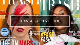
4. TEXT CHANGES TO LIFE ON MARS
• Tag line to "not your average trashy mag" - relevant to
the masthead and logo, mentioned the idea of it being a
different type of entertainment magazine in statement of
intent
• Changed my story on veganism to a stand-up comedian
talking about it
• Changed the main cover story into a documentary piece
• Changed DIY Halloween costumes to be based on
horror films
5. CHANGES TO TEXT ON
MADONNA
• Changed the story on art to art behind
Disney films
• Main cover story now based on an
interview with popular, young actress millie
bobby brown who would likely talk about
issues like this and is popular with my
target market
• Binging boxsets- alliteration and relevant
and entertaining, chance to win is engaging