1. Media Contents Page
Analysis
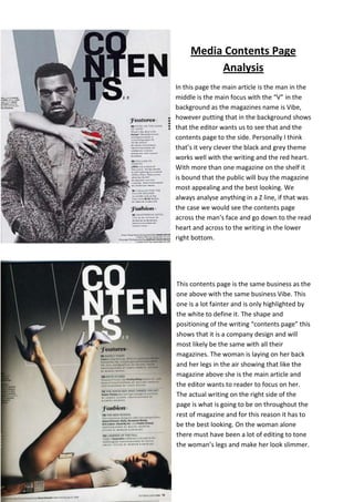
In this page the main article is the man in the
middle is the main focus with the “V” in the
background as the magazines name is Vibe,
however putting that in the background shows
that the editor wants us to see that and the
contents page to the side. Personally I think
that’s it very clever the black and grey theme
works well with the writing and the red heart.
With more than one magazine on the shelf it
is bound that the public will buy the magazine
most appealing and the best looking. We
always analyse anything in a Z line, if that was
the case we would see the contents page
across the man’s face and go down to the read
heart and across to the writing in the lower
right bottom.
This contents page is the same business as the
one above with the same business Vibe. This
one is a lot fainter and is only highlighted by
the white to define it. The shape and
positioning of the writing “contents page” this
shows that it is a company design and will
most likely be the same with all their
magazines. The woman is laying on her back
and her legs in the air showing that like the
magazine above she is the main article and
the editor wants to reader to focus on her.
The actual writing on the right side of the
page is what is going to be on throughout the
rest of magazine and for this reason it has to
be the best looking. On the woman alone
there must have been a lot of editing to tone
the woman’s legs and make her look slimmer.
2. This magazine contents page is different to the
others with what the editor wanted us to focus
on. The main article is the man and is as long as
the page showing that he is the main focus and as
he is making eye contact with the reader it shows
he’s what we need to draw our attention to do.
Unlike the other two this is for a song and his
playlist is along the side showing that he is the
artist and they’re his songs. Unlike the theme for
the other two this one is red and black which isn’t
as eye catching, but they make up for it with the
long picture and bold writing.