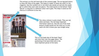
1. The writing is on the left hand side of the contents page. The are big bold letters
to show the titles of the pages. This helps to reader to easily see what’s in the
magazine. Also the numbers are in red which also stands out and lets the reader
get to where they want with one glance. The small section at the bottom ‘Oasis
Special’ is coloured in a different colour and is gold. This helps it stand out the
most as it is different to the rest.
The colour scheme is quite simple. They use red,
white and black. The red helps important
information stand out. Also the use of the small
amount of gold stands out the most as it is only
used a bit and it draws your eye straight away.
This is a full body shot of the band ‘Oasis’
who have their own few pages about. The
positioning of the band show who is the
most important person of the band.
2. The writing is directly in the middle of the contents page. There are
word in bold to stand out and so the reader knows what is in it. Also
the repeated slogan of ‘Closer to…’ links to the title of the magazine.
The pink numbering links to the colour scheme and helps the page
numbers stand out.
There are a lot of shots used on this
contents page. The close up shots are used
to show thee famous person in the
magazine and the medium-full and full body
shots are used to show off the fashion or
the models bodies.
The colour scheme is very bright and alive.
The uses of the pink and yellow really make
the contents page stand out and gives it a
feminine look which will attract women
readers.
3. The colour scheme is very simple and
dull. The only colours used are red
green and white. The red helps the
title stand out and the green helps
some writing stand out.
The model covers the majority of the
right side. The close shot makes it clear
who he is and what sport he is involved
in which can be assumed by his
clothing.
The writing is all placed on the left hand
side. The titles and key information is
coloured in green instead of black. This
makes it stand out more and you are able to
see it at a first glance.
4. The colour scheme is quite repetitive. There is a
white background and there are different shades of
blue used.
There are a number of shots used on this front
cover. The close up on the boy shows clearly
who he is and what he has in his hands. The
medium shot of the man in the shirt and tie
could emphasise the fact he is successful. And
finally the full show of the carts show clearly
what they are.
The writing is placed on two sides of the page.
In the top half it in the centre and the bottom
half it is on the left. Titles and important
information are also in different colours.
5. The colour scheme is simple but affective.
The title has three different shades of
orange which stands out and may attract
readers.
The model covers the right side of the contents
page. The full body shot show her body positioning
which could suggest she is very laid back and the
articles show this. Also her clothing matches the
colour scheme.
The writing is all placed on the left side of
the page. Bold writing is used to show the
titles clearly and help them stand out. Also
red writing is used to help highlight the
pages.