Creating Organized Groups and Layers in Photoshop
•Download as DOCX, PDF•
0 likes•73 views

The document discusses how the author organized layers in Photoshop to create a magazine contents page. They created groups for different elements like contents and page numbers. The first layer added was a background image, then images of themselves. Text was added using fonts from Dafont.com and effects like outlines. A grid view was enabled to help evenly space and measure layers. Additional text layers were inserted for contents, features in red text, and issue date. Images of a photo shoot and album cover were also included. Throughout the process, the author moved layers and experimented with blending options to refine the design.

Recommended
More Related Content
What's hot
What's hot (17)
Viewers also liked
Viewers also liked (19)
Similar to Creating Organized Groups and Layers in Photoshop
Similar to Creating Organized Groups and Layers in Photoshop (20)
Recently uploaded
Recently uploaded (20)
Creating Organized Groups and Layers in Photoshop
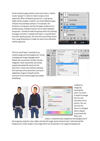
- 1. As the contents page contains many more layers, I had to create “groups” in order to make my layers more organized. When clicking the group icon, a new group folder will be created, in which I can insert different types of layers into avoiding confusion. For example, the Contents is one group, and also the page numbers are in another group, making it easy for me to switch between the groups. I started to make the groups when first starting the page, and when I created more layers, I inserted them into their specific groups. This was one crucial thing I learnt from using Photoshop as it helps me work more efficiently and be organized. The first actual layer I inserted to my contents page was the background. I found a background image of google which follows the conventions of other hip-hop magazine I have researched, and simply copied and pasted the work into the document. I have now started to develop the main base of my document, and soon I added few images of myself and the structure of my contents page was rapidly developing. I edited my images by learning the short- cut ctrl+U in order to change the hue and saturation of my picture. You can see how the picture is changed when I played around with the filters and colours. I had previously cropped out the background of the image by using the crop, rubber and also the magic wand and lasso tool. I had removed the background in order to get a crisp image which can be placed on my magazine background.
- 2. I have learnt to insert many text files by clicking the text icon on the tool bar of Photoshop. I have downloaded some samples of Dafont.com in order to find the most suitable texts for my magazine cover. I clicked the FX button and added many blending options to my text layers. The screen shot to the left shows how I also inserted a vivid outline of the magazine. From my research I noticed that some magazines had a line around the magazine where the content is placed, so I decided to add one by going to the shape tool and drawing a curved square. As magazine products are really precise and have all the layers including text and images organized and even, I wanted to make my product go along the same lines. I learnt how to insert a grid by going onto “view>show>grid”. This enables my page to be divided into a thin grid, which is used as a ruler. When I put the grid on, I was able to measure what texts go where to make it even and look professional. As you can see from the screenshot, I have enabled the grid and you can see how the page is divided in a invisible grid which helps me to evenly match my layers. The grid could be divided into the segments one user wants. I added a new group of layers which were the contents of the magazine. These are simply the bulk of text layers which show what is going to be inside my magazine. I also included the issue date. I added some red text for the features section. This was done by simply clicking the layer button of the text and changing the colour. I also learnt how to quickly transform my layers by Ctrl+t. I wanted the audience to notice the difference with the contents and the features; thereby I included different colour combinations. I added another group of layers which where the numbers, and the information of what the contents shows.
- 3. The next steps I have taken to complete the magazine contents page was include some features to the magazine. I decided to insert some images of myself in a photo shoot, and also an album by the famous singer Rihanna. I also inserted more text layers in order to show what is due to be in the magazine. This was a simple step-by- step guide to how I created my magazine contents page. One thing I had learnt from Photoshop was to move layers between each other, which brings layers in front of others. The way to this is by simply dragging one layer and putting it above another layer. The layer above will always be in front. I had used this feature many times in both my contents page and also my magazine cover and double page spread. For example, I want the background to be at the back, so I made sure the background layer was placed at the back, so every other layer builds on top of it. I have also learned how to sample text layers and make them look classier. For example, the sample on the left shows how I have experimented with the blending options in order to make the text look gold, from a dull yellow. Photoshop is great at editing text and here is one example of how I have changed the bevel and emboss and the gradient.