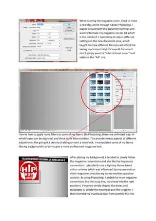
1. When starting the magazine cover, I had to make
a new document through Adobe Photoshop. I
played around with the document settings and
wanted to make my magazine size be A4 which
is the standard. I learnt how to adjust different
settings on the new document area, which
taught me how different file sizes will affect the
saving process and also the overall document
size. I simply went to “international paper” and
selected the “A4” size.
I learnt how to apply many filters to some of my layers. On Photoshop, there are unlimited ways in
which layers can be adjusted, and there is the filters section. This provides many aspects of different
adjustments like giving it a sketchy drawing or even a neon look. I manipulated some of my layers
like my background in order to give a more professional magazine look.
After placing my background, I decided to slowly follow
the magazine conventions and also the hip-hop music
conventions. I decided to use a hip-hop theme based
colour scheme which was influenced by my research on
other magazines and also my survey monkey question
analysis. By using Photoshop, I added the main magazine
conventions like the strap line, masthead into the right
positions. I inserted simple shapes like boxes and
rectangles to create the masthead and the strapline. I
then inserted my masthead logo from another PDF file.
2. I have inserted
the main
magazine
conventions as
you can see the
logo, strapline,
bar-code, issue
date,
background, and
also my primary
focus (artist)
I had used the magic wand tool, rubber tool, and also
the magnetic lasso tool in order to take my artist from
the original background. I then had to edit the actual
artist in order to make the lighting match the
background of the product. I first went to the
hue/saturation effect which makes the images change
through lightness, saturation and also hue. I increased
the saturation to make the image look livelier.
The step I took after that to make my image look more
professional is the levels setting. Ctrl + L are what I use
to open the box up. What this does is make the brighter colours brighter, and the darker colours
darker. By using this filter, I have made the correct lighting in order to make my image suitable for
the background.
I have now decided to insert the
text layers and the content aspect
of my magazine. I used consistent
fonts and I have kept the colour
scheme consistent (red, black,
silver). In order to add text, I just
simply click the text icon on the
tool bar. Photoshop has a range of
different texts and they can be
edited through the blending
options. I made sure my colours
look solid and bold to strike the
eye, as from my magazine
research I found lots of bold
vibrant dark colours. I created a
grid which made sure my work
looks neat and not uneven.
I got an image from
the web of a
microphone. I learnt to
rub out the areas, and
place it onto my artist
hand. I did this
because I had no props
to illustrate the hip-
hop genre. This was
simply done by the
rubber tool and also
making the artist layer
be placed in front of
the microphone.