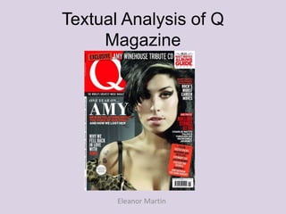
2. Denotation:
• We can see a mid close-up of
Amy Winehouse framed by
bold, simple cover lines.
• The masthead is a white ‘Q’
against a red background in
the upper left hand corner,
following codes and
conventions of most
magazines.
• The colour scheme is mostly
red, white and black, which
stands out against the neutral
background.
• The selling line is directly
below the masthead, which
also follows codes and
conventions of magazines.
3. Masthead:
• The masthead is large and bold, taking up a large amount of the
page.
• It’s quite minimalistic, which reflects the mature content of the
magazine – it’s not too ‘in your face’.
• The masthead and the selling line are partially covered up by the
main image, showing that the magazine is so familiar and well
know that it doesn’t need to be advertised all the time.
• ‘The world’s greatest music magazine’ tells us that Q Magazine is
a step above other music magazines, that the reader shouldn’t
bother reading others, as Q is the ‘greatest’.
• The price and publishing date are on the spine of the magazine as
opposed to directly beneath the masthead, going against codes
and conventions.
4. Cover lines:
• The cover lines surround the
image without going over her
face, which allows the reader to
easily see the main image as
well as read the cover lines.
• The red and white follow the
general colour theme of the
magazine (as they match the
masthead), but they also allow
the cover lines to stand out
against the grey background.
• Each ‘layer’ of text in each cover
line is a different colour, which
follows the code and
conventions of most magazines.
• There is a puff in the lower right
corner telling the reader what’s
inside the magazine, the red
background allowing it to stand
out.
5. Main cover line:
• While providing anchorage for the main image, the main cover line also tells
the reader exactly what the main article in the magazine is.
• It’s noticeably larger than the rest of the cover lines, once again showing that
it’s the main article.
• Using just ‘Amy’ as opposed to ‘Amy Winehouse’ gives the reader a sense
of familiarity with the celebrity, and by association makes the magazine more
attractive to potential buyers.
• ‘And how we lost her’ gives the impression that Amy Winehouse’s death
affected everyone, the use of ‘we’ gives the reader a sense of community.
6. Main image:
• The main image is of Amy
Winehouse making direct
eye contact with the
camera, which beckons the
viewer in to look closer at
the magazine.
• The use of a grey
background makes her
stand out and attract
attention.
• Her face is very lit up,
which gives her a more
innocent, wholesome look,
as opposed to the effect
darkness would give her.