Case studynotes
•Download as PPTX, PDF•
0 likes•117 views

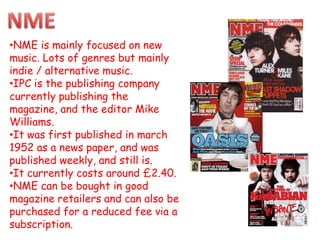
- NME is a weekly music magazine focused on new and indie/alternative music genres that has been published since 1952. - It is currently published by IPC and edited by Mike Williams. - NME can be purchased at magazine retailers for around £2.40 or through a subscription at a reduced rate.

Recommended
More Related Content
What's hot
What's hot (16)
Viewers also liked
Similar to Case studynotes
Similar to Case studynotes (20)
Case studynotes
- 1. •NME is mainly focused on new music. Lots of genres but mainly indie / alternative music. •IPC is the publishing company currently publishing the magazine, and the editor Mike Williams. •It was first published in march 1952 as a news paper, and was published weekly, and still is. •It currently costs around £2.40. •NME can be bought in good magazine retailers and can also be purchased for a reduced fee via a subscription.
- 2. NME is very distinct. Its style is iconic and extremely well recognised. The masthead stands out on the colour background, and is slightly covered by the main image. This magazine follows typical magazine conventions, has lots of cover lines, connected with the images and puffs standing out from the rest of the magazine. The medium close up main image is of a well known artist (Pete Doherty.) The barcode is pushed away in the corner so it does not hide much of the photo, another typical convention of a magazine. This edition in particular seems to be more aimed at girls rather than boys, as the colours are softer and more gentle, pinks and purples especially considering the main image is a topless man. The magazine tries to give incentives to buy the magazine, such as the chance to win VIP festival tickets. This is in a puff to draw attention from the reader. Overall this cover is effective at hitting the target audience and attracting more readers.
- 3. This contents page is extremely iconic of NME. It has the iconic NME logo, at the top and an index on the left hand side, typical of every NME contents page. It is extremely simple and all of the numbers fall into categories or numerical order. The columns are in plain sight and uncomplicated. A large story is present on the contents page, as with many contents pages. The story has a large image taking up a huge amount of space on the page meaning it is not blank but also not cluttered as a contents page should not be.
- 4. This double page spread does not bost much in the way of text but a striking image of Florence Welch and an American flag. In many different ways this spread does follow NME’s house style with the black writing and its typical colour, red. The font in this article is particularly plain and does not show imagination but is very easy to read. The whole text is in columns to not confuse people and make the process of reading it very enjoyable. The photo its self covers a whole side of A4, coving more page than he actual article, showing he star is bigger than what has to be written about.
- 5. •This magazine champions rock music and focuses on the artists producing this music. •The publishing company is freeway press incorporated. And the editor is Ben Patashnik. •It was first published in march 1999. •It currently costs around £3.60 and is produced weekly. •Rocksound can be bough from most good magazine retailers ad available via subscription.
- 6. Rock sound has a very simple style. The colour scheme changes with every artist on the front cover, such as this bright yellow used o enhance he ands name on the front. I believe this is aimed at a youthful market because it is quite cluttered and the colours are vibrant and jump out of the page. You can tell from sight f he front cover that it is a magazine, following many conventions, such as the front having a barcode, and here being many cover lines. It advertises what is inside to try and incise customers. Puffs on the cover also draw potential customers attention to their deals and contents. Overall the magazine is very good at hitting its target audience and looks very god on a shelf.
- 7. This contents page is very simple. Only one image looking right down the camera, he looks to be dressed very plainly but black as lots of people that listen to rock music also stereotypically wear black. The actual contents section is very simple, here is not much on it but it shows the main sections that people will be interested in. His is in chronological order. On lots of contents pages and cover pages for youthful audiences the person in the main image is often pulling a face to some extent.
- 8. This double page spread does not have much text on again showing actually having the ban appear in the magazine means more than the story being written. It will boost sales for he magazine as people want o read about their favourite artist. It says this is about he band but Hayley Williams is more prominent than the other members as she is in colour and he others are not. The actual tile is very colourful and on a slant with like scribbles on, this does not look very formal and stands out on the black background, black again very associated with some rock music.
- 9. NME is a magazine very similar to the idea I have had, in fact, my magazine will compete with NME magazine. NME has a vey similar style to this magazine, as it is not very cluttered, it is very plain but striking t the same time. It focuses on new music and a lot of indie music, it targets a youthful audience, such as mine will an audience such as around 14-30. rocksound mixes lots of fonts on the front cover, making it look rather good, this is where I got the idea and am imitating this. Although rocksound uses lots of colours, the majority of them I will use on my cover as the magazine for them seems to be working.