
Recommended
More Related Content
What's hot
What's hot (19)
Similar to Music magazine analysis
Similar to Music magazine analysis (20)
More from Bethany-Millward
More from Bethany-Millward (6)
Recently uploaded
Recently uploaded (20)
Music magazine analysis
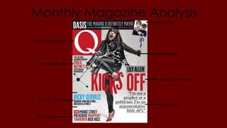
- 1. Monthly Magazine Analysis Masthead Banner Main image Main Cover Line Strap Line Cover Line Cover Line Cover Line
- 2. Mast Head • The masthead is in large, bright white, text and is presented on a bright red background which contrasts with the white/grey background used for the rest of the cover. This means that it really stands out and draws attention so people know straight away what magazine it is. The masthead is an iconic symbol that is shown on all their magazines and other projects they are involved in (like the Q awards)so is easily recognisable and stands out on the shelf. The magazines simple, one word name ‘Q’ means that the red box surrounding it frames it perfectly, making it appear neat and professional. The masthead is placed in the top left hand corner of the page so that it does not interfere with the main feature of the magazine that takes up most of the cover.
- 3. Main Image • The main image on the cover shows Lily Allen who is the focus of the main feature of the magazine and ties in with the main cover line and strap line. In the image shows Lily Allen is snapping a microphone stand in half over her leg and the fragments of the shattered stand are all around her. When accompanied with her all black, all leather outfit and bright red heals this helps create a ‘bad girl’ kind of image. This would appeal to the magazines target audience as they would typically be interested in alternative, rocky and edgy music, so would not be attracted to an image of a ‘good girl’ or overly pop like image. So by representing Lily Allen in this way they will be attracting their target audience and appealing to their customers. The aggressive side to the image and the way her leg is kicking out links the main cover line, ‘Kicks Out’, creating a clever sense of continuity. The colours also cleverly tie in with the rest of the cover, as she is wearing black, has black hair and red shoes and the main colour scheme of the cover is black and red. The image is the only image on the cover (except for the one included in the banner) and takes up a very large portion of the page. This shows how significant the feature is to the magazine and ensures the magazine has a clean cut, professional appearance.
- 4. Main Cover Line and Strap Line • The main cover line, ‘Lily Allen Kicks off’ dominates the bottom right hand corner of the page and crosses the main image showing that they are both about the same story. The phrase ‘kick’s off’ is in large, bold, bright red writing meaning that it stands out against the black and white that surrounds it. The use of those words in order to entice the audience by suggesting that the article could involve controversy, which is something that would appeal to the magazines target audience. • The strap line is in smaller, black text that is very clear against the white background. The fact that the strap line is underlined shows that it is a significant part of the cover. It is a quote from the Lily Allen article in the magazine, the words also emphasise the idea that there could be some form of controversial drama in the story, ‘I’m an argumentative little sh*t’.
- 5. Banner • The banner runs across the top of the page. It is presented in a black box, separating it from the rest of the cover and showing it is a different article to the main feature. The text is in white, grey, blue and red with the different features of the article in different colours. This gives the impression that there is lots of different content within the story and that it is pact full of worthy information. The biggest bit of text is the word ‘Oasis’, they have chosen to make this the focus of the banner because Oasis is a very famous band that will appeal to a large amount of the magazines target audience, meaning that more people are likely to buy the magazine based in it featuring Oasis, this is also emphasised by the use of an image of the band which is also included on the banner.
- 6. Cover Lines • The cover lines describe additional content that is covered in the magazine, other than the main cover feature, as to appeal to a wider audience. Someone that is not interested in Lily Allen may see that one of the other cover lines talks about someone else that they are interested in, such as Ricky Gervais or Palo Nutini, and they may purchase the magazine on the strength of this. • The cover lines are placed along the borders of the cover so that they can been seen as clearly separate from the main feature and don’t interfere with the effect of the main image and cover line. • The colours used for all the cover lines fits in with the colour scheme used on the rest of the cover (red, black white and a small amount of blue) creating continuity and a neat, professional appearance.