Unleash Your Potential - Namagunga Girls Coding Club
How did you attract/address your audience?
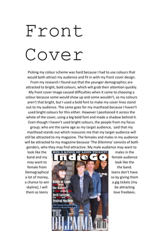
1. Front
Cover
Picking my colour scheme was hard because I had to use colours that
would both attract my audience and fit in with my front cover design.
From my research I found out that the younger demographics are
attracted to bright, bold colours, which will grab their attention quickly.
My front cover image caused difficulties when it came to choosing a
colour because some would show up and some wouldn’t, so my colours
aren’t that bright, but I used a bold font to make my cover lines stand
out to my audience. The same goes for my masthead because I haven’t
used bright colours for this either. However I positioned it across the
whole of the cover, using a big bold font and made a shadow behind it.
Even though I haven’t used bright colours, the people from my focus
group; who are the same age as my target audience, said that my
masthead stands out which reassures me that my target audience will
still be attracted to my magazine. The females and males in my audience
will be attracted to my magazine because ‘The Dilemma’ consists of both
genders, who they may find attractive. My male audience may want to
look like the males in the
band and my female audience
may want to look like the
female from the band.
Demographical teens don’t have
a lot of money, so by giving them
a chance to win a gig tickets (my
skyline), I will be attracting
them as teens love freebees.
2. Contents
Page
I have tried to use neutral colours on my contents page but still
maintaining my house style. I have done this so my audience don’t get
the impression that it’s
aimed at the other gender.
The content in my magazine
provides an equal balance
of artists, which may appeal to
one gender or both. I also
included articles about gigs
and festivals because this
was a popular topic chose in
my audience research. I
have used images of
‘The Dilemma’ from a
different photo shoot, which
3. show the band laughing, giving my audience a feel of what they are
really like. Also on my contents page there are images of other bands so
my audience get a better understanding of the bands that feature in my
magazine. I made sure I included more than one image on my contents
page because if I just had writing or one image, this maybe quite
overwhelming for my audience, also most teens prefer images to text.
Double
Page
Spread
I used a range of informal and formal language in my magazine because
my audience are aged between 15-17, so they can relate to it better. By
4. using an informal and less structured approach my audience will have a
better understanding and find it less boring than if it was formal, that is
why I made my double page interview more of a chat. The image on my
double page spread will attract my audience because it is from the same
photo shoot as my cover and this will make my audience want to read
the article. When they read the article they will see that the band
members are a similar age which will inspire my audience because they
can relate to the band.