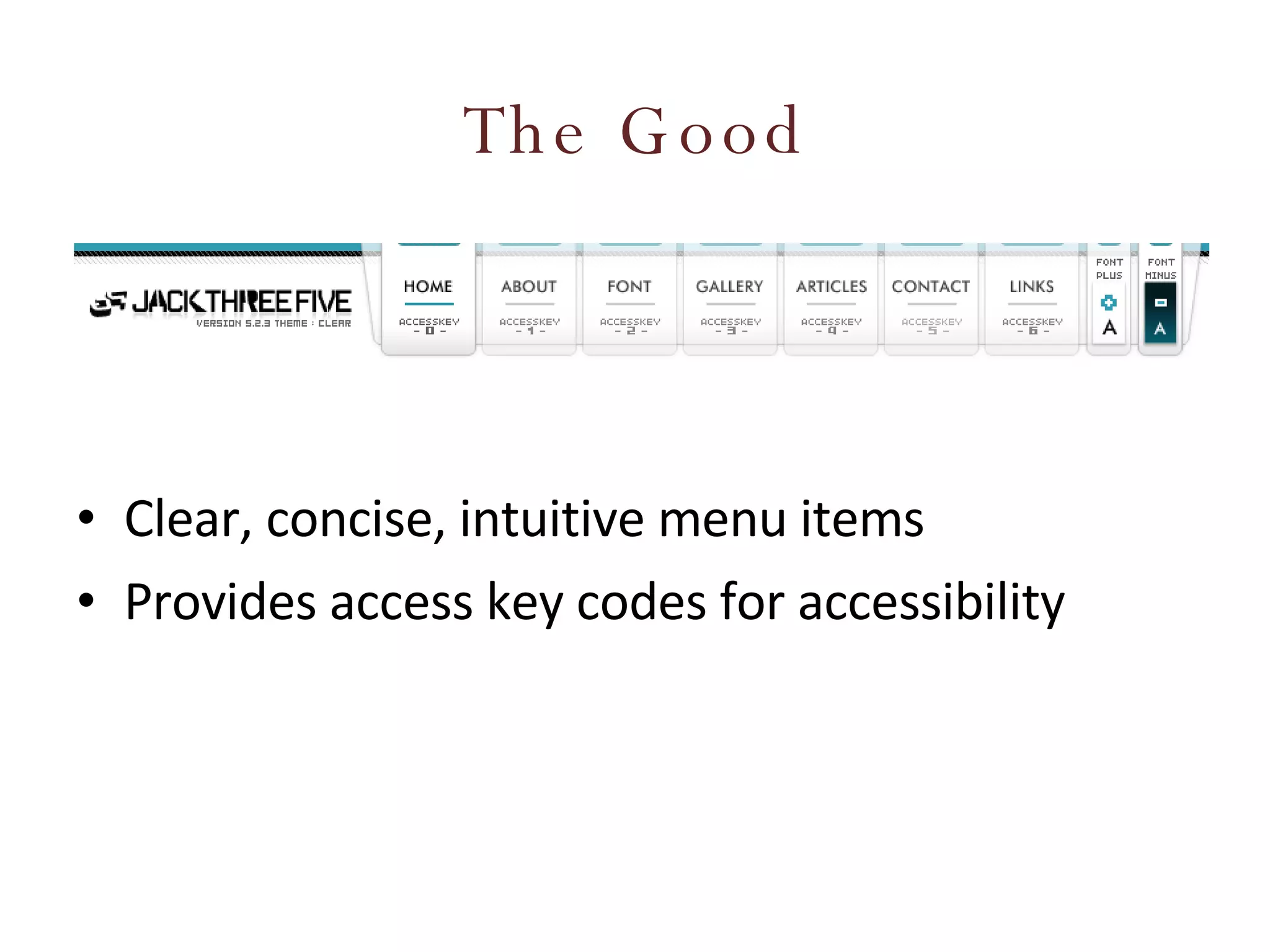
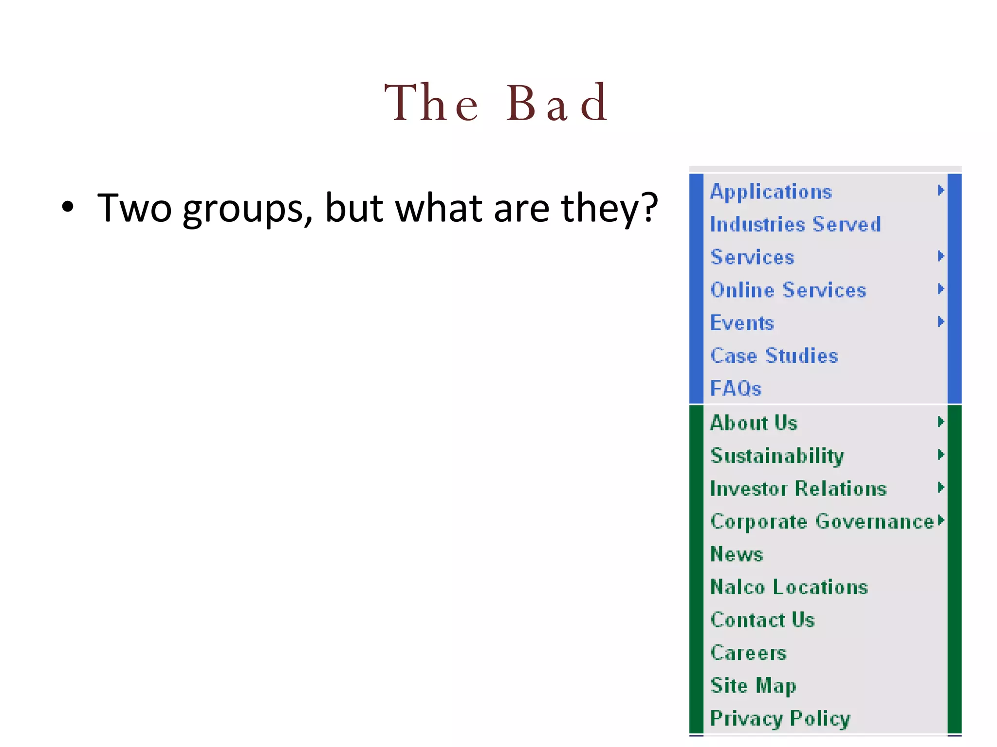
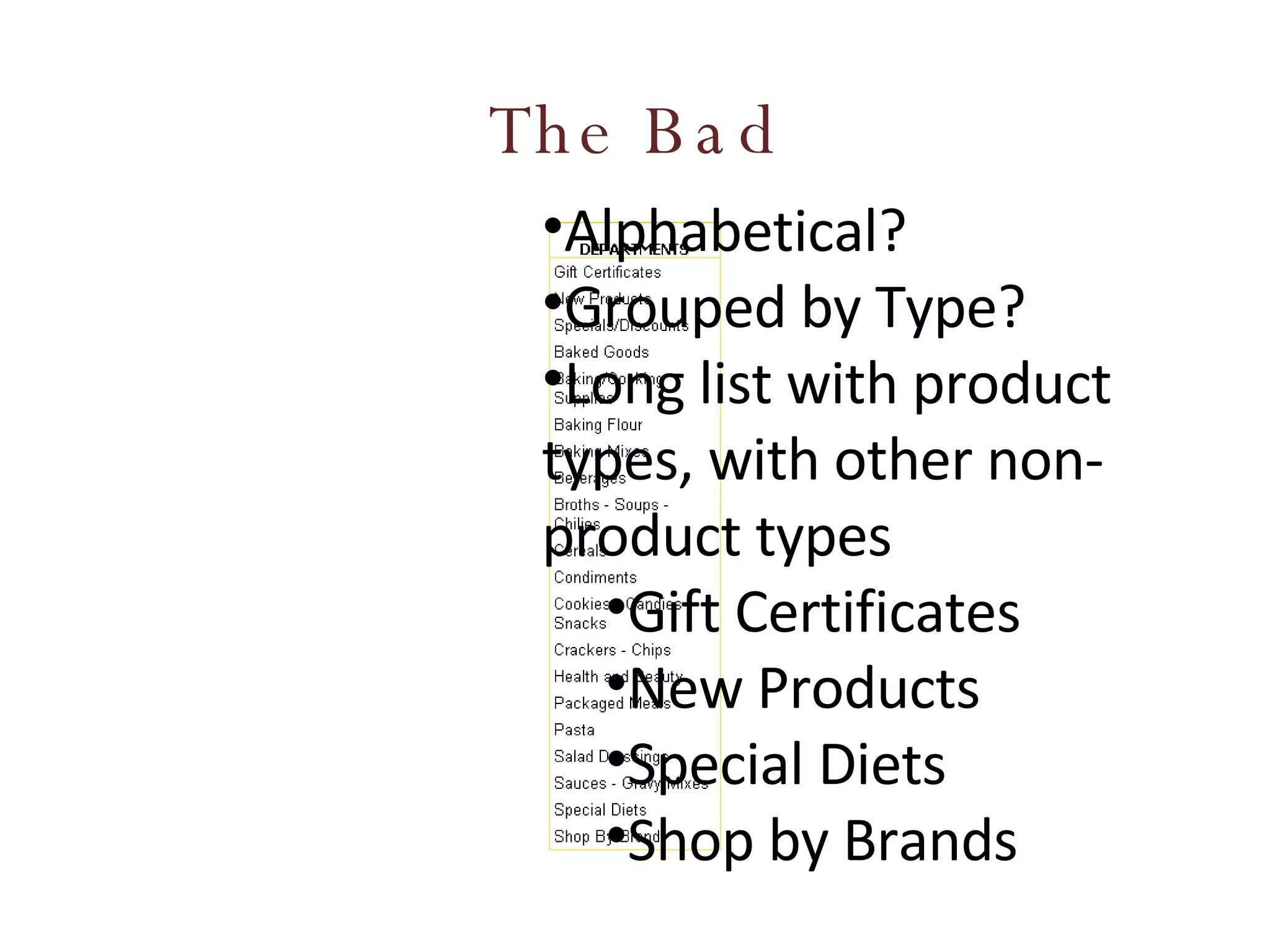
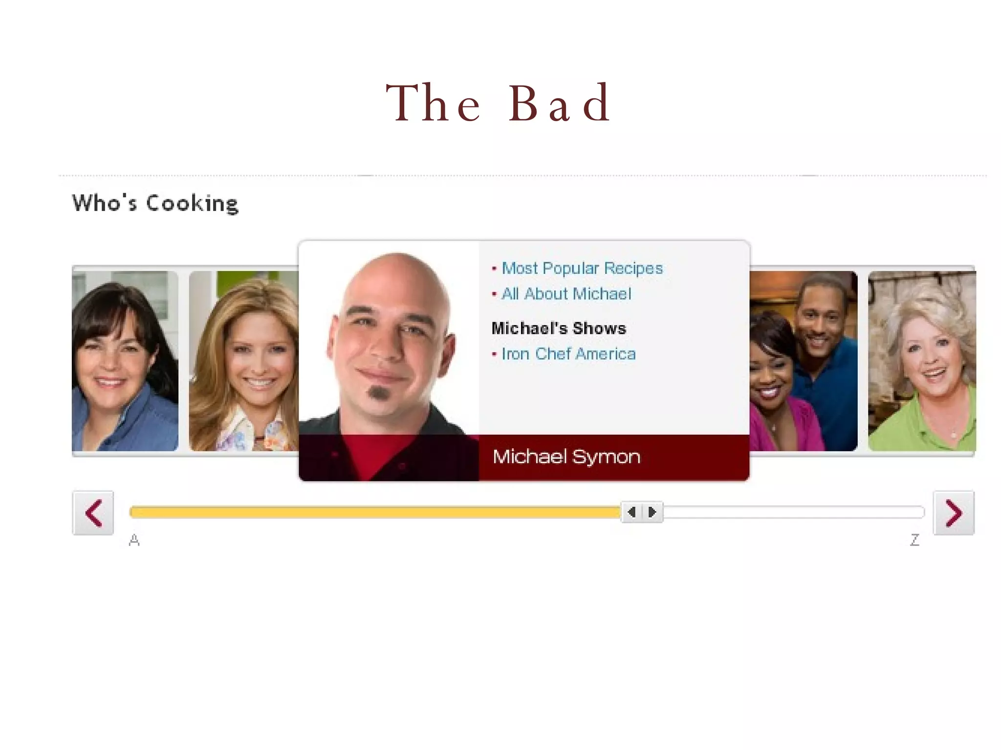
Information Architecture Tasks & Tools for improving your web design
What is Information Architecture (IA)? “ Information architecture (IA) is the art of expressing a model or concept of information used in activities that require explicit details of complex systems.”  — Wikipedia “ Information architecture is the science of figuring out what you want your site to do and then constructing a blueprint before you dive in and put the thing together.”  — Webmonkey
Tonight, let’s use this definition… Tasks & exercises that balance the needs & goals of the business/organization, site and intended audience, to deliver a roadmap on how a website’s information should be presented. Information includes: Content Navigation Labeling
Who am I to talk?
You are all  Information Architects!
As web designers, you may wear many hats…. Bookkeeper Designer Coder Salesperson Information Architect Web Strategist Business Person Usability Consultant Client Liaison
IA consists of… Understanding what the business/site goals are Understanding who the intended audience is and how they will interact with the information on the site Organizing the information so it makes sense Create a structure for the site to support the information; the intended goals
IA consists of… (con’t) Things an IA looks at/handles: User behavior Success factors Politics (Client or organization) Website organization & structure Labeling & identifiers Search Navigation
User behavior Analysis to determine current behavior Web analytics, User testing, Focus groups What users look at  What users click on  Why they do the things they do  How to identify  your  users and  their  needs Determine preferred behavior Design to support desired behavior
Success factors What actions must take place to make your website successful? Purchases Downloads Leads (phone calls, emails, brick & mortar visits)
Politics (Client or organization) A lot of IA is common sense What makes it difficult are politics, personal agendas An IA learns to listen, then effective counter politics & agendas with sound proof Remind them of ROI Prioritize based on ROI
Website organization & structure Organization is not only important related to storage, but retrieval Structure supports how the information is retrieved
Web Site Structures Narrow and deep Fewer links; more clicks Broad and shallow More links; fewer clicks
Narrow and deep Fewer links Better for directing site visitors down a particular direction / channel.  More clicks Bad if click-throughs become seemingly pointless; user gets lost; forgets what they were looking for
Broad and shallow More links More difficult to scan; decipher which link is relevant Fewer clicks Quicker to access
Which is best? Neither 100% of the time It depends on the situation; the information, the audience and the goals It’s always a balance… Directing site visitors to where you want them to go, with the fewest clicks, quicker access
Methods of organizing information Alphabetical Attributes/facets  (e.g., price, color, shape, etc.) By format  (e.g., forms, calculators, whitepapers) By topic By type of task  (e.g., payments, registrations, applications) Chronological  (timeline) Segmentation by target audience  (e.g., small/medium/large businesses, or “For Parents,” “For Educators,” etc.) Spatial/relational/geographical Social/classified by users Popularity  (viewed, sent, bought, tagged) Keyword tags
Alphabetical Makes sense for people … … maybe not as much for restaurants People Aaron, Peter Belweather, Tom Cone, David Deacon, Dennis Earley, Robert Franks, Herman Guest, Sandy Restaurants Applebees Big Bowl Carson’s Di Piero‘s El Famous Burrito Famous Dave’s
Attributes/facets Great for filtering information Fine tuning a record set Custom categories
By format Same information available different formats Video Book/Audio Books Music
By topic Most popular method of organization Best for browsing
By type of task
Chronological Used for timelines, historical reference Note the  topic sub-navigation/filter
Segmentation by target audience Different information for different audiences
Spatial/relational/geographical
Social/classified by users Tag Clouds Keywords/label by users Size denotes popularity
Labeling & identifiers Concentration on Headings/Groupings Navigation/links Action elements (buttons) Should be user centric What terms, labels, elements that are intuitive, persuasive
Card Sorting “ Card sorting is a great, reliable, inexpensive method for finding patterns in how users would expect to find content or functionality”   — boxesandarrows.com
Card Sorting Two Methods Open Card Sorting : Individuals given content, no groups. Participants create the groupings, then place the content in the appropriate grouping. Closed Card Sorting : Individual given content & groupings. Participants place the content in the pre-established groupings.
Card Sorting Pros Simple  – Card sorts are easy for the organizer and the participants. Cheap  – Typically the cost is a stack of 3×5 index cards, sticky notes, a pen or printing labels, and your time. Quick to execute  – You can perform several sorts in a short period of time, which provides you with a significant amount of data. Established  – The technique has been used for over 10 years, by many designers. Involves users  – Because the information structure suggested by a card sort is based on real user input, not the gut feeling or strong opinions of a designer, information architect, or key stakeholder, it should be easier to use. Provides a good foundation  – It’s not a silver bullet, but it does provide a good foundation for the structure of a site or product.
Card Sorting Cons Does not consider users’ tasks  – Card sorting is an inherently content-centric technique. If used without considering users’ tasks, it may lead to an information structure that is not usable when users are attempting real tasks. An information needs analysis or task analysis is necessary to ensure that the content being sorted meets user needs and that the resulting information structure allows users to achieve tasks. Results may vary  –The card sort may provide fairly consistent results between participants, or may vary widely. Analysis can be time consuming  – The sorting is quick, but the analysis of the data can be difficult and time consuming, particularly if there is little consistency between participants. May capture “surface” characteristics only  – Participants may not consider what the content is about or how they would use it to complete a task and may just sort it by surface characteristics such as document types.
It’s Your Turn, Your Record Store Alicia Keys Kayne West Mills Brothers AC/DC Journey Jonas Brothers Chicago James Taylor Tom Jones Frank Sinatra Paula Abdul Pet Shop Boys Barbara Streisand Bee Gees Tupac Count Basie Lionel Hampton Slide Hampton Maynard Ferguson Kenny Rogers Carrie Underwood Andre Bocelli Teddy Pendergrass Lionel Richie Mantovani Ahmad Jamal Art Blakey Buddy Rich Louis Bellson Aerosmith Ray Charles Al Green The Temptations Celine Dion The Boston Pops Barry Manilow The Beatles BeBe Winans Billy Joel Black Eye Peas Blood, Sweat & Tears Boz Scaggs Bruce Hornsby Bruce Hornsby Christopher Cross Leonard Bernstein Yo-Yo Ma Creed Dan Fogelberg Van Halen Dean Martin Louis Prima Jay-Z Nelly Notorious B.I.G. Toby Keith Britney Spears Michael Jackson Beyonce Electric Light Orchestra
Navigation Global / Local Horizontal/Vertical Global Navigation Bar Site-wide Tabs Breadcrumbs Sub/Sectional Menus Provides  Context Current State Current Location
IA & Navigation should support the goals 70% prospects for general dentistry services 30% prospects for cosmetic dentistry services Little cross-over from general to cosmetic; fear of cross/up-selling
IA & Navigation should support the goals
The good, bad & ugly of navigation
The Good Know what page/section your’re on Accented by color & icon
The Good Provides State – where am I now? (bold) Further description of site section
The Good Tab stand out, compared to other tabs
The Good Clear, concise, intuitive menu items Provides access key codes for accessibility
The Bad Two groups, but what are they?
The Bad Alphabetical? Grouped by Type? Long list with product types, with other non-product types Gift Certificates New Products Special Diets Shop by Brands
The Bad
The Downright Ugly Chipotle (default)
The Downright Ugly Chipotle (when you mouse over the logo)
The Downright Ugly Poyneter.org (Where’s the nav?)
The Downright Ugly Poyneter.org (Oh, there it is (if I’m lucky))
Links Links should hyperlink to resources that meet the site visitor’s expectations. Link labels should be short, concise & intuitive Graphical links must use alt tags for usability when graphics not loaded/accessible Links should be presented differently than other text (i.e. color, underline, etc.) Long lists should be broken into groups or chunks for easier scanning
Links Before After Apples Canned Peas Catfish  Chicken Legs English Muffins Garlic Ground Beef Milk Oranges Peaches Potato Chips Tea Produce Apples Oranges Garlic Peaches Meat Catfish Chicken Legs Ground Beef Beverages Milk Tea Grocery Canned Peas English Muffins Potato Chips
In-Line Links Links embedded in body text Was the rage in 1994. Great for research content. Bad for business Use wisely. Citrus  is a common term and  genus  of  flowering plants  in the family  Rutaceae , originating in tropical and subtropical southeast regions of the world. The Latin word  citrus  was borrowed from  ancient Greek   kedros  "cedar, juniper" probably through  Etruscan . The Romans applied the word to several different trees with fragrant foliage or wood (compare the completely unrelated  cedars ) [1] . The  taxonomy  and  systematics  of the genus are complex and the precise number of natural  species  is unclear, as many of the named species are  clonally  propagated  hybrids , and there is genetic evidence that even some wild, true-breeding species are of hybrid origin [2] . Cultivated  Citrus  may be derived from as few as four ancestral species. Natural and cultivated origin hybrids include commercially important  fruit  such as the  oranges ,  grapefruit ,  lemons , some  limes , and some  tangerines .
Action elements Web page elements that do something. Buttons Provide benefit to site visitor Make sure that They stand out, constrasting, prominance compared to other content They tell the site visitor what to do. They tell  the site visitor what will happen if they act.
Action Elements Task should be intuitive as well. What does the Go button do (below)? … and where does it go? What does the Search button do (below)?
Action elements Average/Poor/Bad Effective/Great
The ROI? Before After Return on investment:  $300,000,000 Email Address: Password: Login Login Register Forgot Password Email Address: Password: Login Login Continue Forgot Password
IA Review Checklist - Process Site organization tested with users Clients have reviewed the architecture for completeness and appropriateness The site organization has been finalized and documented. A site maintenance plan is documented. All content has been acquired or planned for. Site logs and search logs have been reviewed for possible refinements.
IA Review Checklist - Coverage No relevant content is missing. No unnecessary pages can be removed. The site has all necessary pieces, e.g., Home About / Introduction / Overview Contact / Feedback Forms Site Map / Site Index / Table of Contents Help/Frequently Asked Questions Search Error Pages Privacy Policy / Copyright Policy
IA Review Checklist - Tasks All important tasks and user types are supported Common tasks flow along a natural and short sequence of pages Important tasks are achievable in one section of the site, or appropriately cross-linked
IA Review Checklist - Organization The site is relatively broad and shallow. Categories are placed at the right depth. Based on importance, no categories need to be promoted or demoted. Important options come first. Related options are grouped. The organization is flexible. Sections can be added and deleted without major reorganization.
IA Review Checklist - Categories Categories divide up the space sensibly  Each category has comprehensive coverage  All topics are in the correct category
IA Review Checklist -  Orientation and Labeling  Pages are clearly identified and explained, with clear page titles and good descriptions. Landmark pages are sufficiently distinct. Labels are clear, meaningful, and appropriate to their target content. Labels are consistent in specificity, tone, and usage. Link labels provide the scent of all subcategories. Scope notes are provided when useful. Users can gauge their progress through the information.
IA Review Checklist - Links The link to the home page is explicitly indicated. External links are chosen with restraint, appropriate, and regularly maintained. Page links are minimal and clearly labeled. There are no dead-end pages-those without any outgoing links.
IA Review Checklist - Navigation The navbar indicates where the user is currently located. The user can see how the current page is positioned within the whole site. The hierarchy is clear. The user can determine which options are at the top level versus a sublevel. Text navigation is provided for users who are not viewing images. Navigation is at the top and the bottom of long pages. The user can quickly review all options without scrolling or rolling over the options.
IA Review Checklist - Search Users can choose to either browse or search (though search may not be needed on small or very well structured sites).  The scope of the search is clear.  Search tips are provided, especially after too few or too many results are found.  Search results indicate the number of matches and the total records or documents.  Search results are comprehensive, precise, and relevant.  Search results are ordered usefully.  Search results provide the context and/or description of each match.  Search results are categorized when there are a large number of matches.  The search query is repeated in the results, and users can easily refine searches.  Common queries produce good results.  The search is robust with regard to misspellings, alternate spellings, synonyms, plurality, and prefixes and suffixes.
Resources Books Information Architecture for the World Wide Web  – Rosenfeld & Morville Information Architecture – Blueprint for the Web  – Christina Wodtke
Resources (cont.) Online Information Architecture Defined -  http://www.sitepoint.com/article/architecture-defined/   BoxesandArrows.com Card sorting: a definitive guide  -  http://www.boxesandarrows.com/view/card_sorting_a_definitive_guide The $300 Million Button   http://www.uie.com/articles/three_hund_million_button
Questions? Dennis Deacon [email_address] http://www.dennisdeacon.com Twitter: @deconspray

Information Architecture - Tasks & Tools for Web Designers

  • 1.
    Information Architecture Tasks& Tools for improving your web design
  • 2.
    What is InformationArchitecture (IA)? “ Information architecture (IA) is the art of expressing a model or concept of information used in activities that require explicit details of complex systems.” — Wikipedia “ Information architecture is the science of figuring out what you want your site to do and then constructing a blueprint before you dive in and put the thing together.” — Webmonkey
  • 3.
    Tonight, let’s usethis definition… Tasks & exercises that balance the needs & goals of the business/organization, site and intended audience, to deliver a roadmap on how a website’s information should be presented. Information includes: Content Navigation Labeling
  • 4.
    Who am Ito talk?
  • 5.
    You are all Information Architects!
  • 6.
    As web designers,you may wear many hats…. Bookkeeper Designer Coder Salesperson Information Architect Web Strategist Business Person Usability Consultant Client Liaison
  • 7.
    IA consists of…Understanding what the business/site goals are Understanding who the intended audience is and how they will interact with the information on the site Organizing the information so it makes sense Create a structure for the site to support the information; the intended goals
  • 8.
    IA consists of…(con’t) Things an IA looks at/handles: User behavior Success factors Politics (Client or organization) Website organization & structure Labeling & identifiers Search Navigation
  • 9.
    User behavior Analysisto determine current behavior Web analytics, User testing, Focus groups What users look at What users click on Why they do the things they do How to identify your users and their needs Determine preferred behavior Design to support desired behavior
  • 10.
    Success factors Whatactions must take place to make your website successful? Purchases Downloads Leads (phone calls, emails, brick & mortar visits)
  • 11.
    Politics (Client ororganization) A lot of IA is common sense What makes it difficult are politics, personal agendas An IA learns to listen, then effective counter politics & agendas with sound proof Remind them of ROI Prioritize based on ROI
  • 12.
    Website organization &structure Organization is not only important related to storage, but retrieval Structure supports how the information is retrieved
  • 13.
    Web Site StructuresNarrow and deep Fewer links; more clicks Broad and shallow More links; fewer clicks
  • 14.
    Narrow and deepFewer links Better for directing site visitors down a particular direction / channel. More clicks Bad if click-throughs become seemingly pointless; user gets lost; forgets what they were looking for
  • 15.
    Broad and shallowMore links More difficult to scan; decipher which link is relevant Fewer clicks Quicker to access
  • 16.
    Which is best?Neither 100% of the time It depends on the situation; the information, the audience and the goals It’s always a balance… Directing site visitors to where you want them to go, with the fewest clicks, quicker access
  • 17.
    Methods of organizinginformation Alphabetical Attributes/facets (e.g., price, color, shape, etc.) By format (e.g., forms, calculators, whitepapers) By topic By type of task (e.g., payments, registrations, applications) Chronological (timeline) Segmentation by target audience (e.g., small/medium/large businesses, or “For Parents,” “For Educators,” etc.) Spatial/relational/geographical Social/classified by users Popularity (viewed, sent, bought, tagged) Keyword tags
  • 18.
    Alphabetical Makes sensefor people … … maybe not as much for restaurants People Aaron, Peter Belweather, Tom Cone, David Deacon, Dennis Earley, Robert Franks, Herman Guest, Sandy Restaurants Applebees Big Bowl Carson’s Di Piero‘s El Famous Burrito Famous Dave’s
  • 19.
    Attributes/facets Great forfiltering information Fine tuning a record set Custom categories
  • 20.
    By format Sameinformation available different formats Video Book/Audio Books Music
  • 21.
    By topic Mostpopular method of organization Best for browsing
  • 22.
  • 23.
    Chronological Used fortimelines, historical reference Note the topic sub-navigation/filter
  • 24.
    Segmentation by targetaudience Different information for different audiences
  • 25.
  • 26.
    Social/classified by usersTag Clouds Keywords/label by users Size denotes popularity
  • 27.
    Labeling & identifiersConcentration on Headings/Groupings Navigation/links Action elements (buttons) Should be user centric What terms, labels, elements that are intuitive, persuasive
  • 28.
    Card Sorting “Card sorting is a great, reliable, inexpensive method for finding patterns in how users would expect to find content or functionality” — boxesandarrows.com
  • 29.
    Card Sorting TwoMethods Open Card Sorting : Individuals given content, no groups. Participants create the groupings, then place the content in the appropriate grouping. Closed Card Sorting : Individual given content & groupings. Participants place the content in the pre-established groupings.
  • 30.
    Card Sorting ProsSimple – Card sorts are easy for the organizer and the participants. Cheap – Typically the cost is a stack of 3×5 index cards, sticky notes, a pen or printing labels, and your time. Quick to execute – You can perform several sorts in a short period of time, which provides you with a significant amount of data. Established – The technique has been used for over 10 years, by many designers. Involves users – Because the information structure suggested by a card sort is based on real user input, not the gut feeling or strong opinions of a designer, information architect, or key stakeholder, it should be easier to use. Provides a good foundation – It’s not a silver bullet, but it does provide a good foundation for the structure of a site or product.
  • 31.
    Card Sorting ConsDoes not consider users’ tasks – Card sorting is an inherently content-centric technique. If used without considering users’ tasks, it may lead to an information structure that is not usable when users are attempting real tasks. An information needs analysis or task analysis is necessary to ensure that the content being sorted meets user needs and that the resulting information structure allows users to achieve tasks. Results may vary –The card sort may provide fairly consistent results between participants, or may vary widely. Analysis can be time consuming – The sorting is quick, but the analysis of the data can be difficult and time consuming, particularly if there is little consistency between participants. May capture “surface” characteristics only – Participants may not consider what the content is about or how they would use it to complete a task and may just sort it by surface characteristics such as document types.
  • 32.
    It’s Your Turn,Your Record Store Alicia Keys Kayne West Mills Brothers AC/DC Journey Jonas Brothers Chicago James Taylor Tom Jones Frank Sinatra Paula Abdul Pet Shop Boys Barbara Streisand Bee Gees Tupac Count Basie Lionel Hampton Slide Hampton Maynard Ferguson Kenny Rogers Carrie Underwood Andre Bocelli Teddy Pendergrass Lionel Richie Mantovani Ahmad Jamal Art Blakey Buddy Rich Louis Bellson Aerosmith Ray Charles Al Green The Temptations Celine Dion The Boston Pops Barry Manilow The Beatles BeBe Winans Billy Joel Black Eye Peas Blood, Sweat & Tears Boz Scaggs Bruce Hornsby Bruce Hornsby Christopher Cross Leonard Bernstein Yo-Yo Ma Creed Dan Fogelberg Van Halen Dean Martin Louis Prima Jay-Z Nelly Notorious B.I.G. Toby Keith Britney Spears Michael Jackson Beyonce Electric Light Orchestra
  • 33.
    Navigation Global /Local Horizontal/Vertical Global Navigation Bar Site-wide Tabs Breadcrumbs Sub/Sectional Menus Provides Context Current State Current Location
  • 34.
    IA & Navigationshould support the goals 70% prospects for general dentistry services 30% prospects for cosmetic dentistry services Little cross-over from general to cosmetic; fear of cross/up-selling
  • 35.
    IA & Navigationshould support the goals
  • 36.
    The good, bad& ugly of navigation
  • 37.
    The Good Knowwhat page/section your’re on Accented by color & icon
  • 38.
    The Good ProvidesState – where am I now? (bold) Further description of site section
  • 39.
    The Good Tabstand out, compared to other tabs
  • 40.
    The Good Clear,concise, intuitive menu items Provides access key codes for accessibility
  • 41.
    The Bad Twogroups, but what are they?
  • 42.
    The Bad Alphabetical?Grouped by Type? Long list with product types, with other non-product types Gift Certificates New Products Special Diets Shop by Brands
  • 43.
  • 44.
    The Downright UglyChipotle (default)
  • 45.
    The Downright UglyChipotle (when you mouse over the logo)
  • 46.
    The Downright UglyPoyneter.org (Where’s the nav?)
  • 47.
    The Downright UglyPoyneter.org (Oh, there it is (if I’m lucky))
  • 48.
    Links Links shouldhyperlink to resources that meet the site visitor’s expectations. Link labels should be short, concise & intuitive Graphical links must use alt tags for usability when graphics not loaded/accessible Links should be presented differently than other text (i.e. color, underline, etc.) Long lists should be broken into groups or chunks for easier scanning
  • 49.
    Links Before AfterApples Canned Peas Catfish Chicken Legs English Muffins Garlic Ground Beef Milk Oranges Peaches Potato Chips Tea Produce Apples Oranges Garlic Peaches Meat Catfish Chicken Legs Ground Beef Beverages Milk Tea Grocery Canned Peas English Muffins Potato Chips
  • 50.
    In-Line Links Linksembedded in body text Was the rage in 1994. Great for research content. Bad for business Use wisely. Citrus is a common term and genus of flowering plants in the family Rutaceae , originating in tropical and subtropical southeast regions of the world. The Latin word citrus was borrowed from ancient Greek kedros "cedar, juniper" probably through Etruscan . The Romans applied the word to several different trees with fragrant foliage or wood (compare the completely unrelated cedars ) [1] . The taxonomy and systematics of the genus are complex and the precise number of natural species is unclear, as many of the named species are clonally propagated hybrids , and there is genetic evidence that even some wild, true-breeding species are of hybrid origin [2] . Cultivated Citrus may be derived from as few as four ancestral species. Natural and cultivated origin hybrids include commercially important fruit such as the oranges , grapefruit , lemons , some limes , and some tangerines .
  • 51.
    Action elements Webpage elements that do something. Buttons Provide benefit to site visitor Make sure that They stand out, constrasting, prominance compared to other content They tell the site visitor what to do. They tell the site visitor what will happen if they act.
  • 52.
    Action Elements Taskshould be intuitive as well. What does the Go button do (below)? … and where does it go? What does the Search button do (below)?
  • 53.
  • 54.
    The ROI? BeforeAfter Return on investment: $300,000,000 Email Address: Password: Login Login Register Forgot Password Email Address: Password: Login Login Continue Forgot Password
  • 55.
    IA Review Checklist- Process Site organization tested with users Clients have reviewed the architecture for completeness and appropriateness The site organization has been finalized and documented. A site maintenance plan is documented. All content has been acquired or planned for. Site logs and search logs have been reviewed for possible refinements.
  • 56.
    IA Review Checklist- Coverage No relevant content is missing. No unnecessary pages can be removed. The site has all necessary pieces, e.g., Home About / Introduction / Overview Contact / Feedback Forms Site Map / Site Index / Table of Contents Help/Frequently Asked Questions Search Error Pages Privacy Policy / Copyright Policy
  • 57.
    IA Review Checklist- Tasks All important tasks and user types are supported Common tasks flow along a natural and short sequence of pages Important tasks are achievable in one section of the site, or appropriately cross-linked
  • 58.
    IA Review Checklist- Organization The site is relatively broad and shallow. Categories are placed at the right depth. Based on importance, no categories need to be promoted or demoted. Important options come first. Related options are grouped. The organization is flexible. Sections can be added and deleted without major reorganization.
  • 59.
    IA Review Checklist- Categories Categories divide up the space sensibly Each category has comprehensive coverage All topics are in the correct category
  • 60.
    IA Review Checklist- Orientation and Labeling Pages are clearly identified and explained, with clear page titles and good descriptions. Landmark pages are sufficiently distinct. Labels are clear, meaningful, and appropriate to their target content. Labels are consistent in specificity, tone, and usage. Link labels provide the scent of all subcategories. Scope notes are provided when useful. Users can gauge their progress through the information.
  • 61.
    IA Review Checklist- Links The link to the home page is explicitly indicated. External links are chosen with restraint, appropriate, and regularly maintained. Page links are minimal and clearly labeled. There are no dead-end pages-those without any outgoing links.
  • 62.
    IA Review Checklist- Navigation The navbar indicates where the user is currently located. The user can see how the current page is positioned within the whole site. The hierarchy is clear. The user can determine which options are at the top level versus a sublevel. Text navigation is provided for users who are not viewing images. Navigation is at the top and the bottom of long pages. The user can quickly review all options without scrolling or rolling over the options.
  • 63.
    IA Review Checklist- Search Users can choose to either browse or search (though search may not be needed on small or very well structured sites). The scope of the search is clear. Search tips are provided, especially after too few or too many results are found. Search results indicate the number of matches and the total records or documents. Search results are comprehensive, precise, and relevant. Search results are ordered usefully. Search results provide the context and/or description of each match. Search results are categorized when there are a large number of matches. The search query is repeated in the results, and users can easily refine searches. Common queries produce good results. The search is robust with regard to misspellings, alternate spellings, synonyms, plurality, and prefixes and suffixes.
  • 64.
    Resources Books InformationArchitecture for the World Wide Web – Rosenfeld & Morville Information Architecture – Blueprint for the Web – Christina Wodtke
  • 65.
    Resources (cont.) OnlineInformation Architecture Defined - http://www.sitepoint.com/article/architecture-defined/ BoxesandArrows.com Card sorting: a definitive guide - http://www.boxesandarrows.com/view/card_sorting_a_definitive_guide The $300 Million Button http://www.uie.com/articles/three_hund_million_button
  • 66.
    Questions? Dennis Deacon[email_address] http://www.dennisdeacon.com Twitter: @deconspray