This document analyzes and summarizes the contents page of a music magazine. It notes the following key points:
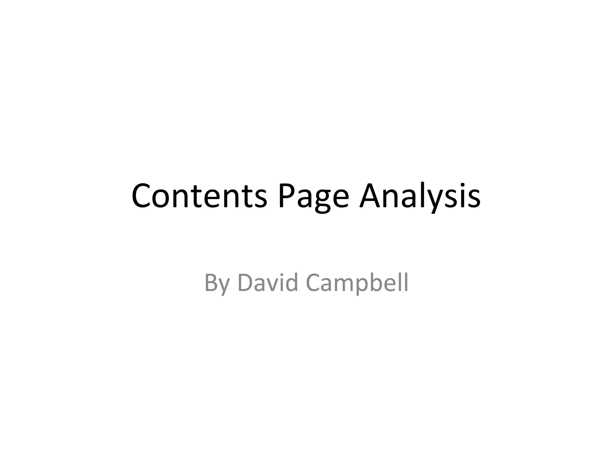
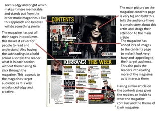
- The text on the contents page is bold and stands out to make it more memorable compared to other music magazines.
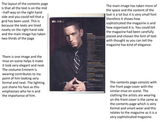
- The main picture is very large and draws attention to the featured artist and main article.
- Sections and subheadings are organized into columns for easy reading and navigation without clicking through pages.
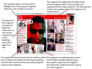
- Many images are included to make the page visually appealing and interesting to pull readers into the magazine.
- A mini article provides a preview of what's inside and the magazine's theme.