
Recommended
More Related Content
What's hot
What's hot (20)
Viewers also liked
Viewers also liked (16)
Similar to Digipak making process
Similar to Digipak making process (20)
Recently uploaded
Recently uploaded (20)
Digipak making process
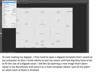
- 1. To start making my digipak , I first need to open a digipak template that I saved on my computer so then I know where to put my covers and how big they have to be to fit the size of a digipak cover. I did this by opening a new image that’s been saved in my documents and used it as a main template where I put all my layers on when each of them is finished.
- 2. Then I put my back cover together and put it onto my template. It includes names of the songs that are included on both of the disks in this album. I also added how to contact the producers on social media in the right bottom corner as it’s quite important because if the audience has any question, they know how they can contact them or follow them etc. I added a design of a pink background and colourful bubbles, very similar colours to the bubbles on my poster to create the continuity and make sure that the both products are linked.
- 3. After that, I added my front cover onto this template. It’s quite simple, yet quite effective in my opinion as it has 4 photos but they’re all the same, just the opacity is different for all of them. The background is yellow and I think it looks good as it still creates the continuity even when the main is not pink. Because I’ve used a bit of yellow colour on my poster and the back of my digipak, it creates the effect. I did my writing in dark red/burgundy and orange to make sure that it stands out but still keeps the continuity going.
- 4. The next thing I put onto my digipak was inside left cover which simply just includes a photo of my artist but it’s been duplicated like it was on the front cover as well as my poster. The opacities are different but it can still be seen that it’s the same photos. It, once again, creates the continuity as I’ve used the same method for my other things. I left the background of it white as I didn’t want to include too many colours because it’d look too child-like if I used more colours.
- 5. And then I had to include both of the CDs and I decided to keep them very simple and just use the colours that have been used already (pink, orange/red, yellow). The reason I didn’t want to make it really complicated is because there are already two layers that include photos so I didn’t want this digipak to consist of just my artist’s photos.
- 6. Then, at last, I added a back right cover and I also kept this simple because not a lot of people see it anyway as it’s just on the other side of one of the disks so it’s not really an important cover of a digipak. It’s in a yellow colour, the same as the front cover.