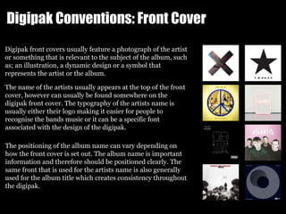
The document discusses the conventions of digipaks and how the author's media product followed and challenged some of these conventions. Some of the key points made:
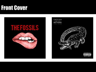
- The front cover followed conventions like featuring the artist name and a relevant image, but challenged conventions by including the album title.
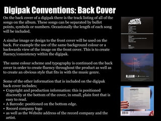
- The back cover included the standard track listing and copyright information but challenged conventions by including the album title instead of the artist name.
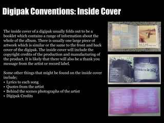
- Inside, spine, and CD designs kept the consistent color scheme but challenged conventions in some layout choices.
- The poster design followed conventions seen in other posters like including release date and reviews while challenging conventions by not showing the album artwork.
In summary, the author's media