
Recommended
More Related Content
What's hot
What's hot (19)
Similar to Codes and conventions
Similar to Codes and conventions (20)
More from BrianThOk
Recently uploaded
Recently uploaded (20)
Codes and conventions
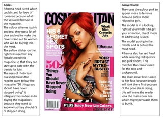
- 1. Codes: Rihanna head is red which could stand for love of romance because of all the sexual reference in the magazine. The colour scheme is pink and red, they use a lot of pink and red to make the cover stand out to women who will be buying this the most. The yellow sticker on the right tells use that any females need this magazine so that they can stay up to date with the trends for July. The uses of rhetorical question makes the readers want to buy the magazine “50 things you should have never stopped doing” It intrigues the readers in to buying the magazines because they want to know what they shouldn’t of stopped doing. Conventions: They uses the colour pink to appeal more to females because pink is more related to girls. The model is in a looking right at you which is to get your attention, direct mode of addressing is used. The model posing in the middle and is behind the mast head. Rihanna also has red hard while wearing red lip stick and pink shorts. This matches the colours used for the text and background. The main cover line is next to her face because people will look there first because of the pose she is doing, this will make the reader look the main cover line which might persuade them to buy it.
- 2. Codes: The colour scheme is red, white and black these are very rock and role colours because red in this case is related to blood which shows that the band is hard-core and that they take there music seriously. The ripped cloths showing their bloody skin shows that their music is hard- core and brutal. Its to show there fans that they are the biggest and best rock and roll band and that they fell the same way about there music. The white colours used is to show there purity as it slowly gets broken as we see from the t-shirt while it gets bloody and ruined. The yellow is used to promote a product such as stickers, posters, CD and PlayStation. Conventions: The clothing and tattoos shows us that this magazine is going to be about rock since rock and roll is a lot more hard-core and rough. We see the band ‘Bring me the horizon’ in the middle of the magazine and the leader/main singer is in front but he is the only one covering the mast text and his band mates are in the back with the text in front of them. The whole band is looking straight at you which gets the attention of the reader because of eye contact, you cant get the same effect if they was looking away. We have all the information such as the websites and barcode in the bottom right which is useful if the reader wanted a digital copy and wanted to share there opinions about the magazine.
- 3. Codes: The uses of yellow is to match the gold the model is wearing and suits the main idea of this magazine cover which is to show that the model ‘Bruno Mars’ future is bright. We also wears glasses which is to also backed the point that his future is bright. We also see a stream of a white blue light going down in the background. This could be used to show a ray of light. They also uses the Billboard colours which is blue and yellow the 2 colours used in this magazine. The overall colour scheme is very bright which is the theme of this magazine, it does this just by using colours. Conventions: The model is in front of the mast head which is used in most covers. It also has some cover lines that are behind him but there is one in front of him. The model takes up all the space because he is such a big singer which is why the magazine decided to make him the face of the cover rather then covering him up with text. It also has a cover line that shows the reader that it has other singers in this magazine such as Rihanna and Papa Roach which are all different singers for different genres. They did this it expand on there target audience as It has a whole diverse group of singers that a lot of readers could enjoy. The facial expression of the model shows that he is formal and that he is professional.
- 4. Codes: The uses of blue is to match her eyes. It is almost the same colour but is changed so it suits the black and white. The white and black which is used to match her clothes which are also black and white. The colour scheme is dull but it has got blue which does add some brightness to it. It also black and white but with the contrast it makes it light. Although it not very clear you can see that the model is wearing red nail paint this could because of the red spin logo. The pose she is doing is inviting which makes the reader wat to buy this magazine. Conventions: The model is in front of the mast head and is in the middle of the page which is used in most covers. The main cover line is next to her face so that people could see who she is, if they already don’t and because they would be the face place they’ll look. The sweater she is wearing suits her hair and also the background. The + sign as the cover line is a conventional way of saying also including these artist. The layout of the magazine is conventional, the model in the middle with all the cover lines around her with the masthead at the top with the barcode at the bottom with all the information such as the website and the date it was made.