Z Score,T Score, Percential Rank and Box Plot Graph
pa
1. Poster Analysis
“Annabelle”
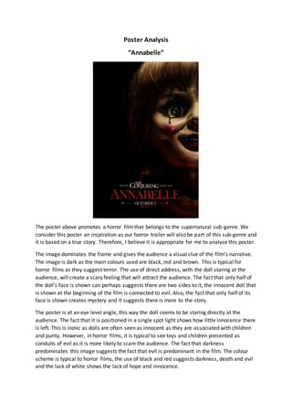
The poster above promotes a horror filmthat belongs to the supernatural sub-genre. We
consider this poster an inspiration as our horror trailer will also be part of this sub-genre and
it is based on a true story. Therefore, I believe it is appropriate for me to analyse this poster.
The image dominates the frame and gives the audience a visual clue of the film’s narrative.
The image is dark as the main colours used are black, red and brown. This is typical for
horror films as they suggest terror. The use of direct address, with the doll staring at the
audience, will create a scary feeling that will attract the audience. The fact that only half of
the doll’s face is shown can perhaps suggests there are two sides to it, the innocent doll that
is shown at the beginning of the film is connected to evil. Also, the fact that only half of its
face is shown creates mystery and it suggests there is more to the story.
The poster is at an eye level angle, this way the doll seems to be staring directly at the
audience. The fact that it is positioned in a single spot light shows how little innocence there
is left. This is ironic as dolls are often seen as innocent as they are associated with children
and purity. However, in horror films, it is typical to see toys and children presented as
conduits of evil as it is more likely to scare the audience. The fact that darkness
predominates this image suggests the fact that evil is predominant in the film. The colour
scheme is typical to horror films, the use of black and red suggests darkness, death and evil
and the lack of white shows the lack of hope and innocence.
2. The facial expression of the doll seems happy and sweet as it is smiling and has rosy cheeks.
However, this is disrupted by the blood tear drop, which suggests we will not be presented
with a happy story. Blood connotes danger and death, also its face is shadowed, enabling
the audience to focus on the eye and the blood rather than the smile. The title is red and
bold; the colour again denotes blood and death and links to the horror genre.
“The Conjuring” is mentioned in order to attract the audience and also give them an idea of
the narrative. The fans of “The Conjuring” will be excited and are likely to watch it and also
enjoy it. This link between the two films draws in the same kind of audience. The font size of
“The Conjuring” is bigger than the rest of the text, in order for the audience to notice it, but
not as big as the title, therefore it is not stealing the spotlight. The fact that the film came
out on October 3rd is also a typical convention as horror films are more likely to come out
during autumn as this is linked to Halloween.
In conclusion, the poster for “Annabelle” is effective in attracting its audience as it uses
typical conventions and features for horror films, without giving away too much information
about the narrative.