
Recommended
More Related Content
What's hot
What's hot (20)
Viewers also liked
Viewers also liked (16)
Similar to Horror poster analysis
Similar to Horror poster analysis (20)
Recently uploaded
Recently uploaded (20)
Horror poster analysis
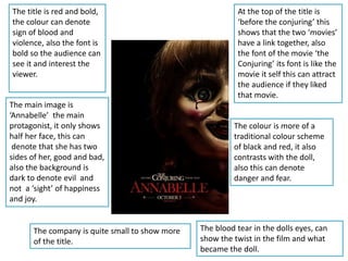
- 1. The title is red and bold, the colour can denote sign of blood and violence, also the font is bold so the audience can see it and interest the viewer. The main image is ‘Annabelle’ the main protagonist, it only shows half her face, this can denote that she has two sides of her, good and bad, also the background is dark to denote evil and not a ‘sight’ of happiness and joy. At the top of the title is ‘before the conjuring’ this shows that the two ‘movies’ have a link together, also the font of the movie ‘the Conjuring’ its font is like the movie it self this can attract the audience if they liked that movie. The blood tear in the dolls eyes, can show the twist in the film and what became the doll. The company is quite small to show more of the title. The colour is more of a traditional colour scheme of black and red, it also contrasts with the doll, also this can denote danger and fear.
- 2. The title is positioned in the middle to stand out and is the main focus for the audience. Most of the poster is black but there is lighting positioned in the middle, this shows what the movie is about and connote a sense of ‘hope’. The release date is at the bottom and the date states ‘Halloween’ this shows as everyone knows the date of Halloween and that time of day is about ghouls and horror. The slogan positioned bottom of the title shows the death threat of the movie. The producers is positioned to promote as most people know them movies. The title ‘OUIJA’ is like the letters and shaped like the Ouija board it self. The company is positioned really small at the bottom to make the main focus of the poster.
- 3. The background is dull and grey this is to make the red blood stand out for the audience. The producers are positioned to promote the movie since these movies ‘paranormal and ‘insidious’ is popular. The girl drawing with the blood is the main focus, the girl is quite creepy and could give the audience a clue of the film, also the blood connotes death and gore since the girl is the one with the blood, the audience feels quite sorry for the girl but its quite scary this denotes violence's. The blood paints a drawing has ‘demonic’ like eyes and a quite scary face this links to the slogan under the title, this creates an effect as its looking straight into the camera to look at the audience. The title is positioned in the middle and is bold and spaced out but also is quite faded, and the word ‘sinister 'means giving the impression that something harmful or evil is happening or will happen, also the colour of the background contrasts with the colour of the font making it stand out for the audience. At the bottom is ‘coming soon’ this shows no detail for the audience. This poster you can tell its horror as the blood and the creepy girl this denotes a scary mood.