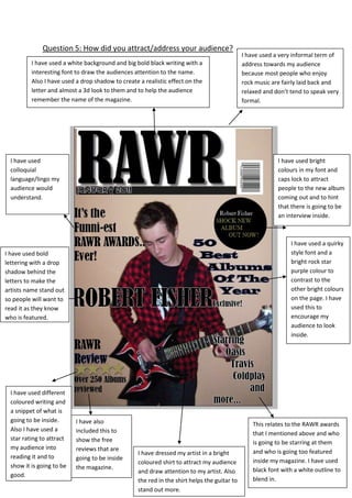
1. I have used a very informal term of address towards my audience because most people who enjoy rock music are fairly laid back and relaxed and don’t tend to speak very formal.I have also included this to show the free reviews that are going to be inside the magazine.This relates to the RAWR awards that I mentioned above and who is going to be starring at them and who is going too featured inside my magazine. I have used black font with a white outline to blend in. I have used different coloured writing and a snippet of what is going to be inside. Also I have used a star rating to attract my audience into reading it and to show it is going to be good.I have used a white background and big bold black writing with a interesting font to draw the audiences attention to the name. Also I have used a drop shadow to create a realistic effect on the letter and almost a 3d look to them and to help the audience remember the name of the magazine.I have used a quirky style font and a bright rock star purple colour to contrast to the other bright colours on the page. I have used this to encourage my audience to look inside.I have used bright colours in my font and caps lock to attract people to the new album coming out and to hint that there is going to be an interview inside.I have used colloquial language/lingo my audience would understand.I have dressed my artist in a bright coloured shirt to attract my audience and draw attention to my artist. Also the red in the shirt helps the guitar to stand out more.I have used bold lettering with a drop shadow behind the letters to make the artists name stand out so people will want to read it as they know who is featured.5905501790700Question 5: How did you attract/address your audience?<br />