Final Completion Certificate of Marketing Management Internship
Conventional features
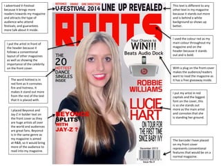
1. I put the artist in front of
the header because it
follows a conventional
layout of other magazines
as well as showing the
importance of the celebrity
on the front cover.
I used the colour red as my
main colour throughout my
magazine and on the
header because it stands
out and is bold.
This text is different to any
other text in my magazine
because it stands out more
and is behind a white
background so shows up
better.
I put my artist in red
capitals and the biggest
font on the cover, this
is so she stands out
more as the main artist
and connotes that she
is standing her ground.
With a plug on the front cover
makes the audience/readers
want to read the magazine as
it has a free giveaway inside.
I advertised V-Festival
because it brings more
readers towards my magazine
and attracts the type of
audience who attend
festivals; and guarantees
more talk about it inside.
The barcode I have placed
on my front cover
represents conventional
features that would be on a
normal magazine.
I placed Beyoncé and
Jay-Z in bolder text on
the front cover as they
are huge artists all over
the world and audiences
are great fans. Beyoncé
is in the same genre as
my magazine is aimed
at-R&B, so it would bring
more of the audience to
read into my magazine.
The word hottest is in
red font as it connotes
fire and hotness. It
makes it stand out more
from the rest of the text
that it is placed with.
2. All articles begin with techniques of a larger first
letter or a drop cap. The larger letter or in some
cases the drop cap shows where the starting point
of the article is. Adding these techniques can also
add a formal delicacy to the text.
Printing who took the photo
gives my magazine more of a
professional view and has
contions of any other
magazine.
This introduction to the
article is a feature that
appears in magazines and is
always used. It is put there to
show that this is the main
article and explains what it is
about in little detail.
The title of the artist is in
bold, large text font to
show it stands out and the
red colour creates
continuity.
I have placed my artist on one full side of the double page
spread because it shows her importance. She covers the
full half of it which mirrors the text on the other side of
that the text talks from the artist herself.
3. With the name of the
magazine repeated
throughout the magazine
in the same font creates
continuity.
The slight detail of text
underneath the caption gives
a brief idea of what each
section is about.
The date helps the
audience know what
issue the magazine is
from as well as the issue
number above the
barcode on the front
cover.
The website allows
the audience and
readers to look up
stories inside the
magazine and stories
that haven’t yet been
published inside the
magazine.
I placed Robbie Williams
in as a large image as he
known hugely especially
in the UK. When people
see that Robbie Williams
is mentioned in the
magazine they have
more chance of reading
in it, from being fans of
him.
I put albums in its own
section as they play an
interesting role in the
magazine as the audience
are interested in how their
favourite artists are doing
in the charts.
I put the monthly
subscriptions in my
magazine for
following conventional
features of all other
monthly magazines.