
Recommended
More Related Content
What's hot
What's hot (20)
Similar to Dizzee Rascal Analysis
Similar to Dizzee Rascal Analysis (20)
More from asmediac14
More from asmediac14 (20)
Recently uploaded
Recently uploaded (20)
Dizzee Rascal Analysis
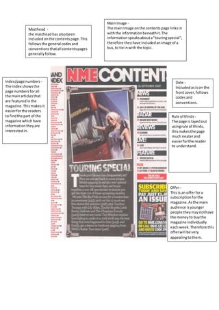
- 1. Masthead - the masthead has also been included on the contents page. This follows the general codes and conventions that all contents pages generally follow. Main Image - The main image on the contents page links in with the information beneath it. The information speaks about a "touring special", therefore they have included an image of a bus, to tie in with the topic. Index/page numbers - The index shows the page numbers for all the main articles that are featured in the magazine. This makes it easier for the readers to find the part of the magazine which have information they are interested in. Date - Included as is on the front cover, follows codes and conventions. Rule of thirds - The page is layed out using rule of thirds, this makes the page much neater and easier for the reader to understand. Offer - This is an offer for a subscription for the magazine. As the main audience is younger people they may not have the money to buy the magazine individually each week. Therefore this offer will be very appealing to them.
- 2. Main Image - This image is hoping to connect with the younger audience. It shows Dizzee Rascal looking up to no good looking like he spray painting, but if you look closely, he is cleaning it. This could be a way of trying to stop young people from doing graffiti. He is also featured in the double page spread because the information on the page is based upon him therefore it is only logical to have him as the main image. Main cover line - The main cover line on the double page spread presents a play on words. Instead of saying 'Rags to Riches' it says 'Tags to Riches'. This links in with the main image being based on graffiti. This is used to attract the audience as they are more likely to read on if it makes them laugh. Main Text body - The main text on this page has been split into four separate column. This presents the text in a much more interpretable layout and it less confusing for the reader to read. Otherwise is they cannot understand it they will not read it. Image - The second image on the page serves as a complement to the main image. It continues the theme of rebellion and partying. This is clearly shown by the beer on the page and also the sound system.
- 3. Masthead - The masthead for the magazine NME shows the title of the magazine across the top of the page in big, bold red writing. The mast head is not being covered up by the main image on this magazine. Header/skyline - The skyline for this magazine is used mainly to attract readers to the magazine, it provides a specific one time offer that only this magazine has. "16 page autumn tour special". Main Image - The main image for this magazine features Dizzee Rascal, this is a very technique to attracting readers as big fans of his are likely to read the magazine. This serves as the unique selling point of the magazine, and will be the main reason people purchase it. Puff - The puff serves the purpose of providing the reader with a specific offer. In this case it is offering about a pavement reunion. This will be one of the main things people see when they first look at the cover, as it is next to the masthead and the main image. Main cover line - The main cover line anchors the main image, showing the name of the person in the main image Dizzee Rascal, and a quote from him. The language in the quote is very casual and features the slang term 'Man', therefore it is reaching out to a younger audience. Barcode - The barcode is simply used for scanning upon purchase. The barcode the codes and convention of most magazines, by having the barcode appear in the bottom left hand corner. Colour Scheme - The colour scheme of this magazine is mainly white, black and red. This colour scheme is very simple yet allows the text to stand out and not to be over complicated. Price - The price on this magazine is presented by the barcode, and shows the magazine costs £2.30. This price is set to satisfy the audience, who will likely by working/middle class and have around this amount of money spare.