
Recommended
More Related Content
What's hot
What's hot (20)
Viewers also liked
Viewers also liked (18)
Similar to R&B magazine masthead design and layout follows industry conventions
Similar to R&B magazine masthead design and layout follows industry conventions (20)
More from asmediad14
More from asmediad14 (20)
Recently uploaded
Recently uploaded (20)
R&B magazine masthead design and layout follows industry conventions
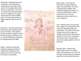
- 1. Masthead – following codes and conventions I have placed the masthead in the top right of the cover. It is the largest text and so shows its importance. The name is musical and so shows the genre of a music magazine. It is quite chilled which fits with the R&B genre. This also helps attract my target audience who are fans of R&B. Coverlines – They are positioned to the left and right, following codes and conventions. They relate to content inside the magazine and of the feature artist. Coverlines such as: ‘the UKs R&B charts’ advertises the magazines genre of R&B. Main image – Is centred and dominates the page, following codes and conventions. The artist is showing direct address and therefore engaging the reader. It is a mid-shot and a prop is used in the form of a mic. The mic emphasises the fact that this is a music magazine. Title – Relates to the artist and the font is large in size compared to the coverlines, following codes and conventions. The name of the artist is large so fans of the singer are instantly attracted, the text below is smaller as this is of less importance. The feature artist is young, which attracts my target audience of 16-18 year olds. Skyline – Advertises what the magazine is going to provide. It is below the masthead so the audience can see the name and then what it is to provide. Barcode, date – Placed in the bottom right corner, this follows codes and conventions as it is out of the way not distracting the audience away from the important elements.
- 2. Masthead & title – Masthead features on the page following codes and conventions. It is smaller than the title as it is not as important as it was on the cover page. Titles font is larger to clearly display the purpose of the page. Images – Multiple images staggered down the page. Page looks more interesting with pictures on both sides. They are accompanied by page numbers, following codes and conventions. If the reader likes the look of an image, they can turn to the page to find out more. Sub-headings – Are boxed and larger in font compared to the articles. This shows they’re important and introduce new sections within the magazine. Their font being larger also follows codes and conventions. Layout- The masthead and title are at the top of the page, following codes and conventions. The articles then lead in order of importance with the images integrated. The page doesn’t look too busy but still has no empty spaces, implying there is loads of content inside.
- 3. Title – Largest text on the page, following codes and conventions. This is the first thing you want the reader to see, so it dominates the top of the page. The word ‘exclusive’ implies that no other interview will reach a higher peak than this. It also suggests that the magazine has all the information you need on the artist. Sub-heading – Smaller font than the title showing that it adds extra information. It is a question, suggesting that if the reader reads on, they will find the answer. Main image – Dominates left page and is a long shot. It shows the artist in the studio, emphasising the music element of the magazine. Article – It is a Q&A article, which follows codes and conventions. It is easy to read and easy for the reader to find out information on the artist.