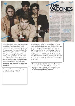
1. The left side of the double page is the image
of the band. The mise-en-scene of this
image immediately creates an impression of
the rock genre of the magazine, due to the
clothing worn by the band members and
their appearance, e.g. leather jackets and
denim, heavy eye makeup etc. The props
used in the image also imply this genre, as
they are carrying guitars. The lighting in the
image is very high key, especially on the
lead singers face, connoting his importance
in the band.
On the right top side of the double page, The band
name is placed in bold, black font. The font is on a light
coloured background, depicting the band is quite
big/important in the rock music industry. Under the
masthead, there is a coverline for the band with the
lead singers name highlighted in blue font whilst the
rest of the coverline is in black, mirroring the idea from
the main image; that the lead singer is very important
in the band.
The article text is set out in 2 columns. There is a
quote in the middle of the 2nd
column that is
highlighted in blue; possibly conveying this quote
as an important part of the interview.
The colour scheme of the double page
spread is blue, beige and black.