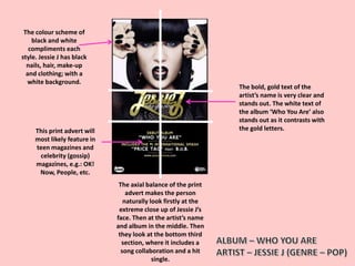
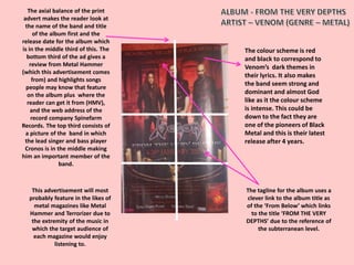
This print advert will
most likely feature in
teen magazines and
celebrity (gossip)
magazines, e.g.: OK!
Now, People, etc.
The colour scheme of
black and white
compliments each
style. Jessie J has black
nails, hair, make-up
and clothing; with a
white background.
The axial balance of the print
advert makes the person
naturally look firstly at the
extreme close up of Jessie J’s
face. Then at the artist’s name
and album in the middle. Then
they look at the bottom third
section, where it includes a
song collaboration and a hit
single.
The bold, gold text of the
artist’s name is very clear and
stands out. The white text of
the album ‘Who You Are’ also
stands out as it contrasts with
the gold letters.
The axial balance of the print advert makes the
person naturally look at the block, white text of
the artist’s name. Then they will look at the mid
shot of Lana Del Ray, specifically her face. Lastly,
they will look at the bottom third section,
where it includes the album name slightly
bolder and bigger than the songs included and
when the album is out.
The top third of this
print advert is in
capital letters and the
white text is clear
against the blue (sky)
background.
The album ‘Born To
Die’ is in blue text as it
is on a white
background, of her
shirt. It is subtly
underlined and
underneath, the
release of the album
date and songs that
are featured, are
centered in the
bottom third of the
print ad.
Lana Del Ray’s close
up is in the middle of
the print advert. This
is effective because
she is the artist and it
makes sense not only
to promote her album,
but her simple style.
Her light make-up and
white shirt is not too
much and it works
well with the outside
background and the
blue and white text
colours.
The colour scheme is red
and black to correspond to
Venom’s dark themes in
their lyrics. It also makes
the band seem strong and
dominant and almost God
like as it the colour scheme
is intense. This could be
down to the fact they are
one of the pioneers of Black
Metal and this is their latest
release after 4 years.
The axial balance of the print
advert makes the reader look at
the name of the band and title
of the album first and the
release date for the album which
is in the middle third of this. The
bottom third of the ad gives a
review from Metal Hammer
(which this advertisement comes
from) and highlights songs
people may know that feature
on the album plus where the
reader can get it from (HMV),
and the web address of the
record company Spinefarm
Records. The top third consists of
a picture of the band in which
the lead singer and bass player
Cronos is in the middle making
him an important member of the
band.
The tagline for the album uses a
clever link to the album title as
of the ‘From Below’ which links
to the title ‘FROM THE VERY
DEPTHS’ due to the reference of
the subterranean level.
This advertisement will most
probably feature in the likes of
metal magazines like Metal
Hammer and Terrorizer due to
the extremity of the music in
which the target audience of
each magazine would enjoy
listening to.

Media - Print Adverts Research

  • 2.
    This print advertwill most likely feature in teen magazines and celebrity (gossip) magazines, e.g.: OK! Now, People, etc. The colour scheme of black and white compliments each style. Jessie J has black nails, hair, make-up and clothing; with a white background. The axial balance of the print advert makes the person naturally look firstly at the extreme close up of Jessie J’s face. Then at the artist’s name and album in the middle. Then they look at the bottom third section, where it includes a song collaboration and a hit single. The bold, gold text of the artist’s name is very clear and stands out. The white text of the album ‘Who You Are’ also stands out as it contrasts with the gold letters.
  • 3.
    The axial balanceof the print advert makes the person naturally look at the block, white text of the artist’s name. Then they will look at the mid shot of Lana Del Ray, specifically her face. Lastly, they will look at the bottom third section, where it includes the album name slightly bolder and bigger than the songs included and when the album is out. The top third of this print advert is in capital letters and the white text is clear against the blue (sky) background. The album ‘Born To Die’ is in blue text as it is on a white background, of her shirt. It is subtly underlined and underneath, the release of the album date and songs that are featured, are centered in the bottom third of the print ad. Lana Del Ray’s close up is in the middle of the print advert. This is effective because she is the artist and it makes sense not only to promote her album, but her simple style. Her light make-up and white shirt is not too much and it works well with the outside background and the blue and white text colours.
  • 4.
    The colour schemeis red and black to correspond to Venom’s dark themes in their lyrics. It also makes the band seem strong and dominant and almost God like as it the colour scheme is intense. This could be down to the fact they are one of the pioneers of Black Metal and this is their latest release after 4 years. The axial balance of the print advert makes the reader look at the name of the band and title of the album first and the release date for the album which is in the middle third of this. The bottom third of the ad gives a review from Metal Hammer (which this advertisement comes from) and highlights songs people may know that feature on the album plus where the reader can get it from (HMV), and the web address of the record company Spinefarm Records. The top third consists of a picture of the band in which the lead singer and bass player Cronos is in the middle making him an important member of the band. The tagline for the album uses a clever link to the album title as of the ‘From Below’ which links to the title ‘FROM THE VERY DEPTHS’ due to the reference of the subterranean level. This advertisement will most probably feature in the likes of metal magazines like Metal Hammer and Terrorizer due to the extremity of the music in which the target audience of each magazine would enjoy listening to.