
Recommended
More Related Content
What's hot
What's hot (20)
Similar to Digipack analysis
Similar to Digipack analysis (20)
More from HarveyJGraham
More from HarveyJGraham (20)
Recently uploaded
Recently uploaded (20)
Digipack analysis
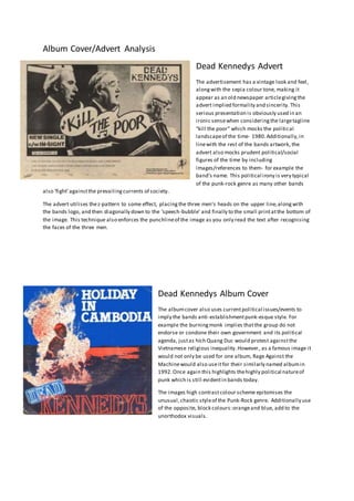
- 1. Album Cover/Advert Analysis Dead Kennedys Advert The advertisement has a vintage look and feel, alongwith the sepia colour tone, making it appear as an old newspaper articlegivingthe advert implied formality and sincerity. This serious presentation is obviously used in an ironic sensewhen consideringthe largetagline “kill the poor” which mocks the political landscapeof the time- 1980.Additionally,in linewith the rest of the bands artwork, the advert also mocks prudent political/social figures of the time by including images/references to them- for example the band’s name. This political irony is very typical of the punk-rock genre as many other bands also ‘fight’againstthe prevailingcurrents of society. The advert utilises thez-pattern to some effect, placingthe three men’s heads on the upper line,alongwith the bands logo, and then diagonally down to the ‘speech-bubble’ and finally to the small printatthe bottom of the image. This technique also enforces the punchlineof the image as you only read the text after recognising the faces of the three men. Dead Kennedys Album Cover The albumcover also uses currentpolitical issues/events to imply the bands anti-establishmentpunk-esque style. For example the burningmonk implies thatthe group do not endorse or condone their own government and its political agenda, justas hích Quang Duc would protest againstthe Vietnamese religious inequality. However, as a famous image it would not only be used for one album, Rage Against the Machinewould also useitfor their similarly named albumin 1992.Once again this highlights thehighly political natureof punk which is still evidentin bands today. The images high contrastcolour scheme epitomises the unusual,chaotic styleof the Punk-Rock genre. Additionally use of the opposite, block colours:orangeand blue, add to the unorthodox visuals.
- 2. Album Cover Analysis Idles Brutalism Advert The advertisement uses the albumcover as the main focal point,possibly becausethey lack a largebudget but also to apply some synergy between the album releaseand the tour/promotion technique. The dingy, greyish brown colour implies thedarker more serious natureof the music.Along with the simple, white brickwork background which draws focus to the albumcover. The black and reddish font not only contrasts with the background but also adds an element of colour to a very black and white advert. Additionally the colour connotes much of the anger at the heart of the band and genre. Idles Album Cover The lack of colour makes the red, albumtitle stand out againstthe largely monochrome image. The use of a photo within the frame adds an extra layer of depth- additionally theimage is of the lead singer’s mother, which links to one of the song titles:‘Mother’. This unusual element of realismrefers to the punk genre which focuses on real events to send a political message.