
Recommended
More Related Content
What's hot
What's hot (20)
Viewers also liked
Similar to Magazine double page spread analysis
Similar to Magazine double page spread analysis (20)
More from jordanjenkins98
More from jordanjenkins98 (14)
Recently uploaded
Recently uploaded (20)
Magazine double page spread analysis
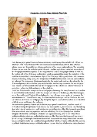
- 1. Magazine Double Page Spread Analysis This double page spread is taken from the country music magazine called Nash. This is an interview with Miranda Lambert when she released her Platinum album. This article is talking about her three different albums and some of the songs on the album. The layout to this article is where the main image of Miranda Lambert’s platinum records is on the left of the two pages and takes up most of the page, there is a small paragraph written in pink on the bottom left of the first page and another small paragraph that starts the main text of the article written in black on the bottom right of the first page. This layout shows it is clear and simple positioning being used. The image shows that the article is on Miranda Lambert and her albums. The colours on this image is pink for the text which matches the colour for the first small paragraph on the first page and the titles for the song names on the second page. This creates a symbiotic link between the two pages for the article, it is affective because it also shows where the different parts of the article is. There are three smaller image on the second page to break up the text of the article as well as to show that the imformation under the images are related to that image. The three images are of three different CDs that Miranda Lambert has released over a series of years and the text under each CD is a different song that is related to the image and the Platinum Records CD which is shown on the first page. By doing this it gives a visual stimulation as to what the article is about and ingaes the audience. Each of the images used in this whole double page spread are different, the first one is of Miranda looking straight at the camera and is a close up of her, the second is a medium long shot where she is leaning on a wall holding the neck of a guitar. The third image is a medium shot where she is standing against a wall and is holding the sides of her jacket. The last image is where she is leaning on a bed and has a guitar leaning next to her while she is looking out to the ditstance and not at the camera. The three smaller images all use heavy eye make-up and a simple costume which differs from the main image which uses simpler tones and lighter make-up. In all four images her hair is left down and is blonde, this shows a symbiotic link that she shows within her album covers. Also it symbolises the natural nature
- 2. theme that country music holds. Underneath each song title on the second page is the release date of the song and the album name, written in black bold letters that match the song title which is written in pink bold letters. This cna be a promotion of her three albums that have a few song reviews as the eader is provided with an image of the album and the album name. The whole article is reviewing the songs on the Platinum Records and at the same time is promoting her three CDs that are featured.
- 3. Magazine Double Page Spread Analysis This is a double page spread taken from a country music magazine. In this double page spread the article is about four aspiring country singers who are involved in the country TV show named Nashville. The colours used in this article are yellow for highlighting and underlining the title to the article. This choice of colour is affective because it stands out but you are still able to read the text of the article itself. The symbolism of yellow is courage and happiness, so by using yellow it is showing that the artists in the main image have courage to perform for the first time and show their journy within country music and fame. Also it is showing that they are happy with thier life and careers. We can see that this article is about the artists and the TV show Nashville, showing that it is a factual story and is not a interview or reivew. The layout to this article is like a traditional article where there are two collums of text and a related image to break up the text. The image is showing two of the four artirtists, who are shown on the first page, on stage and looking back at the camera almost suggesting that they’re scared or nervous. This image shows that the article is about their journey and what they will be feeling during this journey. In the image you can see that the costumes are traditional country wear, they men are wearing jeans and a shirt. The shirts differ for each of the three men, where the woman is wearing a white dress with a blue belt around the waist. Three of the artists are wearing cowboy boots in brown while the thrid man is wearing dark brown/ black shoes. These costumes show that country artists are the same as everyone else, it also implies that they are simple and down-to-earth people. They stick to their beliefs and don’t let fame change who they are. The title of the article also shows that it is about their journey, as it is ‘Stage Ready’. This is giving off the main meaning to the article and what it will be about. By usuing the words ‘Stage Ready’ as the titlte makes the readers intriged as to what the article will tell them about the four artists. The title is written in bold black letters to stand out on the page, this is effective because the readers will see this and want to read the article. Also just above the title is a small amount of text that is highlighted in yellow and written in black. This could be the sell-line of the article as it is briefly telling the readers what the
- 4. article will be about. This however does not ditsract to much attention from the main article and title. This whole double page spread is unique and interesting, the layout is simple and clear. However there is not a large amount of text within the main article text, therefore for my double page spread I will follow the layout of this double page spread but I will change the positionings of the images slightly and where the title is placed. For instance I might change the placement of the title so that it is on the first page with the main image for the article and then add another small related image within the main text of the article.