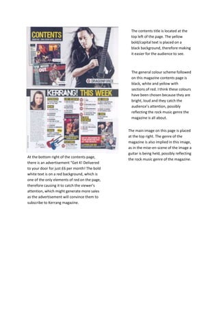
1. The contents title is located at the
top left of the page. The yellow
bold/capital text is placed on a
black background, therefore making
it easier for the audience to see.
The general colour scheme followed
on this magazine contents page is
black, white and yellow with
sections of red. I think these colours
have been chosen because they are
bright, loud and they catch the
audience’s attention, possibly
reflecting the rock music genre the
magazine is all about.
The main image on this page is placed
at the top right. The genre of the
magazine is also implied in this image,
as in the mise-en-scene of the image a
guitar is being held, possibly reflecting
the rock music genre of the magazine.
At the bottom right of the contents page,
there is an advertisement “Get K! Delivered
to your door for just £6 per month! The bold
white text is on a red background, which is
one of the only elements of red on the page,
therefore causing it to catch the viewer’s
attention, which might generate more sales
as the advertisement will convince them to
subscribe to Kerrang magazine.