
Recommended
More Related Content
What's hot
What's hot (19)
Viewers also liked
Viewers also liked (16)
Similar to Double Page Spread Analysis Of KERRANG
Similar to Double Page Spread Analysis Of KERRANG (20)
Recently uploaded
Recently uploaded (20)
Double Page Spread Analysis Of KERRANG
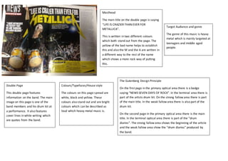
- 1. Target Audience and genre The genre of this music is heavy metal which is mainly targeted at teenagers and middle aged people. Double Page This double page features information on the band. The main image on this page is one of the band members and his drum kit at a performance. It also features cover lines in white writing which are quotes from the band. Colours/Typefaces/House style The colours on this page spread are white, black and yellow. These colours also stand out and are bright colours which can be described as loud which heavy metal music is. Masthead The main title on the double page is saying “LIFE IS CRAZIER THAN EVER FOR METALLICA”. This is written in two different colours which both stand out from the page. The yellow of the bad name helps to establish this and also the M and the A are written in a different way to the rest of the name which shows a more rock way of putting this. The Gutenberg Design Principle On the first page in the primary optical area there is a badge saying “NEWS SEVEN DAYS OF ROCK”. In the terminal area there is part of the artists drum kit. On the strong fallow area there is part of the main title. In the weak fallow area there is also part of the drum kit. On the second page in the primary optical area there is the main title. In the terminal optical area there is part of the “drum diaries”. The strong fallow area shows the beginning of the article and the weak fallow area show the “drum diaries” produced by the band.