APM Welcome, APM North West Network Conference, Synergies Across Sectors
Poster analysis 2
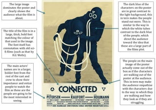
1. The large image
dominates the poster and
clearly shows the
audience what the film is
about.
The dark blue of the
characters on the poster
are in great contrast to
the light background, this
in tern makes the people
stand out more. This is
similar to the way in
which the white tubes
contrast to the dark blue
of the people, which
direct the audience
toward the idea that
these are a large part of
the films plot.
The people on the main
image of the poster
actually come out of the
box as if the characters
are walking out of the
poster at the audience.
This in tern may make
the audience empathise
with the characters due
to the way in which they
are walking and how
they look as if they are
struggling.
The title of the film is in a
large, thick, bold font
matching the colour of
that used in the image.
The font itself has
connotation with old sci-
fi films (such as that by
H.G Wells).
The main actors’
names are in a larger,
bolder font from the
rest of the cast and
crew to show their
importance and entice
people to watch the
film as these are the
people are going to be
the most interested in
seeing.